2020 hit everyone hard, and adjusting to the new "normal" took a while.
One of the things my friends and I missed most was going to our favorite coffee shops and restaurants to enjoy a quality drink, especially coffee. Since ordering hot drinks online wasn't really an option, we started thinking about how we could make it work during the pandemic.
Even as life gradually returns to normal, we believe the concept behind this case study remains relevant. For people with busy schedules, the ability to skip the line using our app is still a big win.
My Role
As a Product Designer and co-creator of the app, I helped shape the overall concept, define the product journey, and design the prototype and visual identity.
I worked closely with my teammate to brainstorm and refine ideas based on solid UX and startup principles, like understanding future users, identifying client needs, and building with purpose.
Over the span of three months, we dedicated 2–3 hours each week to the lo-fi prototype and visual design. Since it was a two-person effort with a hackathon-style approach, the documentation is minimal for now, just the essentials.
RESPONSIBILITIES 🧔🏽
Product concept & journey, ideation, end-to-end prototype, visual concept
TIMELINE & OUTPUT ⏱
3 months of work on product
TEAM 💃🏼🕺🏻
Product Designers (2)
The Context ☕️
You know those late-night conversations about gadgets that could make everyday life easier? This idea came out of one of those moments. Naturally, during the pandemic, most ideas circled around “I want fewer people around me” or “I miss my favorite spots!”
Supporting Local Businesses
We also saw a chance to help struggling local cafés by giving them better tools to manage customer orders and workflow efficiently.
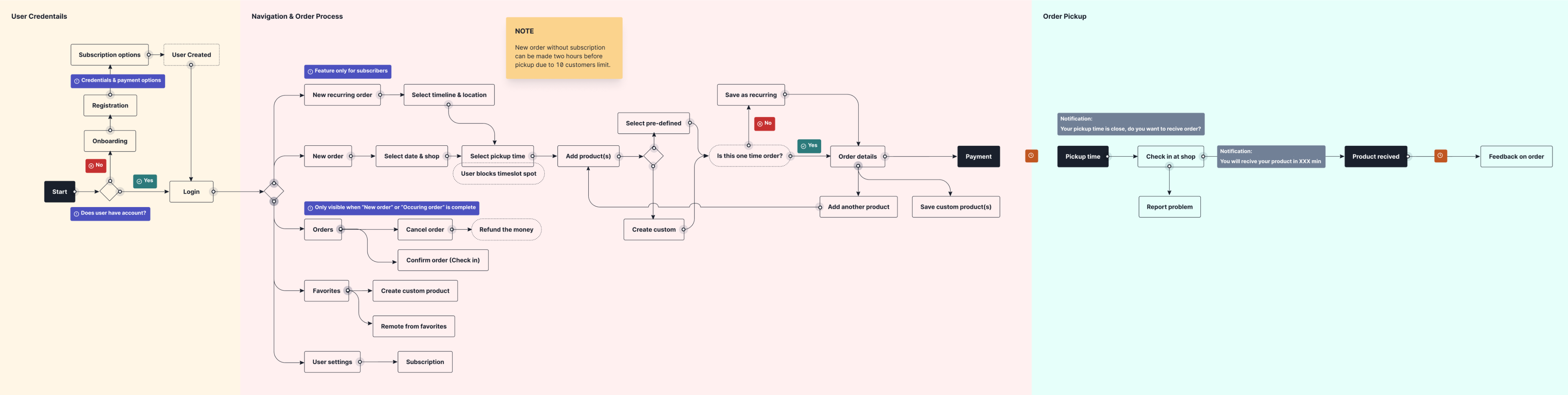
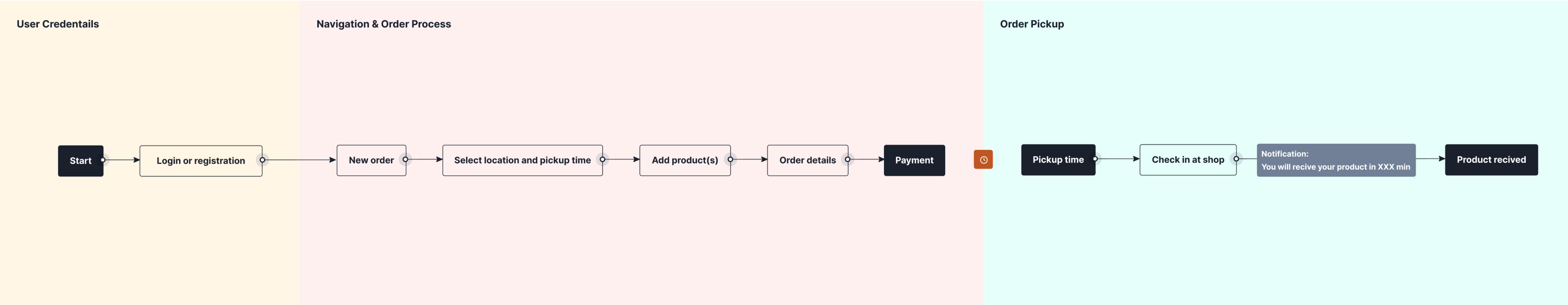
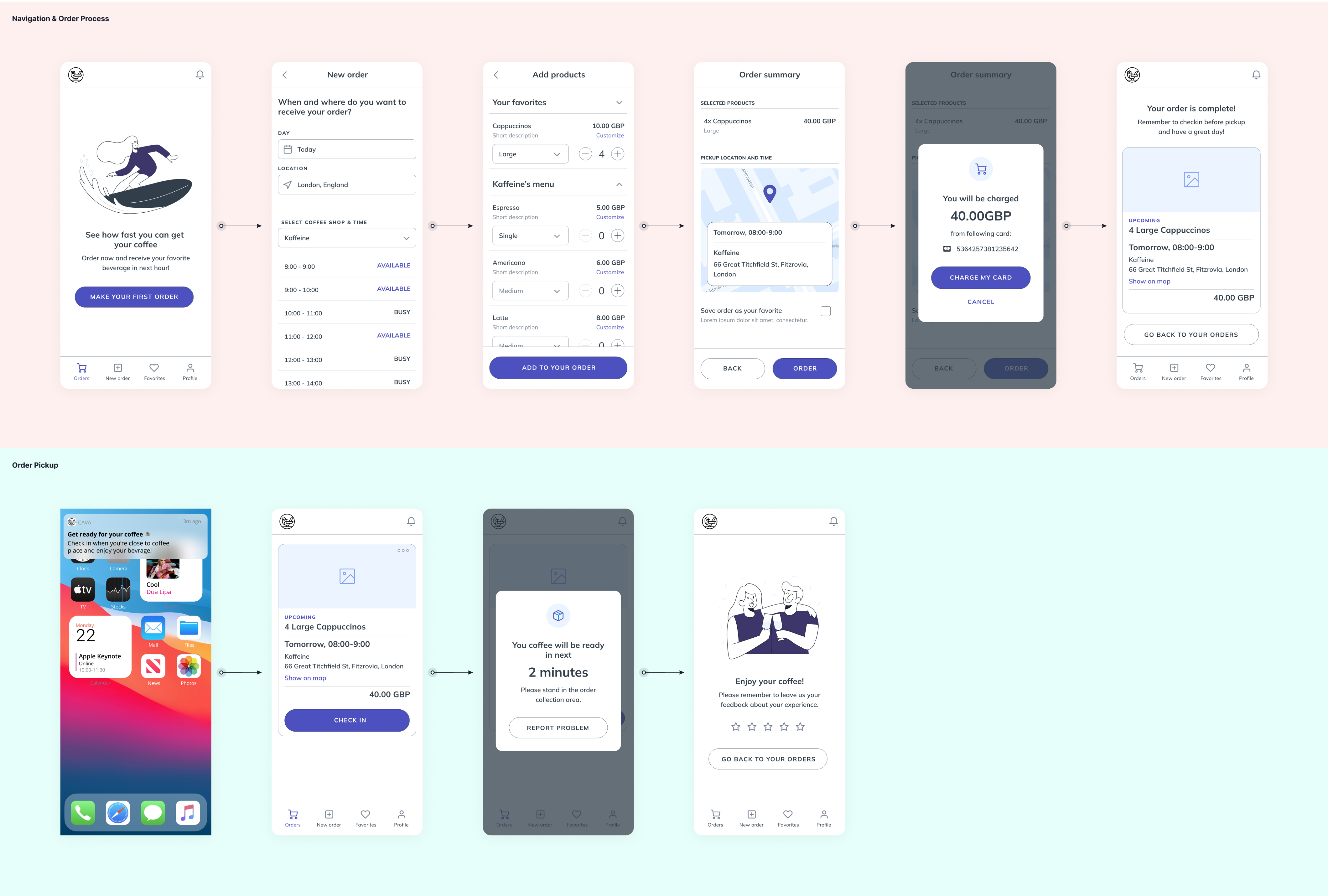
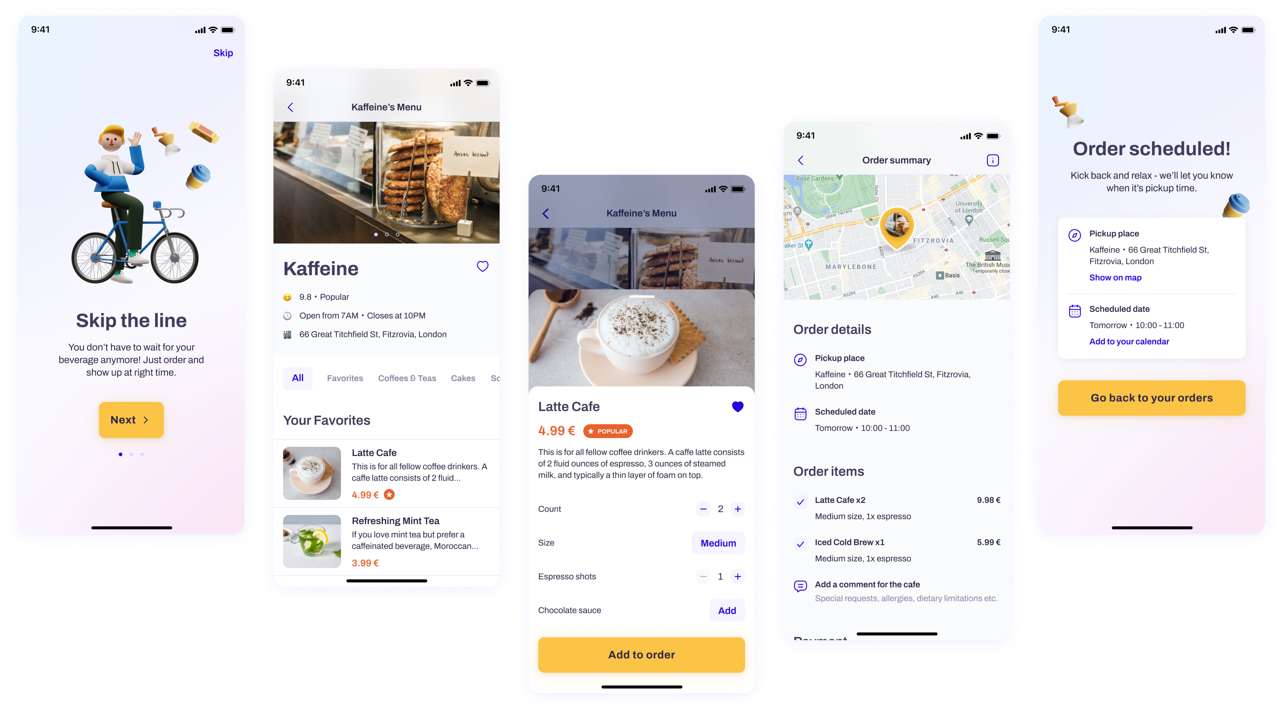
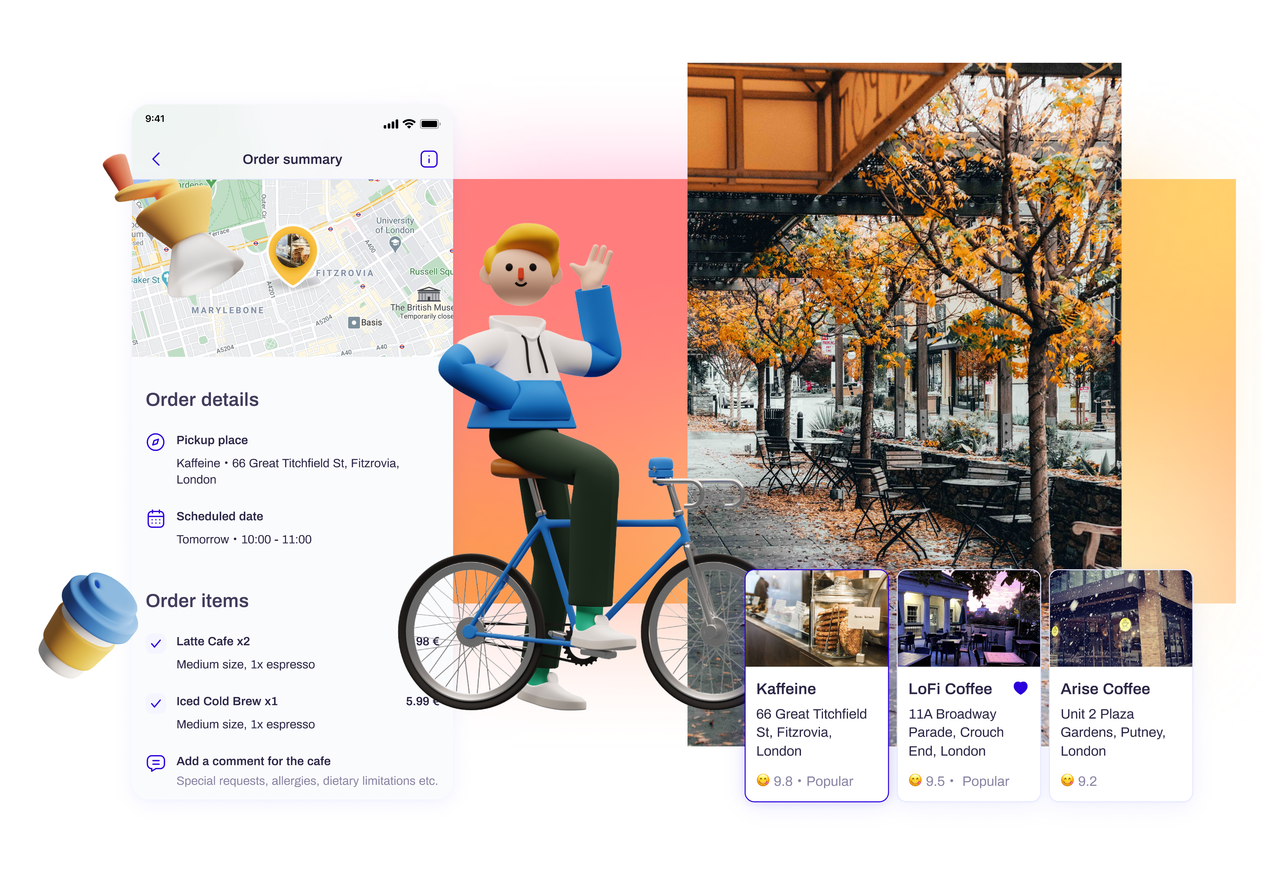
Order. Grab. Enjoy.
Given the pandemic’s limitations, we knew we had to minimize in-person interaction. So we designed the app to let users set all their preferences ahead of time.
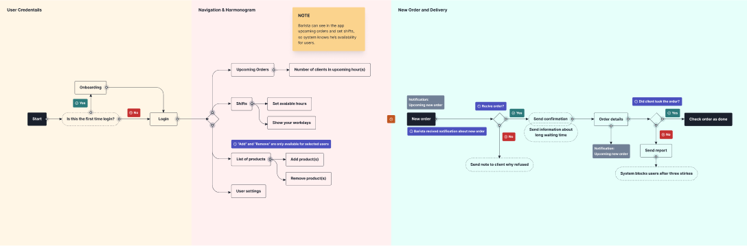
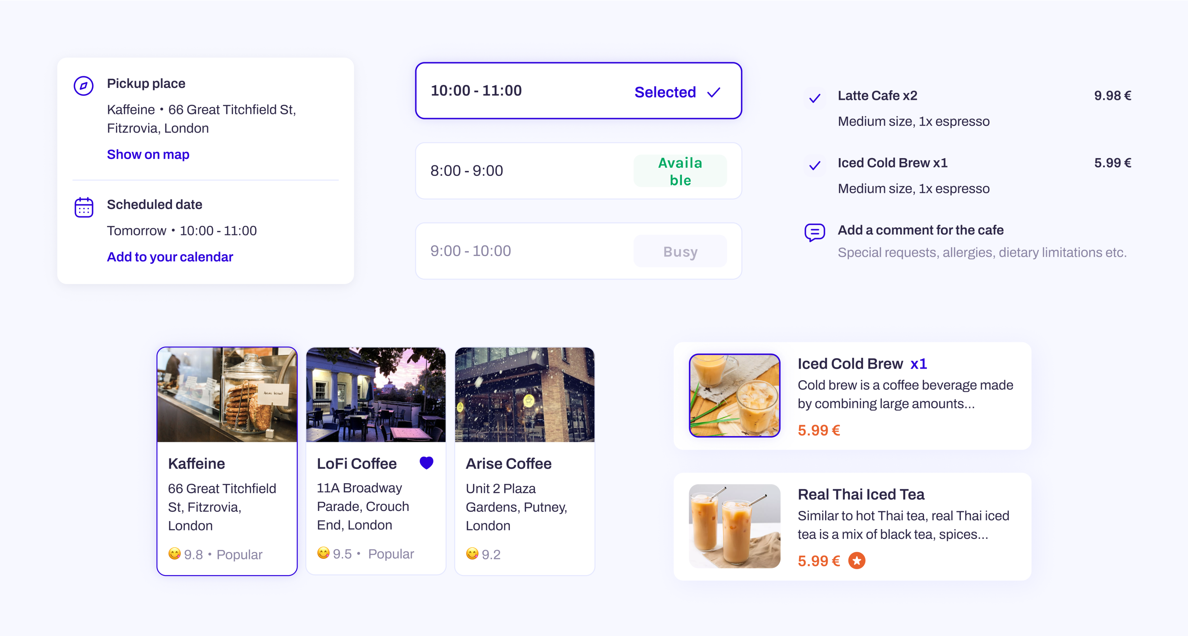
Stay in the Loop
User interactions are centered around upcoming orders. A few minutes before pickup, both customer and café staff receive instructions tailored to their needs.
Design Challenges
There are tons of food delivery apps out there, but few focus specifically on cafés or were designed with a pandemic in mind. Benchmarking was easy, but the real challenge came from navigating very specific business constraints that really pushed our creative thinking.
Understanding the Users
With just two of us on the team, we quickly built proto-personas: Customer and Barista. Our guerrilla-style research gave us surprising insights into their pains and gains, helping us focus the UX around real user goals.

The Customer
Poland, 24 y.o.
Stan is an accomplished Project Manager with experience at top tech companies like Google. He’s now exploring fresh opportunities across the UK market.

Motivation
Andrzej really misses his daily coffee ritual and worries about the future of his local café. Supporting his favorite spot while keeping up the habit has become more important to him than ever.
Goal
He wants a convenient way to enjoy his favorite hot chocolate latte from his go-to café every day without waiting in line or disrupting his remote work routine.

The Barista
Poland, 34 y.o.
Stanisław is a passionate coffee shop owner with years of hands-on experience. He began his journey as a barista and eventually opened his own café, which has become a warm, familiar space where friends and family love to gather.
Motivation
When the pandemic hit, Stanisław kept his business afloat by selling coffee directly to customers. Now, he’s focused on attracting more foot traffic and keeping his beloved shop thriving despite the challenging times.
Goal
Stanisław’s goal is to grow his customer base, boost product sales, and preserve the welcoming hub he’s built, keeping his business strong and sustainable.
Bringing It to Life
Mapping out the cognitive and visual journeys for both personas required different goals: customers want their drinks, and businesses want visibility. We brainstormed extensively, then distilled the journey into core steps - an exercise that sharpened our focus and confidence in the MVP.
From there, we leaned into visualizing the customer experience, which we found especially fun to design.
Design Philosophy:Accessible at Every Step 💡
From the start, I had a clear vision and the freedom to explore it. Our user base was large, professional, and diverse, so I built the experience around three guiding principles:
Smooth Ordering
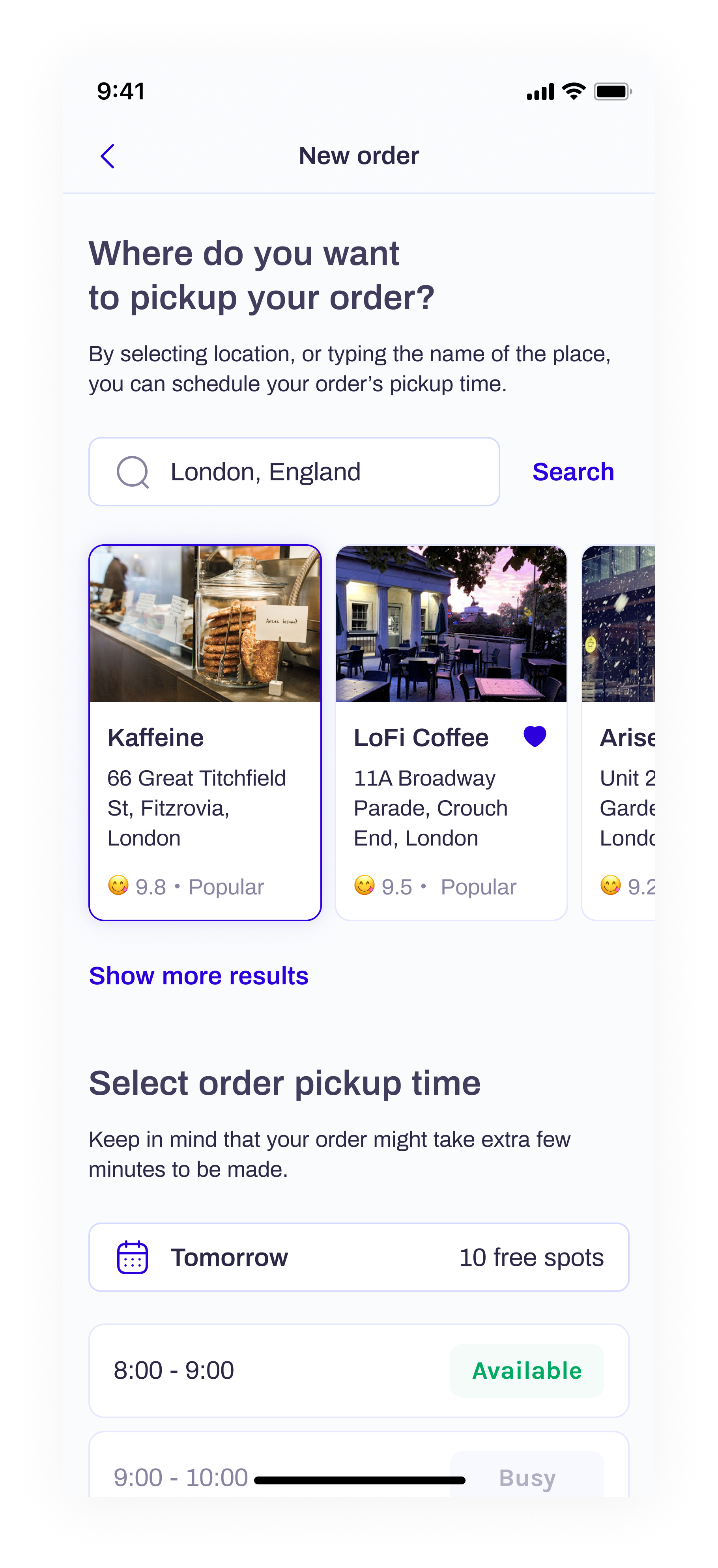
The order process is built for returning customers who already know what they want and when. It worked great in our tests, especially with items that need to be hot and fresh.
Most people know the cafés they order from, so we kept descriptions minimal. One big perk: highly customizable drinks that you can save for next time.
Subscription plans would offer discounts, larger orders, and scheduled pickups - something we plan to expand post-MVP.
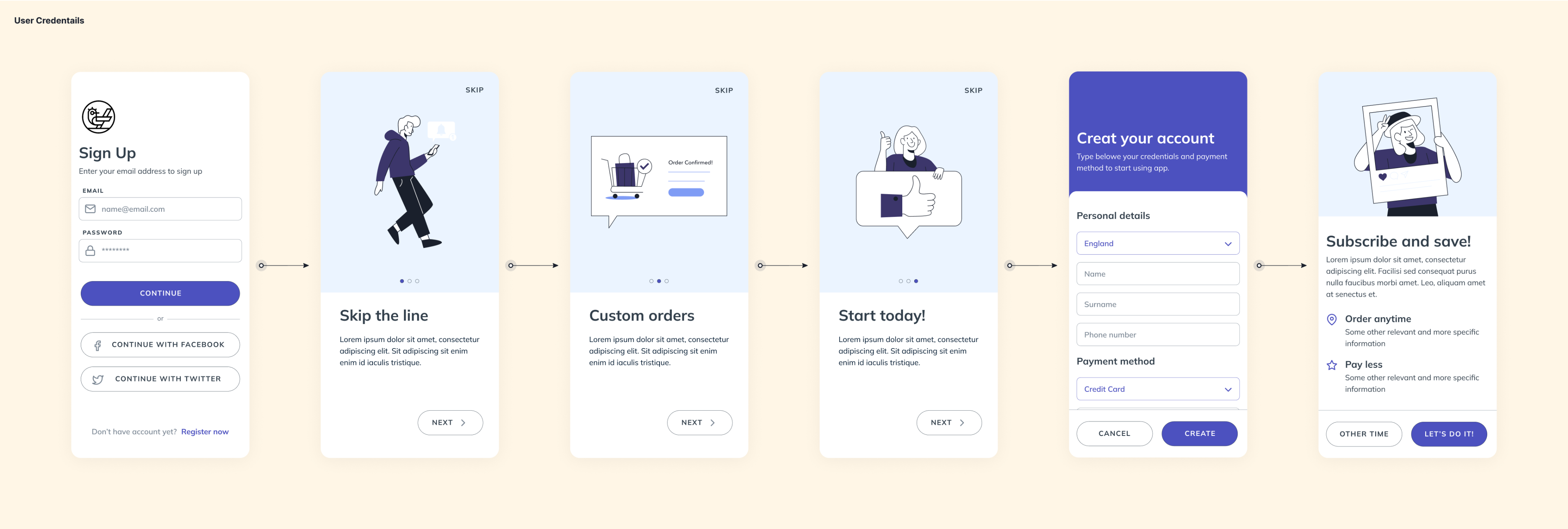
No More Waiting
Pickup time is everything. Users choose a pickup window, check in as they arrive, and receive their orders within minutes, payment happens entirely in-app.
If a customer no-shows without canceling, they get one of three strikes. Our research highlighted that business owners need powerful management tools, which are a key focus for future development.
Designed from the Ground Up 👨🏼💻
We started with familiar UX patterns from Wolt and Just Eat, but they didn’t fit our unique requirements. Our UI blends clean shapes with a user-centric design - modern, intuitive, and built for fast, flexible ordering.
Warm Meets Cool
We chose a contrasting palette. Orange and blue, inspired by autumn warmth. This pairing gives CafeCo a distinct visual personality.

Minimalism with a Spark
We kept things sleek and essential. Some elements use color to show their state, while others rely on bold typography. The base palette is white and gray, letting product photos shine. Shadows and blur effects elevate the overall look
The Outcome 🤔
CafeCo came to life in just a few days. We’re proud of what we accomplished as a two-person team, even if the UI took a little longer than planned.
Our biggest takeaway? Trust your instincts, test fast, and don’t overthink the process. It worked and it was a...
Success!
Building an app from idea to prototype in just three days is no small feat. Sure, the visuals took extra time, but the core concept was solid by the end of the weekend.
What’s Next?
Now that the pandemic’s over, the idea isn’t quite as groundbreaking. Still, there's potential to evolve it into a platform for users who want personalized orders. Though it’d take serious effort.
Maybe we’ll revisit it someday - or maybe it’ll remain a great lesson in creativity, agility, and teamwork.

CafeCo
Get your joe ahead of schedule

/
Behance
/
Dribbble
Mateusz Staniszewski © 2025
Designed With Time & Love by Me ⭐

2020 hit everyone hard, and adjusting to the new "normal" took a while.
One of the things my friends and I missed most was going to our favorite coffee shops and restaurants to enjoy a quality drink, especially coffee. Since ordering hot drinks online wasn't really an option, we started thinking about how we could make it work during the pandemic.
Even as life gradually returns to normal, we believe the concept behind this case study remains relevant. For people with busy schedules, the ability to skip the line using our app is still a big win.
My Role
As a Product Designer and co-creator of the app, I helped shape the overall concept, define the product journey, and design the prototype and visual identity.
I worked closely with my teammate to brainstorm and refine ideas based on solid UX and startup principles, like understanding future users, identifying client needs, and building with purpose.
Over the span of three months, we dedicated 2–3 hours each week to the lo-fi prototype and visual design. Since it was a two-person effort with a hackathon-style approach, the documentation is minimal for now, just the essentials.
RESPONSIBILITIES 🧔🏽
Product concept & journey, ideation, end-to-end prototype, visual concept
TIMELINE & OUTPUT ⏱
3 months of work on product
TEAM 💃🏼🕺🏻
Product Designers (2)
The Context ☕️
You know those late-night conversations about gadgets that could make everyday life easier? This idea came out of one of those moments. Naturally, during the pandemic, most ideas circled around “I want fewer people around me” or “I miss my favorite spots!”
Supporting Local Businesses
We also saw a chance to help struggling local cafés by giving them better tools to manage customer orders and workflow efficiently.
Order. Grab. Enjoy.
Given the pandemic’s limitations, we knew we had to minimize in-person interaction. So we designed the app to let users set all their preferences ahead of time.
Stay in the Loop
User interactions are centered around upcoming orders. A few minutes before pickup, both customer and café staff receive instructions tailored to their needs.
Design Challenges
There are tons of food delivery apps out there, but few focus specifically on cafés or were designed with a pandemic in mind. Benchmarking was easy, but the real challenge came from navigating very specific business constraints that really pushed our creative thinking.
Understanding the Users
With just two of us on the team, we quickly built proto-personas: Customer and Barista. Our guerrilla-style research gave us surprising insights into their pains and gains, helping us focus the UX around real user goals.
The Customer
Poland, 24 y.o.
Andrzej works in IT and enjoys commuting to the office by bike. He’s a huge fan of hot chocolate lattes and used to start his mornings at his favorite coffee shop. Since the pandemic hit, he’s been working remotely and relying on online grocery deliveries.

Motivation
Andrzej really misses his daily coffee ritual and worries about the future of his local café. Supporting his favorite spot while keeping up the habit has become more important to him than ever.
Goal
He wants a convenient way to enjoy his favorite hot chocolate latte from his go-to café every day without waiting in line or disrupting his remote work routine.
The Barista
Poland, 34 y.o.
Stanisław is a passionate coffee shop owner with years of hands-on experience. He began his journey as a barista and eventually opened his own café, which has become a warm, familiar space where friends and family love to gather.
Motivation
When the pandemic hit, Stanisław kept his business afloat by selling coffee directly to customers. Now, he’s focused on attracting more foot traffic and keeping his beloved shop thriving despite the challenging times.
Goal
Stanisław’s goal is to grow his customer base, boost product sales, and preserve the welcoming hub he’s built, keeping his business strong and sustainable.
Bringing It to Life
Mapping out the cognitive and visual journeys for both personas required different goals: customers want their drinks, and businesses want visibility. We brainstormed extensively, then distilled the journey into core steps - an exercise that sharpened our focus and confidence in the MVP.
From there, we leaned into visualizing the customer experience, which we found especially fun to design.
Design Philosophy:Accessible at Every Step 💡
From the start, I had a clear vision and the freedom to explore it. Our user base was large, professional, and diverse, so I built the experience around three guiding principles:
Smooth Ordering
The order process is built for returning customers who already know what they want and when. It worked great in our tests, especially with items that need to be hot and fresh.
Most people know the cafés they order from, so we kept descriptions minimal. One big perk: highly customizable drinks that you can save for next time.
Subscription plans would offer discounts, larger orders, and scheduled pickups - something we plan to expand post-MVP.
No More Waiting
Pickup time is everything. Users choose a pickup window, check in as they arrive, and receive their orders within minutes, payment happens entirely in-app.
If a customer no-shows without canceling, they get one of three strikes. Our research highlighted that business owners need powerful management tools, which are a key focus for future development.
Designed from the Ground Up 👨🏼💻
We started with familiar UX patterns from Wolt and Just Eat, but they didn’t fit our unique requirements. Our UI blends clean shapes with a user-centric design - modern, intuitive, and built for fast, flexible ordering.
Warm Meets Cool
We chose a contrasting palette. Orange and blue, inspired by autumn warmth. This pairing gives CafeCo a distinct visual personality.
Minimalism with a Spark
We kept things sleek and essential. Some elements use color to show their state, while others rely on bold typography. The base palette is white and gray, letting product photos shine. Shadows and blur effects elevate the overall look
The Outcome 🤔
CafeCo came to life in just a few days. We’re proud of what we accomplished as a two-person team, even if the UI took a little longer than planned.
Our biggest takeaway? Trust your instincts, test fast, and don’t overthink the process. It worked and it was a...
Success!
Building an app from idea to prototype in just three days is no small feat. Sure, the visuals took extra time, but the core concept was solid by the end of the weekend.
What’s Next?
Now that the pandemic’s over, the idea isn’t quite as groundbreaking. Still, there's potential to evolve it into a platform for users who want personalized orders. Though it’d take serious effort.
Maybe we’ll revisit it someday - or maybe it’ll remain a great lesson in creativity, agility, and teamwork.

CafeCo
Get your joe ahead of schedule

/
Behance
/
Dribbble
Mateusz Staniszewski © 2025
Designed With Time & Love by Me ⭐
2020 hit everyone hard, and adjusting to the new "normal" took a while.
One of the things my friends and I missed most was going to our favorite coffee shops and restaurants to enjoy a quality drink, especially coffee. Since ordering hot drinks online wasn't really an option, we started thinking about how we could make it work during the pandemic.
Even as life gradually returns to normal, we believe the concept behind this case study remains relevant. For people with busy schedules, the ability to skip the line using our app is still a big win.
My Role
As a Product Designer and co-creator of the app, I helped shape the overall concept, define the product journey, and design the prototype and visual identity.
I worked closely with my teammate to brainstorm and refine ideas based on solid UX and startup principles, like understanding future users, identifying client needs, and building with purpose.
Over the span of three months, we dedicated 2–3 hours each week to the lo-fi prototype and visual design. Since it was a two-person effort with a hackathon-style approach, the documentation is minimal for now, just the essentials.
RESPONSIBILITIES 🧔🏽
Product concept & journey, ideation, end-to-end prototype, visual concept
TIMELINE & OUTPUT ⏱
3 months of work on product
TEAM 💃🏼🕺🏻
Product Designers (2)
The Context ☕️
You know those late-night conversations about gadgets that could make everyday life easier? This idea came out of one of those moments. Naturally, during the pandemic, most ideas circled around “I want fewer people around me” or “I miss my favorite spots!”
Supporting Local Businesses
We also saw a chance to help struggling local cafés by giving them better tools to manage customer orders and workflow efficiently.
Order. Grab. Enjoy.
Given the pandemic’s limitations, we knew we had to minimize in-person interaction. So we designed the app to let users set all their preferences ahead of time.
Stay in the Loop
User interactions are centered around upcoming orders. A few minutes before pickup, both customer and café staff receive instructions tailored to their needs.
Design Challenges
There are tons of food delivery apps out there, but few focus specifically on cafés or were designed with a pandemic in mind. Benchmarking was easy, but the real challenge came from navigating very specific business constraints that really pushed our creative thinking.
Understanding the Users
With just two of us on the team, we quickly built proto-personas: Customer and Barista. Our guerrilla-style research gave us surprising insights into their pains and gains, helping us focus the UX around real user goals.
The Customer
Poland, 24 y.o.
Andrzej works in IT and enjoys commuting to the office by bike. He’s a huge fan of hot chocolate lattes and used to start his mornings at his favorite coffee shop. Since the pandemic hit, he’s been working remotely and relying on online grocery deliveries.

Motivation
Andrzej really misses his daily coffee ritual and worries about the future of his local café. Supporting his favorite spot while keeping up the habit has become more important to him than ever.
Goal
He wants a convenient way to enjoy his favorite hot chocolate latte from his go-to café every day without waiting in line or disrupting his remote work routine.
The Barista
Poland, 34 y.o.
Stanisław is a passionate coffee shop owner with years of hands-on experience. He began his journey as a barista and eventually opened his own café, which has become a warm, familiar space where friends and family love to gather.
Motivation
When the pandemic hit, Stanisław kept his business afloat by selling coffee directly to customers. Now, he’s focused on attracting more foot traffic and keeping his beloved shop thriving despite the challenging times.
Goal
Stanisław’s goal is to grow his customer base, boost product sales, and preserve the welcoming hub he’s built, keeping his business strong and sustainable.
Bringing It to Life
Mapping out the cognitive and visual journeys for both personas required different goals: customers want their drinks, and businesses want visibility. We brainstormed extensively, then distilled the journey into core steps - an exercise that sharpened our focus and confidence in the MVP.
From there, we leaned into visualizing the customer experience, which we found especially fun to design.
Design Philosophy:Accessible at Every Step 💡
Apps like Just Eat, Wolt, and Uber Eats offer great design patterns - we’d be silly not to learn from them. CafeCo takes inspiration from those, but with our own twist: customers are more likely to pick up orders from their favorite local spots.
Plus, we’re adding unique features like subscriptions and custom orders, which aren’t common in this space.From the start, I had a clear vision and the freedom to explore it. Our user base was large, professional, and diverse, so I built the experience around three guiding principles:
Smooth Ordering
The order process is built for returning customers who already know what they want and when. It worked great in our tests, especially with items that need to be hot and fresh.
Most people know the cafés they order from, so we kept descriptions minimal. One big perk: highly customizable drinks that you can save for next time.
Subscription plans would offer discounts, larger orders, and scheduled pickups - something we plan to expand post-MVP.
No More Waiting
Pickup time is everything. Users choose a pickup window, check in as they arrive, and receive their orders within minutes, payment happens entirely in-app.
If a customer no-shows without canceling, they get one of three strikes. Our research highlighted that business owners need powerful management tools, which are a key focus for future development.
Designed from the Ground Up 👨🏼💻
We started with familiar UX patterns from Wolt and Just Eat, but they didn’t fit our unique requirements. Our UI blends clean shapes with a user-centric design - modern, intuitive, and built for fast, flexible ordering.
Warm Meets Cool
We chose a contrasting palette. Orange and blue, inspired by autumn warmth. This pairing gives CafeCo a distinct visual personality.
Minimalism with a Spark
We kept things sleek and essential. Some elements use color to show their state, while others rely on bold typography. The base palette is white and gray, letting product photos shine. Shadows and blur effects elevate the overall look
The Outcome 🤔
CafeCo came to life in just a few days. We’re proud of what we accomplished as a two-person team, even if the UI took a little longer than planned.
Our biggest takeaway? Trust your instincts, test fast, and don’t overthink the process. It worked and it was a...
Success!
Building an app from idea to prototype in just three days is no small feat. Sure, the visuals took extra time, but the core concept was solid by the end of the weekend.
What’s Next?
Now that the pandemic’s over, the idea isn’t quite as groundbreaking. Still, there's potential to evolve it into a platform for users who want personalized orders. Though it’d take serious effort.
Maybe we’ll revisit it someday - or maybe it’ll remain a great lesson in creativity, agility, and teamwork.

CafeCo
Get your joe ahead of schedule

/
Behance
/
Dribbble
Mateusz Staniszewski © 2025
Designed With Time & Love by Me ⭐