Zonal is a UK-based provider of hospitality technology, offering a comprehensive ecosystem of solutions ranging from restaurant POS terminals to inventory and warehouse management software.
As the digital landscape evolved and competition in the hospitality tech sector intensified, Zonal faced growing pressure to modernize its product experience. Many competing platforms were investing heavily in sleek, scalable design systems that delivered consistent interfaces and faster development cycles.
To stay competitive, Zonal needed a working design system - not just as a design asset, but as a strategic tool for improving efficiency, reducing fragmentation across its applications, and delivering a cohesive experience to both internal users and end customers. Building such a system became central to maintaining Zonal’s relevance in an increasingly experience-driven market.
Disclaimer: All views shared here are my own and may not reflect the official stance of the company. Some design details have been modified.
My Role
During my time there as a Senior Designer, I was responsible for leading the overhaul of Zonal's design system, an initiative aimed at streamlining UI/UX consistency across over ten internal applications used by teams and clients across the hospitality sector.
My primary challenge was maintaining and evolving the design system while navigating significant internal complexity: working with multiple design contributors and four distinct development teams, each operating with different frameworks, priorities, and release expectations.
RESPONSIBILITIES 🧔🏽
Senior Principle Designer & Design System Ownership
TIMELINE & OUTPUT ⏱
Over 2 years of continuous work on the products
TEAM 💃🏼🕺🏻
Product Designers, Front & Back-end Developers and Product Owners
Strategic Goals 🥅
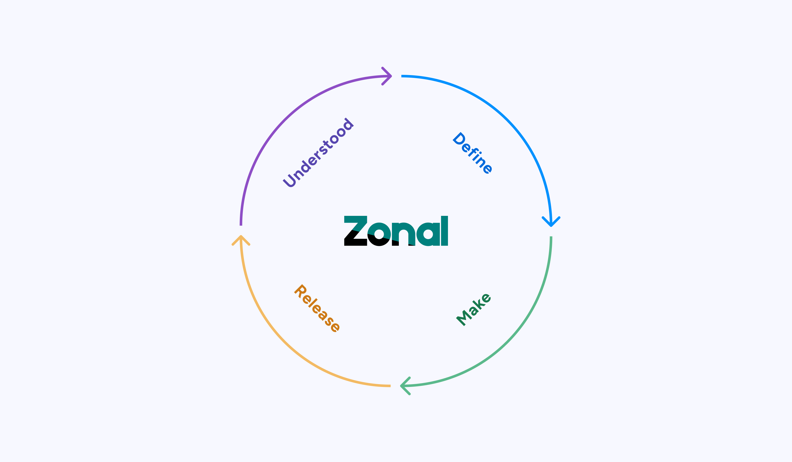
Our mission was to build a scalable design system that could unify over ten Zonal products used across hospitality environments. The team aimed to standardize components and UX patterns, test UI decisions directly on live applications, and enforce accessibility for desktop and mobile users. These goals laid the foundation for reducing redundancy, improving developer efficiency, and delivering consistent user experiences across a complex product landscape.
Scalability
Build a flexible design system that could scale across 10+ product.
Consistency & Real-World Testing
Update and standardize components and UX patterns to ensure consistency and test UI decisions against real-world flows in active Zonal applications.
Accessibility
Introduce and enforce accessibility standards for both desktop and mobile platforms This would allow Zonal to eliminate redundancy, improve developer efficiency, and elevate user experiences across its fragmented product suite.
Discovery & Foundation Setting
The initiative began with a deep dive into Zonal’s design landscape. A third-party agency had previously delivered a component library, but it lacked cohesion with the final products and failed to address critical usability challenges. To course-correct, I led a cross-functional review of Zonal’s applications, examining workflows, visual hierarchies, and broader ecosystem patterns to uncover structural gaps and design inconsistencies.
This effort involved auditing and dismantling the off-the-shelf library, mapping out UX flows across desktop and mobile, and establishing a unified foundation layer, including typography, layout, spacing, and iconography. From there, we planned phased tasks to modernize components, rewrite documentation, and begin applying new design standards throughout active products.
Understanding the Users
I also developed three internal personas to keep our goals aligned:

The Designer
Poland, 24 y.o.
Stan is an accomplished Project Manager with experience at top tech companies like Google. He’s now exploring fresh opportunities across the UK market.

Motivation
Consistency is key - and Alex wants every button, layout, and interaction to align effortlessly with the overall product vision.
Goal
Use the system to quickly design, prototype, and implement cohesive interfaces that scale easily across platforms, saving time and reinforcing brand trust.

The Developer
Poland, 34 y.o.
Jordan is a full-stack developer with a pragmatic approach to building. Jordan values tools that make component integration painless and reliable, so updates roll out smoothly and collaboration with designers stays friction-free.
Motivation
Jordan wants to reduce time spent troubleshooting UI inconsistencies and focus more on delivering features that work perfectly across environments.
Goal
Effortlessly integrate reusable design components while keeping code clean, reliable, and maintainable.

The Restaurant Operator
England, 42 y.o.
Stan is an accomplished Project Manager with experience at top tech companies like Google. He’s now exploring fresh opportunities across the UK market.
Motivation
Running a restaurant is nonstop - and Sam wants tools that feel intuitive and help minimize disruption during busy hours.
Goal
Make the most of Zonal’s system to streamline day-to-day operations, improve customer experience, and empower staff through smarter workflows.
Bringing It to Life
We quickly discovered structural and cultural obstacles that made implementation far more difficult than anticipated. The four developer teams were siloed, each using its own front-end framework and delivery process, which created immediate friction in how updates were shared and applied. At the same time, product owners often pushed for speed over quality, routinely skipping QA and releasing updates without any post-launch feedback or iteration. Design requests for proper workflows, Discovery → Design → Feedback → Development, were regularly dismissed, forcing the design team to work reactively rather than strategically.
These challenges weren’t just frustrating - they exposed deeper issues around alignment and accountability. I came to realize that even the best design system wouldn’t succeed without buy-in from every layer of the organization. So I shifted my approach: focusing on clear documentation, relationship-building across teams, and communicating the long-term value of design consistency. Technical precision was essential, but without organizational support, it couldn’t stand on its own.
Scale & Rule ⚔️
From the start, I had a clear vision and the freedom to explore it. Our user base was large, professional, and diverse, so I built the experience around three guiding principles:
To Review
Reviewing and updating spacing, colors, interactions, and accessibility tags
To Coordinate
Coordinating with fellow designers to capture and manage component variants
To make the call
Making the final call on whether a new variation was added to the library and reviewing every new design project before it entered development
From the start, I had a clear vision and the freedom to explore it. Our user base was large, professional, and diverse, so I built the experience around three guiding principles:
Design Updates
The order process is built for returning customers who already know what they want and when. It worked great in our tests, especially with items that need to be hot and fresh.
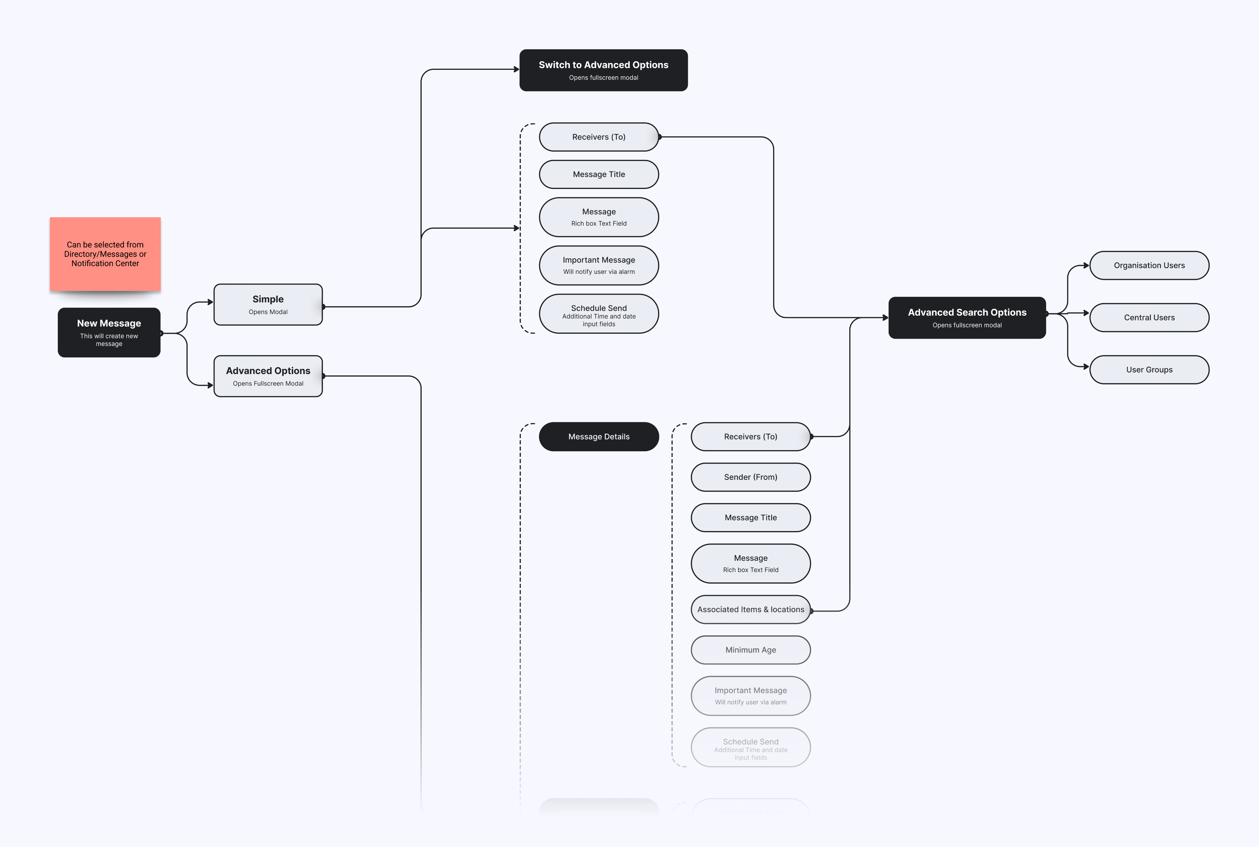
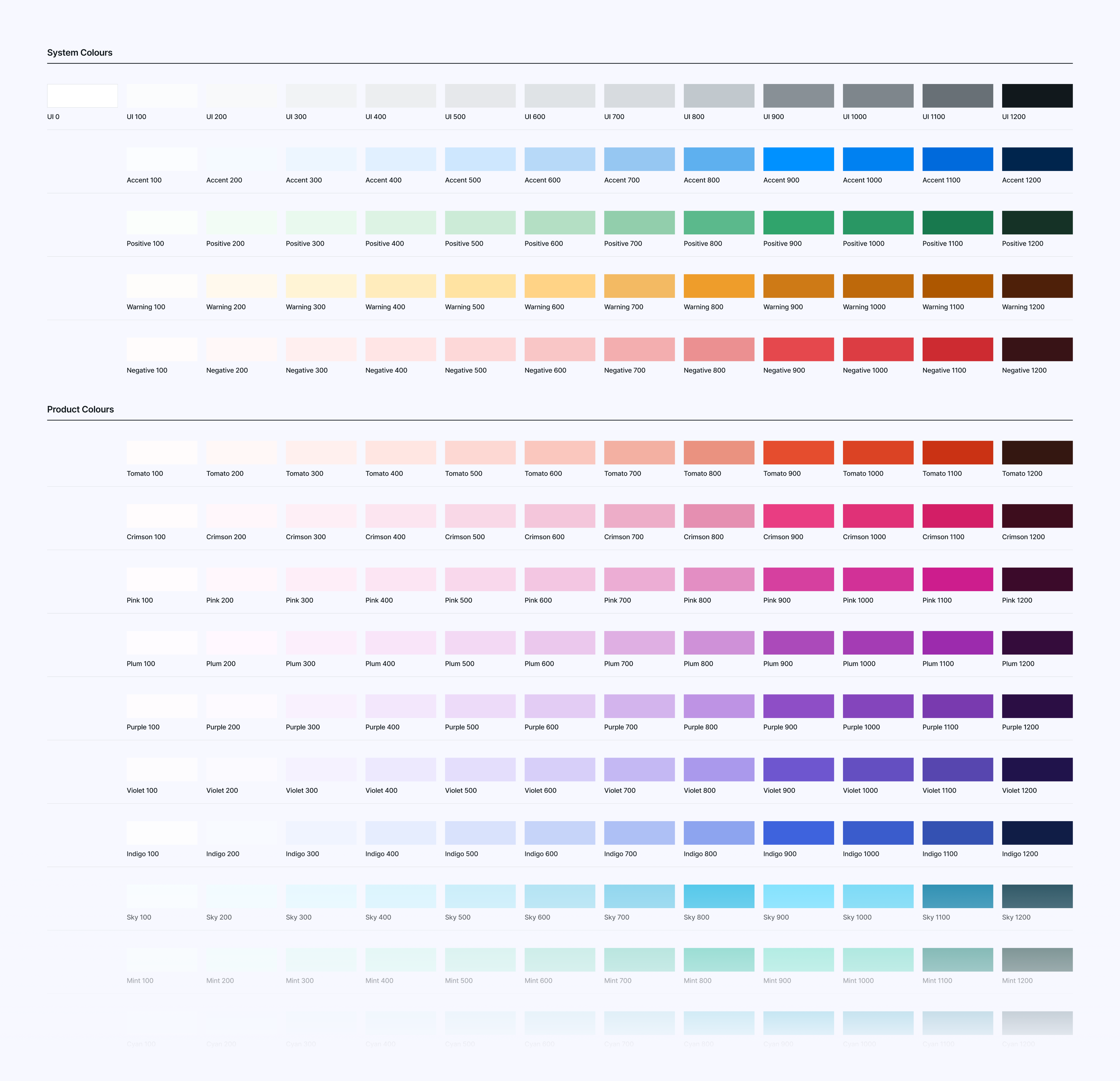
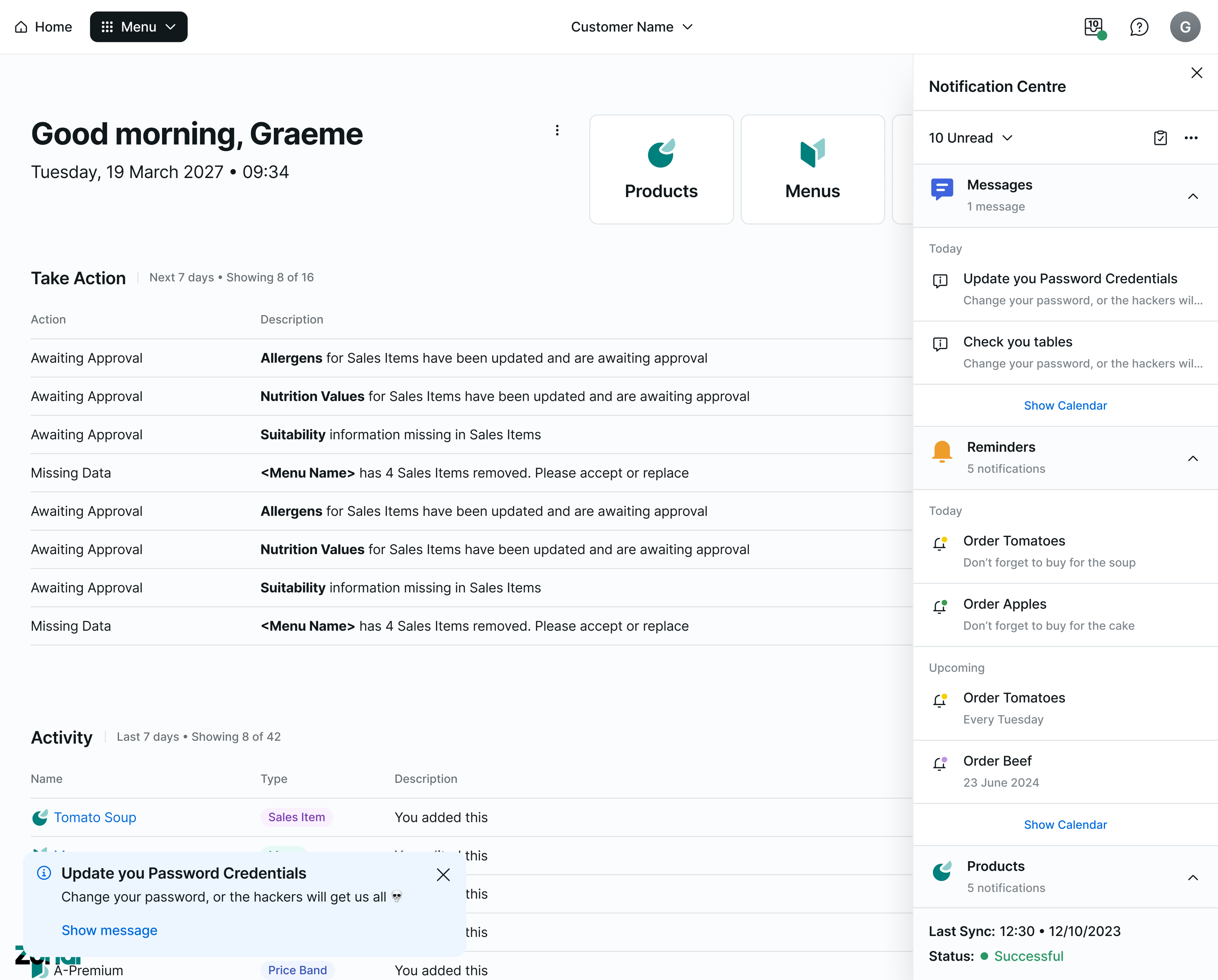
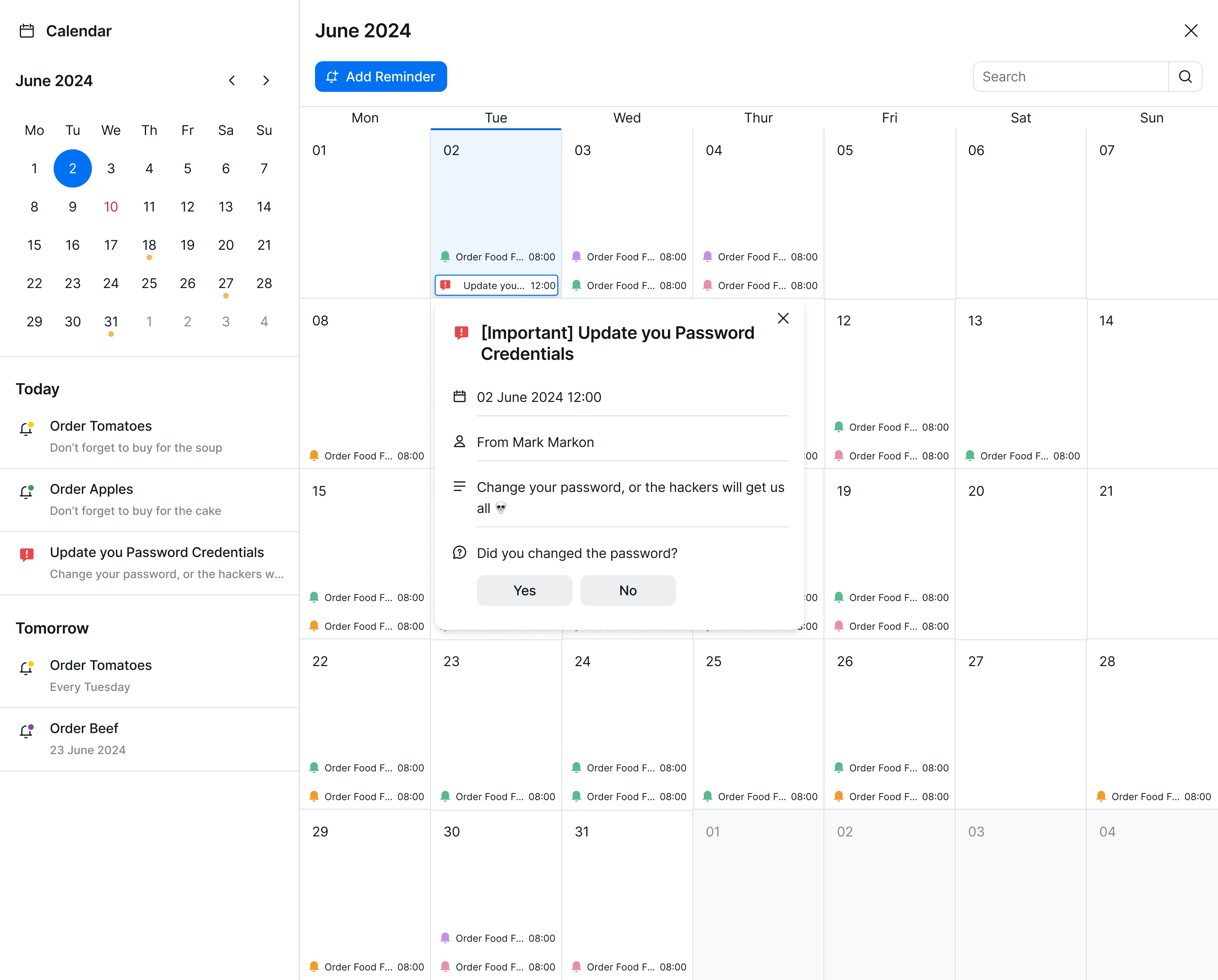
In parallel, we built more than 10 new UI patterns from scratch, including frameworks for search, filtering, data grids, and notification handling. These patterns helped standardize behaviors across products that previously relied on ad hoc, inconsistent logic. We also unified key visual elements such as layouts, typography, and color systems, ensuring that all screens met current accessibility standards while maintaining brand coherence.
Design Accents
To strengthen identity and usability, we introduced custom iconography and branding assets tailored to each Zonal product. This helped distinguish offerings while reinforcing visual hierarchy across modules. Our team also rebuilt the component documentation from the ground up, making it clearer and more actionable for both designers and developers - especially those working with highly specific use cases or nested data structures.
Organising the Components
Lastly, we created separate libraries for mobile and desktop interfaces, acknowledging the different user needs and contexts - while maintaining shared foundations like layout grids, type scales, and icon sets to keep cohesion.
While the system was designed for flexibility, scalability, and accessibility, its long-term success depended on implementation, an area that proved to be outside our design team’s control.
Release & Implementation Breakdown 🏓
Unfortunately, execution faltered despite two years of dedicated effort. Internal communication gaps and siloed processes consistently disrupted the release phase, making alignment nearly impossible. Developers failed to coordinate updates across teams, leading to mismatched component versions and rollout confusion. Even newly designed screens often ignored the updated system, reverting to outdated legacy components that undermined visual and functional consistency.
What failed?
One of the UI teams successfully developed the new design system in code, yet it was only implemented in a single Zonal product potential impact never realized. Most new projects continued using old or mismatched libraries, bypassing the design system entirely, as if it hadn’t been created. A lack of centralized quality assurance made things worse: there was no process to validate implementation, and design feedback loops simply didn’t exist. Work was deployed without evaluation, which meant errors and inconsistencies weren’t caught until much later, if at all.
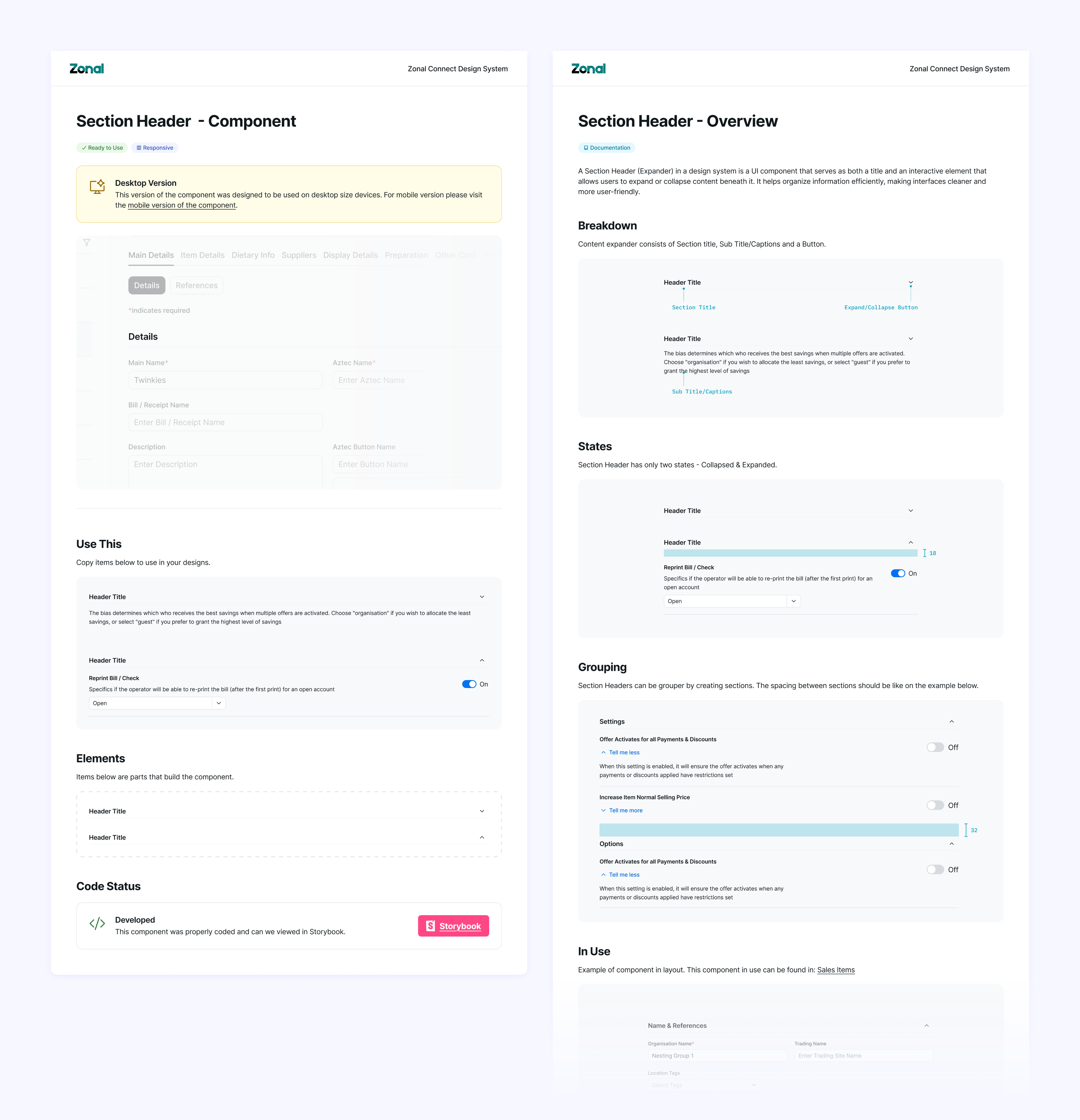
Blue represents action (a common choice in UX), but we swapped it out for yellow in primary buttons to soften the feel. Orange highlights valuable elements and draws attention to details.
Abandoned Project
Despite our steady progress and thorough documentation, the system never saw full-scale adoption. The disconnect between design intention and development execution reflected deeper organizational challenges - ones that no amount of component polish could overcome.
The Outcome 🤔
While the design system itself was never fully implemented, the experience taught me the limits of design leadership in an environment lacking operational structure.
Positive outcomes
I spent two years collaborating with talented, passionate people who cared deeply about good design. I built a system grounded in accessibility, scalability, and clarity that reflected modern UI thinking
Things just happen
The project was dissolved not because of design failure - but because of broken product and engineering workflows. Sometimes strong design isn’t enough - it must be paired with internal buy-in, technical alignment, and release discipline. At Zonal, the lesson was clear: creating quality products requires not just creativity, but organizational maturity and shared accountability.

Zonal
Technology Ecosystem for Hospitality

/
Behance
/
Dribbble
Mateusz Staniszewski © 2025
Designed With Time & Love by Me ⭐

Zonal is a UK-based provider of hospitality technology, offering a comprehensive ecosystem of solutions ranging from restaurant POS terminals to inventory and warehouse management software.
As the digital landscape evolved and competition in the hospitality tech sector intensified, Zonal faced growing pressure to modernize its product experience. Many competing platforms were investing heavily in sleek, scalable design systems that delivered consistent interfaces and faster development cycles.
To stay competitive, Zonal needed a working design system - not just as a design asset, but as a strategic tool for improving efficiency, reducing fragmentation across its applications, and delivering a cohesive experience to both internal users and end customers. Building such a system became central to maintaining Zonal’s relevance in an increasingly experience-driven market.
Disclaimer: All views shared here are my own and may not reflect the official stance of the company. Some design details have been modified.
My Role
During my time there as a Senior Designer, I was responsible for leading the overhaul of Zonal's design system, an initiative aimed at streamlining UI/UX consistency across over ten internal applications used by teams and clients across the hospitality sector.
My primary challenge was maintaining and evolving the design system while navigating significant internal complexity: working with multiple design contributors and four distinct development teams, each operating with different frameworks, priorities, and release expectations.
RESPONSIBILITIES 🧔🏽
Senior Principle Designer & Design System Ownership
TIMELINE & OUTPUT ⏱
Over 2 years of continuous work on the products
TEAM 💃🏼🕺🏻
Product Designers, Front & Back-end Developers and Product Owners
Strategic Goals 🥅
Our mission was to build a scalable design system that could unify over ten Zonal products used across hospitality environments. The team aimed to standardize components and UX patterns, test UI decisions directly on live applications, and enforce accessibility for desktop and mobile users. These goals laid the foundation for reducing redundancy, improving developer efficiency, and delivering consistent user experiences across a complex product landscape.
Scalability
Build a flexible design system that could scale across 10+ product.
Consistency & Real-World Testing
Update and standardize components and UX patterns to ensure consistency and test UI decisions against real-world flows in active Zonal applications.
Accessibility
Introduce and enforce accessibility standards for both desktop and mobile platforms This would allow Zonal to eliminate redundancy, improve developer efficiency, and elevate user experiences across its fragmented product suite.
Discovery & Foundation Setting
The initiative began with a deep dive into Zonal’s design landscape. A third-party agency had previously delivered a component library, but it lacked cohesion with the final products and failed to address critical usability challenges. To course-correct, I led a cross-functional review of Zonal’s applications, examining workflows, visual hierarchies, and broader ecosystem patterns to uncover structural gaps and design inconsistencies.
This effort involved auditing and dismantling the off-the-shelf library, mapping out UX flows across desktop and mobile, and establishing a unified foundation layer, including typography, layout, spacing, and iconography. From there, we planned phased tasks to modernize components, rewrite documentation, and begin applying new design standards throughout active products.
Understanding the Users
I also developed three internal personas to keep our goals aligned:
The Designer
Poland, 24 y.o.
Alex is a product designer focused on crafting intuitive and visually consistent user interfaces. Working across teams, Alex relies on the system to maintain design cohesion, reduce rework, and ensure every user touchpoint feels seamless and familiar.

Motivation
Consistency is key - and Alex wants every button, layout, and interaction to align effortlessly with the overall product vision.
Goal
Use the system to quickly design, prototype, and implement cohesive interfaces that scale easily across platforms, saving time and reinforcing brand trust.
The Developer
Poland, 34 y.o.
Jordan is a full-stack developer with a pragmatic approach to building. Jordan values tools that make component integration painless and reliable, so updates roll out smoothly and collaboration with designers stays friction-free.
Motivation
Jordan wants to reduce time spent troubleshooting UI inconsistencies and focus more on delivering features that work perfectly across environments.
Goal
Effortlessly integrate reusable design components while keeping code clean, reliable, and maintainable.
The Restaurant Operator
England, 42 y.o.
Sam runs a busy, customer-focused restaurant and has recently started using Zonal’s updated applications to manage orders, menus, and staff more efficiently.
Motivation
Running a restaurant is nonstop - and Sam wants tools that feel intuitive and help minimize disruption during busy hours.
Goal
Make the most of Zonal’s system to streamline day-to-day operations, improve customer experience, and empower staff through smarter workflows.
Bringing It to Life
We quickly discovered structural and cultural obstacles that made implementation far more difficult than anticipated. The four developer teams were siloed, each using its own front-end framework and delivery process, which created immediate friction in how updates were shared and applied. At the same time, product owners often pushed for speed over quality, routinely skipping QA and releasing updates without any post-launch feedback or iteration. Design requests for proper workflows, Discovery → Design → Feedback → Development, were regularly dismissed, forcing the design team to work reactively rather than strategically.
These challenges weren’t just frustrating - they exposed deeper issues around alignment and accountability. I came to realize that even the best design system wouldn’t succeed without buy-in from every layer of the organization. So I shifted my approach: focusing on clear documentation, relationship-building across teams, and communicating the long-term value of design consistency. Technical precision was essential, but without organizational support, it couldn’t stand on its own.
Scale & Rule ⚔️
From the start, I had a clear vision and the freedom to explore it. Our user base was large, professional, and diverse, so I built the experience around three guiding principles:
To Review
Reviewing and updating spacing, colors, interactions, and accessibility tags
To Coordinate
Coordinating with fellow designers to capture and manage component variants
To make the call
Making the final call on whether a new variation was added to the library and reviewing every new design project before it entered development
From the start, I had a clear vision and the freedom to explore it. Our user base was large, professional, and diverse, so I built the experience around three guiding principles:
Design Updates
The order process is built for returning customers who already know what they want and when. It worked great in our tests, especially with items that need to be hot and fresh.
In parallel, we built more than 10 new UI patterns from scratch, including frameworks for search, filtering, data grids, and notification handling. These patterns helped standardize behaviors across products that previously relied on ad hoc, inconsistent logic. We also unified key visual elements such as layouts, typography, and color systems, ensuring that all screens met current accessibility standards while maintaining brand coherence.
Design Accents
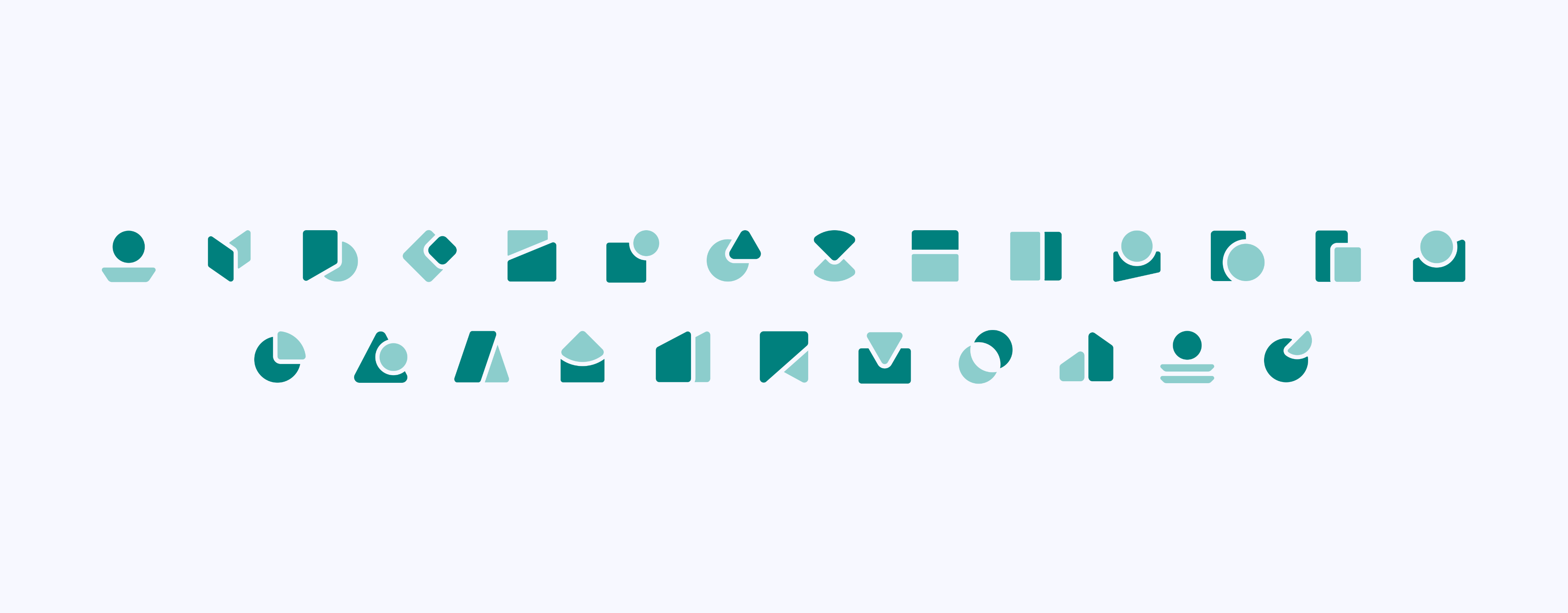
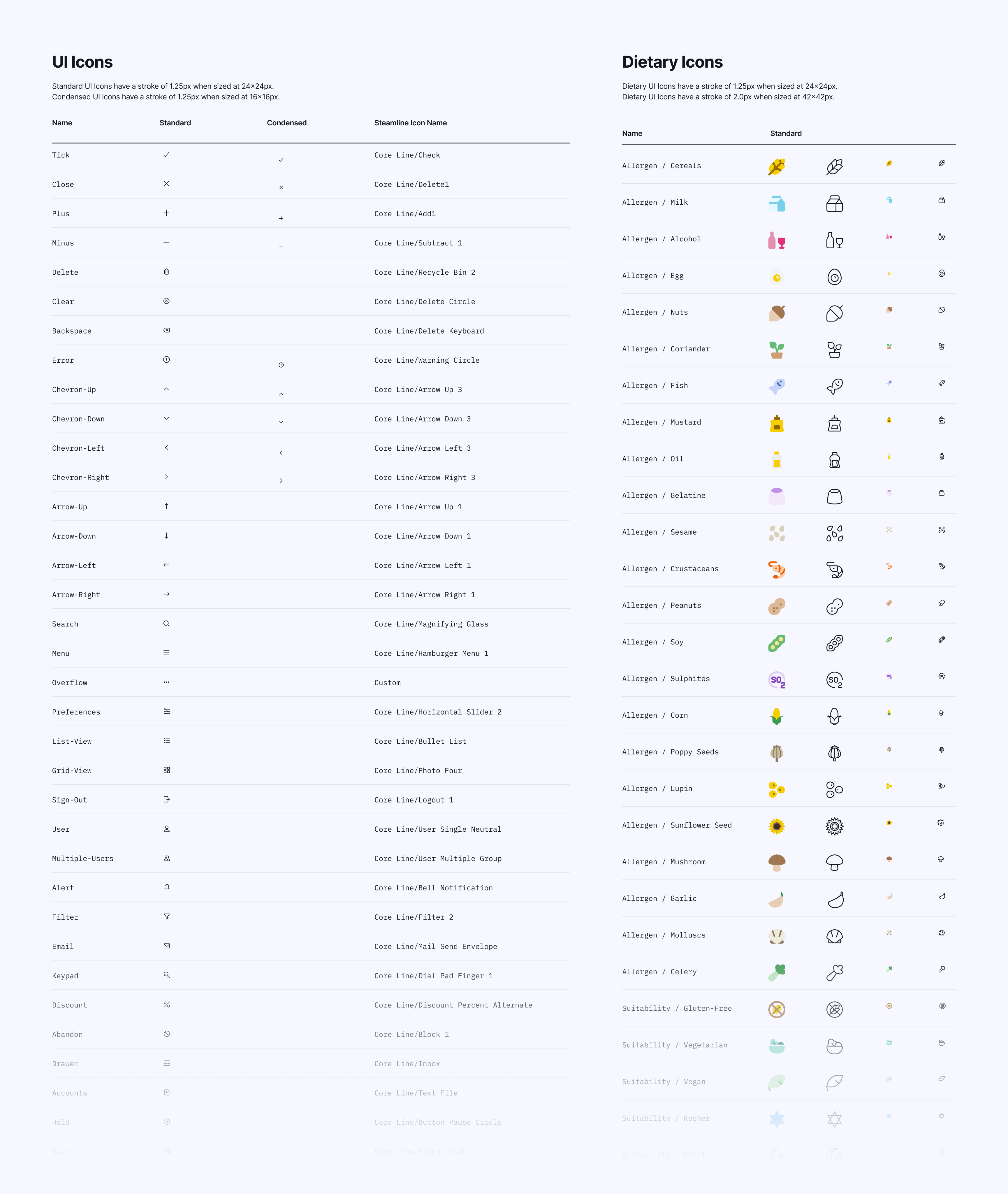
To strengthen identity and usability, we introduced custom iconography and branding assets tailored to each Zonal product. This helped distinguish offerings while reinforcing visual hierarchy across modules. Our team also rebuilt the component documentation from the ground up, making it clearer and more actionable for both designers and developers - especially those working with highly specific use cases or nested data structures.
Organising the Components
Lastly, we created separate libraries for mobile and desktop interfaces, acknowledging the different user needs and contexts - while maintaining shared foundations like layout grids, type scales, and icon sets to keep cohesion.
While the system was designed for flexibility, scalability, and accessibility, its long-term success depended on implementation, an area that proved to be outside our design team’s control.
Release & Implementation Breakdown 🏓
Unfortunately, execution faltered despite two years of dedicated effort. Internal communication gaps and siloed processes consistently disrupted the release phase, making alignment nearly impossible. Developers failed to coordinate updates across teams, leading to mismatched component versions and rollout confusion. Even newly designed screens often ignored the updated system, reverting to outdated legacy components that undermined visual and functional consistency.
What failed?
One of the UI teams successfully developed the new design system in code, yet it was only implemented in a single Zonal product potential impact never realized. Most new projects continued using old or mismatched libraries, bypassing the design system entirely, as if it hadn’t been created. A lack of centralized quality assurance made things worse: there was no process to validate implementation, and design feedback loops simply didn’t exist. Work was deployed without evaluation, which meant errors and inconsistencies weren’t caught until much later, if at all.
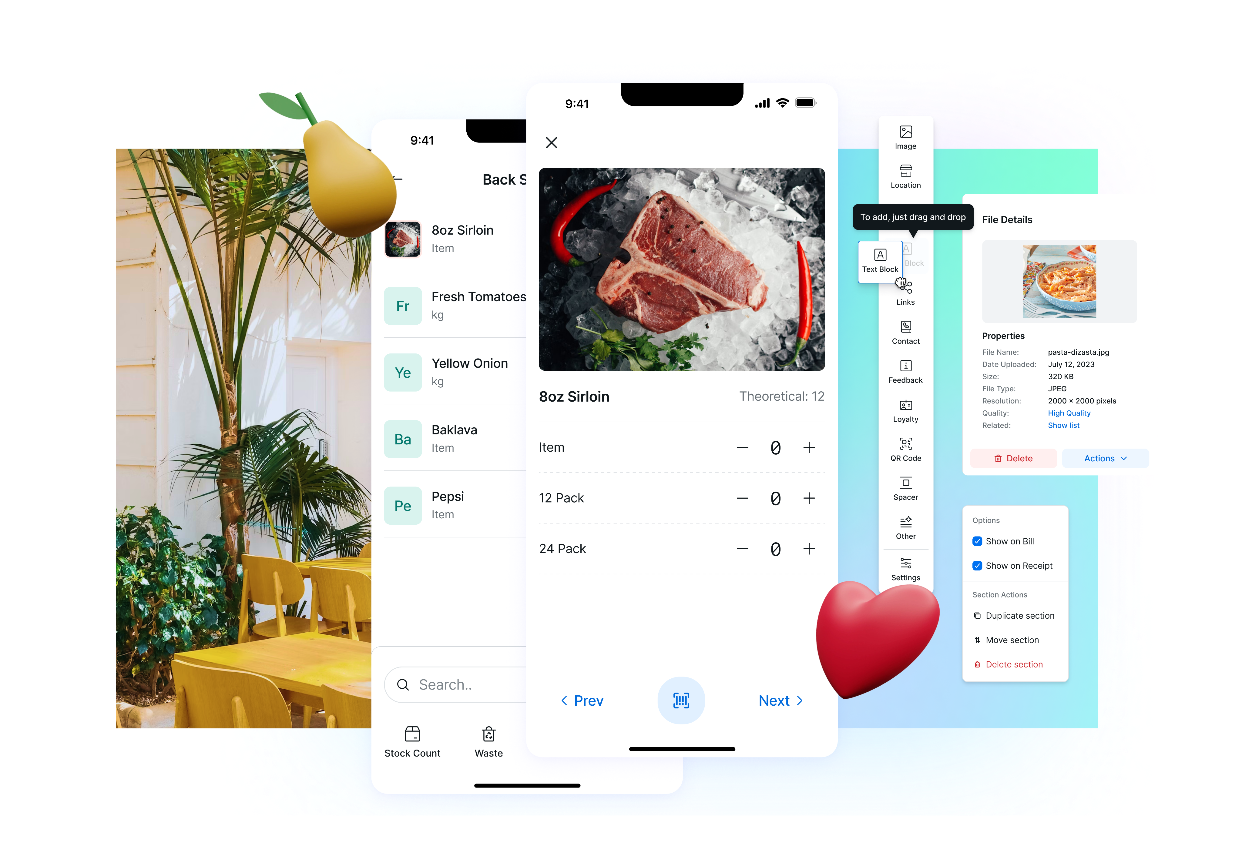
Blue represents action (a common choice in UX), but we swapped it out for yellow in primary buttons to soften the feel. Orange highlights valuable elements and draws attention to details.
Abandoned Project
Despite our steady progress and thorough documentation, the system never saw full-scale adoption. The disconnect between design intention and development execution reflected deeper organizational challenges - ones that no amount of component polish could overcome.
The Outcome 🤔
While the design system itself was never fully implemented, the experience taught me the limits of design leadership in an environment lacking operational structure.
Positive outcomes
I spent two years collaborating with talented, passionate people who cared deeply about good design. I built a system grounded in accessibility, scalability, and clarity that reflected modern UI thinking
Things just happen
The project was dissolved not because of design failure - but because of broken product and engineering workflows. Sometimes strong design isn’t enough - it must be paired with internal buy-in, technical alignment, and release discipline. At Zonal, the lesson was clear: creating quality products requires not just creativity, but organizational maturity and shared accountability.

Zonal
Technology Ecosystem for Hospitality

/
Behance
/
Dribbble
Mateusz Staniszewski © 2025
Designed With Time & Love by Me ⭐
Zonal is a UK-based provider of hospitality technology, offering a comprehensive ecosystem of solutions ranging from restaurant POS terminals to inventory and warehouse management software.
As the digital landscape evolved and competition in the hospitality tech sector intensified, Zonal faced growing pressure to modernize its product experience. Many competing platforms were investing heavily in sleek, scalable design systems that delivered consistent interfaces and faster development cycles.
To stay competitive, Zonal needed a working design system - not just as a design asset, but as a strategic tool for improving efficiency, reducing fragmentation across its applications, and delivering a cohesive experience to both internal users and end customers. Building such a system became central to maintaining Zonal’s relevance in an increasingly experience-driven market.
Disclaimer: All views shared here are my own and may not reflect the official stance of the company. Some design details have been modified.
My Role
During my time there as a Senior Designer, I was responsible for leading the overhaul of Zonal's design system, an initiative aimed at streamlining UI/UX consistency across over ten internal applications used by teams and clients across the hospitality sector.
My primary challenge was maintaining and evolving the design system while navigating significant internal complexity: working with multiple design contributors and four distinct development teams, each operating with different frameworks, priorities, and release expectations.
RESPONSIBILITIES 🧔🏽
Senior Principle Designer & Design System Ownership
TIMELINE & OUTPUT ⏱
Over 2 years of continuous work on the products
TEAM 💃🏼🕺🏻
Product Designers, Front & Back-end Developers and Product Owners
Strategic Goals 🥅
Our mission was to build a scalable design system that could unify over ten Zonal products used across hospitality environments. The team aimed to standardize components and UX patterns, test UI decisions directly on live applications, and enforce accessibility for desktop and mobile users. These goals laid the foundation for reducing redundancy, improving developer efficiency, and delivering consistent user experiences across a complex product landscape.
Scalability
Build a flexible design system that could scale across 10+ product.
Consistency & Real-World Testing
Update and standardize components and UX patterns to ensure consistency and test UI decisions against real-world flows in active Zonal applications.
Accessibility
Introduce and enforce accessibility standards for both desktop and mobile platforms This would allow Zonal to eliminate redundancy, improve developer efficiency, and elevate user experiences across its fragmented product suite.
Discovery & Foundation Setting
The initiative began with a deep dive into Zonal’s design landscape. A third-party agency had previously delivered a component library, but it lacked cohesion with the final products and failed to address critical usability challenges. To course-correct, I led a cross-functional review of Zonal’s applications, examining workflows, visual hierarchies, and broader ecosystem patterns to uncover structural gaps and design inconsistencies.
This effort involved auditing and dismantling the off-the-shelf library, mapping out UX flows across desktop and mobile, and establishing a unified foundation layer, including typography, layout, spacing, and iconography. From there, we planned phased tasks to modernize components, rewrite documentation, and begin applying new design standards throughout active products.
Understanding the Users
I also developed three internal personas to keep our goals aligned:
The Designer
Poland, 24 y.o.
Alex is a product designer focused on crafting intuitive and visually consistent user interfaces. Working across teams, Alex relies on the system to maintain design cohesion, reduce rework, and ensure every user touchpoint feels seamless and familiar.

Motivation
Consistency is key - and Alex wants every button, layout, and interaction to align effortlessly with the overall product vision.
Goal
Use the system to quickly design, prototype, and implement cohesive interfaces that scale easily across platforms, saving time and reinforcing brand trust.
The Developer
Poland, 34 y.o.
Jordan is a full-stack developer with a pragmatic approach to building. Jordan values tools that make component integration painless and reliable, so updates roll out smoothly and collaboration with designers stays friction-free.
Motivation
Jordan wants to reduce time spent troubleshooting UI inconsistencies and focus more on delivering features that work perfectly across environments.
Goal
Effortlessly integrate reusable design components while keeping code clean, reliable, and maintainable.
The Restaurant Operator
England, 42 y.o.
Sam runs a busy, customer-focused restaurant and has recently started using Zonal’s updated applications to manage orders, menus, and staff more efficiently.
Motivation
Running a restaurant is nonstop - and Sam wants tools that feel intuitive and help minimize disruption during busy hours.
Goal
Make the most of Zonal’s system to streamline day-to-day operations, improve customer experience, and empower staff through smarter workflows.
Discovery Takeaways
We quickly discovered structural and cultural obstacles that made implementation far more difficult than anticipated. The four developer teams were siloed, each using its own front-end framework and delivery process, which created immediate friction in how updates were shared and applied. At the same time, product owners often pushed for speed over quality, routinely skipping QA and releasing updates without any post-launch feedback or iteration. Design requests for proper workflows, Discovery → Design → Feedback → Development, were regularly dismissed, forcing the design team to work reactively rather than strategically.
These challenges weren’t just frustrating - they exposed deeper issues around alignment and accountability. I came to realize that even the best design system wouldn’t succeed without buy-in from every layer of the organization. So I shifted my approach: focusing on clear documentation, relationship-building across teams, and communicating the long-term value of design consistency. Technical precision was essential, but without organizational support, it couldn’t stand on its own.
Scale & Rule ⚔️
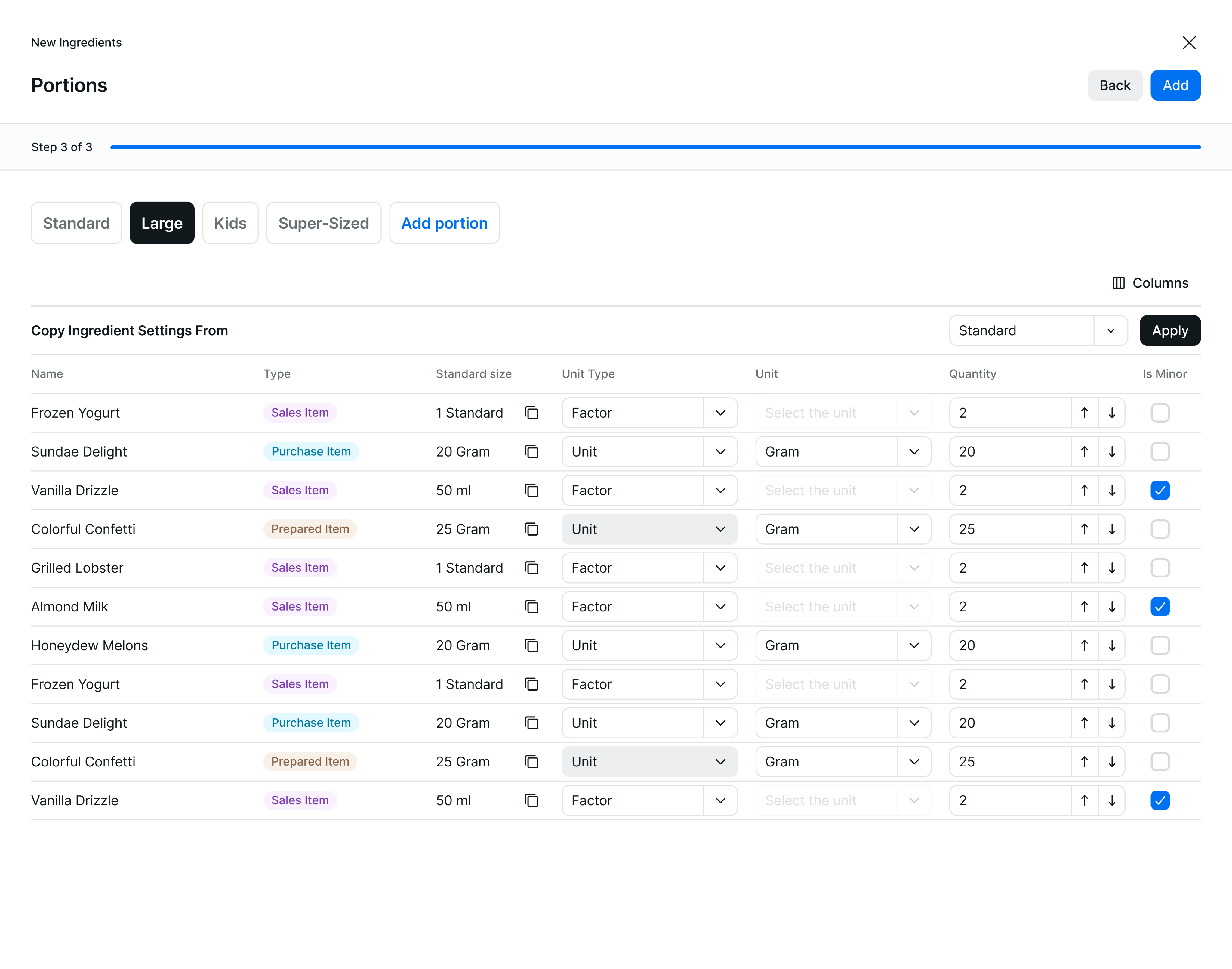
Component consistency was at the heart of the project. Every visual element, from buttons to data tables needed to be reviewed for function, appearance, and interaction feedback across more than 50 active products.
My role included:
To Review
Reviewing and updating spacing, colors, interactions, and accessibility tags
To Coordinate
Coordinating with fellow designers to capture and manage component variants
To make the call
Making the final call on whether a new variation was added to the library and reviewing every new design project before it entered development
This kept visual consistency intact, even as product teams operated with varying levels of oversight.
Design Updates
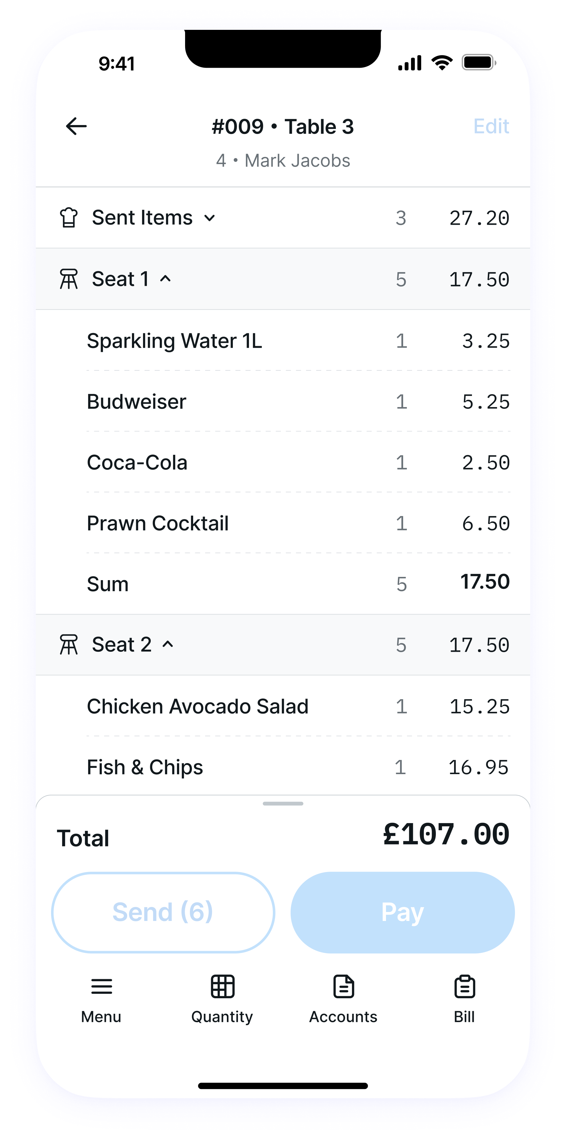
Our progress resulted in meaningful changes that modernized Zonal’s design landscape and laid the foundation for more consistent and user-focused product experiences. Over 30 core components were thoroughly reviewed and updated to handle Zonal’s most demanding use case: presenting dense, structured data in highly interactive tables. These changes weren’t superficial, they focused on spacing, data clarity, interaction feedback, and accessibility compliance.
In parallel, we built more than 10 new UI patterns from scratch, including frameworks for search, filtering, data grids, and notification handling. These patterns helped standardize behaviors across products that previously relied on ad hoc, inconsistent logic. We also unified key visual elements such as layouts, typography, and color systems, ensuring that all screens met current accessibility standards while maintaining brand coherence.
Design Accents
To strengthen identity and usability, we introduced custom iconography and branding assets tailored to each Zonal product. This helped distinguish offerings while reinforcing visual hierarchy across modules. Our team also rebuilt the component documentation from the ground up, making it clearer and more actionable for both designers and developers - especially those working with highly specific use cases or nested data structures.
Organising the Components
Lastly, we created separate libraries for mobile and desktop interfaces, acknowledging the different user needs and contexts - while maintaining shared foundations like layout grids, type scales, and icon sets to keep cohesion.
While the system was designed for flexibility, scalability, and accessibility, its long-term success depended on implementation, an area that proved to be outside our design team’s control.
Release & Implementation Breakdown 🏓
Unfortunately, execution faltered despite two years of dedicated effort. Internal communication gaps and siloed processes consistently disrupted the release phase, making alignment nearly impossible. Developers failed to coordinate updates across teams, leading to mismatched component versions and rollout confusion. Even newly designed screens often ignored the updated system, reverting to outdated legacy components that undermined visual and functional consistency.
What failed?
One of the UI teams successfully developed the new design system in code, yet it was only implemented in a single Zonal product potential impact never realized. Most new projects continued using old or mismatched libraries, bypassing the design system entirely, as if it hadn’t been created. A lack of centralized quality assurance made things worse: there was no process to validate implementation, and design feedback loops simply didn’t exist. Work was deployed without evaluation, which meant errors and inconsistencies weren’t caught until much later, if at all.
Blue represents action (a common choice in UX), but we swapped it out for yellow in primary buttons to soften the feel. Orange highlights valuable elements and draws attention to details.
Abandoned Project
Despite our steady progress and thorough documentation, the system never saw full-scale adoption. The disconnect between design intention and development execution reflected deeper organizational challenges - ones that no amount of component polish could overcome.
The Outcome 🤔
While the design system itself was never fully implemented, the experience taught me the limits of design leadership in an environment lacking operational structure.
Positive outcomes
I spent two years collaborating with talented, passionate people who cared deeply about good design. I built a system grounded in accessibility, scalability, and clarity that reflected modern UI thinking
Things just happen
The project was dissolved not because of design failure - but because of broken product and engineering workflows. Sometimes strong design isn’t enough - it must be paired with internal buy-in, technical alignment, and release discipline. At Zonal, the lesson was clear: creating quality products requires not just creativity, but organizational maturity and shared accountability.

Zonal
Technology Ecosystem for Hospitality

/
Behance
/
Dribbble
Mateusz Staniszewski © 2025
Designed With Time & Love by Me ⭐