
7N was experiencing increased corporate growth and they needed a tailored IT platform to support it.
As 7N experienced rapid growth, the company needed a custom-built IT platform to manage internal processes and support recruitment more efficiently. Leadership decided to build this system from the ground up, assembling a team of talented designers and developers. I took on the role of UI Designer and UX Consultant, helping shape an entirely new product experience to support our expanding organization.
Disclaimer: All views expressed are my own and do not necessarily reflect those of the company. Certain design elements have been modified from the original.
My Role
I was responsible for defining UI guidelines, creating high-fidelity prototypes, and building smooth interactions. I also supported user flow development whenever needed.
The product went through two major iterations over three years. This allowed ample time for research, testing, and crafting pixel-perfect solutions. Our team - three designers (one UX, two UX/UI) and a strong lineup of software engineers - served the needs of four different Product Owners.
Originally scoped as a management tool MVP, the platform eventually evolved into a multifunctional hub for managing current and future consultants across 7N. It's worth noting that early on, the project lacked a designated leader or IT manager. Those roles emerged organically as the platform matured.
RESPONSIBILITIES 🧔🏽
Visual Guidelines, interactions & hi-fi prototyping
TIMELINE & OUTPUT ⏱
3 years to design a web based platform for over 1000 active users
TEAM 💃🏼🕺🏻
UX & UI Designers, Front & Back-end Developers and Product Owners
High-Level Goals 🥅
01 / Make It Accessible
Large platforms can be overwhelming. Our tool needed to support managers and employees through onboarding, performance reviews, and career growth without confusion.
02 / Unite Everything in One Tool
Managing user data can be frustrating, especially if both ends of the experience (employee and management) aren’t considered equally. We aimed to create a calm, intuitive experience.
04 / Reflect the 7N Culture
We wanted to translate 7N’s open-minded, feedback-driven culture into features like chat and simple communication tools.
03 / Make Users Feel Valued
How could we show users their expertise matters? We explored ways to reinforce that they’re progressing and excelling in their specialties.
Context & Discovery
It was vital to understand the organizational environment and the different perspectives feeding into the platform. With multiple product owners each bringing their own priorities, we conducted internal and external interviews to capture the needs of real users.
Who Are the Users?
Using the consultant database, we identified and interviewed users from within and beyond 7N. With input from over 30 co-workers, we built proto-personas to empathize with typical user needs and frustrations. Most of the data contributors were internal employees, whose feedback remained at the core of our decision-making.
The Rock Star Developer
Denmark, 42 y.o.
Henrik is a seasoned Senior Software Engineering Consultant with 7N, currently assigned to one of Scandinavia’s largest banks. He was specially flown in to showcase his expertise as a standout “Rock Star” developer.

Motivation
Henrik aims to update his profile with input from Agents and Managers to increase his visibility and improve his chances of landing high-profile contracts on major projects in the near future.
Goal
To truly feel valued in his role, Henrik wants his consultant profile to stand out - uniquely crafted and prominently featured on the platform.
The Recruiter
Sweden, 38 y.o.
Markus is a seasoned Senior Recruiter at 7N with years of experience, constantly scanning the European market to identify the top 3% of IT talent.
Motivation
The Scandinavian IT job market presents unique challenges in sourcing skilled specialists. Markus wants to shift focus from endless browsing to meaningful conversations and real engagement with candidates.
Goal
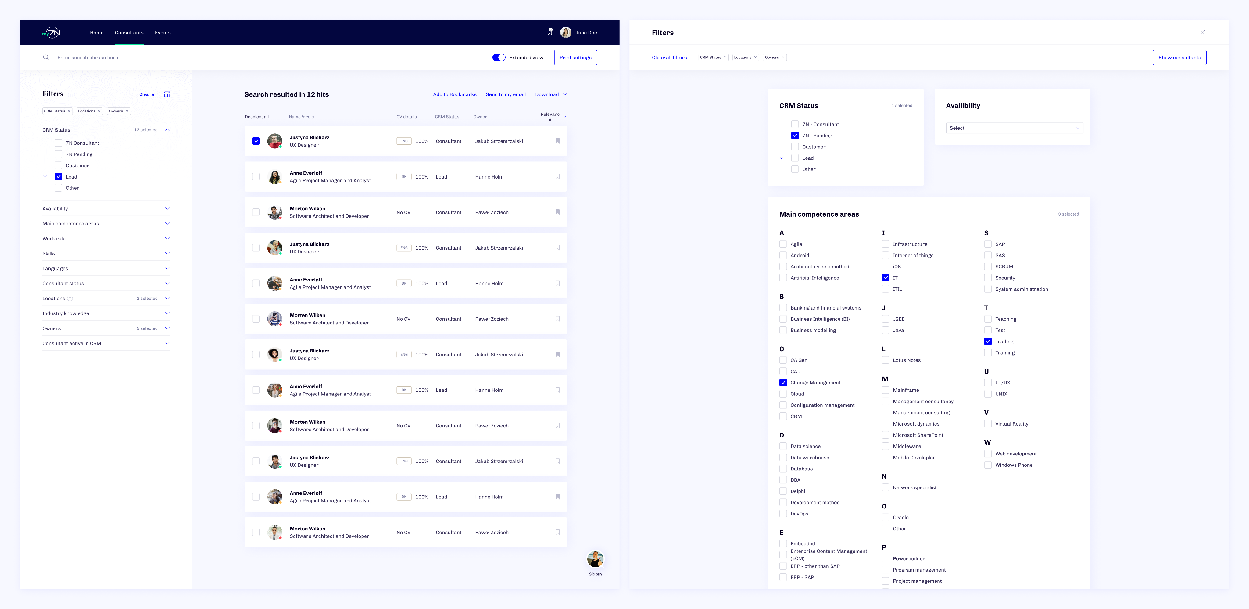
Markus is looking for powerful search and comparison tools to dramatically speed up his research, ideally cutting the time spent by half.

The Newcomer
Poland, 28 y.o.
Lukas is a talented Senior Backend Developer currently being recruited by 7N to join an upcoming long-term client project as a consultant.
Motivation
By sharing his professional details with an Agent, Lukas makes it easier for 7N to present him to clients and open doors to future contract opportunities.
Goal
Lukas is looking for a smooth and straightforward onboarding experience so he can officially join 7N as a consultant and receive a job offer as soon as possible.

The Agent
Poland, 24 y.o.
Anna plays a key role in supporting team growth and cohesion within the company. She’s also responsible for onboarding new 7N consultants, ensuring a seamless start to their journey.
Motivation
Understanding each team member's individual needs and responding to their requests takes time and effort. Anna wants a better-organized management process so she can devote more energy to supporting her teammates.
Goal
She’s looking for a robust tool to streamline assessments, monitor team dynamics, and simplify onboarding, making management more efficient and people-focused.
We built the platform with scalability in mind, ensuring it could adapt even after the original features shipped.
Linking the connections
As the visual design lead, I played a hybrid role - observing, asking, tweaking, and supporting the team’s choices when needed. You could say I stood between Design Thinking and Engineering.
Thankfully, we had strong architectural oversight from the development team, which drastically reduced unnecessary back-and-forth and helped us stay lean and focused.
The design team built smart flows, detailed prototypes, and effective cognitive maps. Our first iteration lacked key stakeholder insights, so the second go-round was more informed and better prepared.
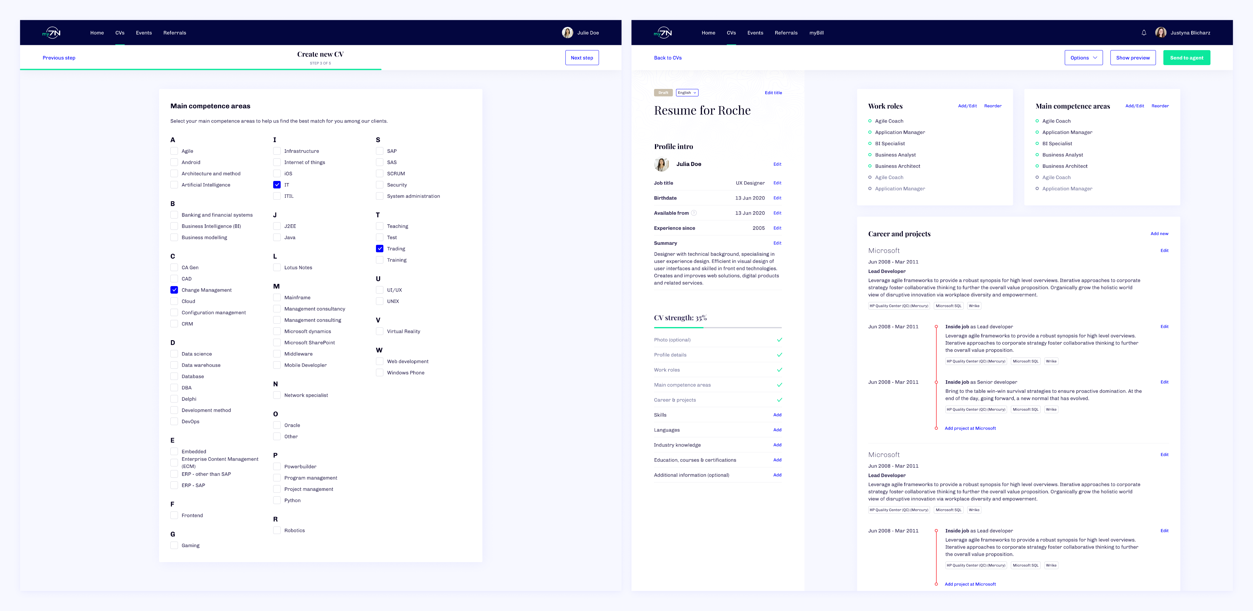
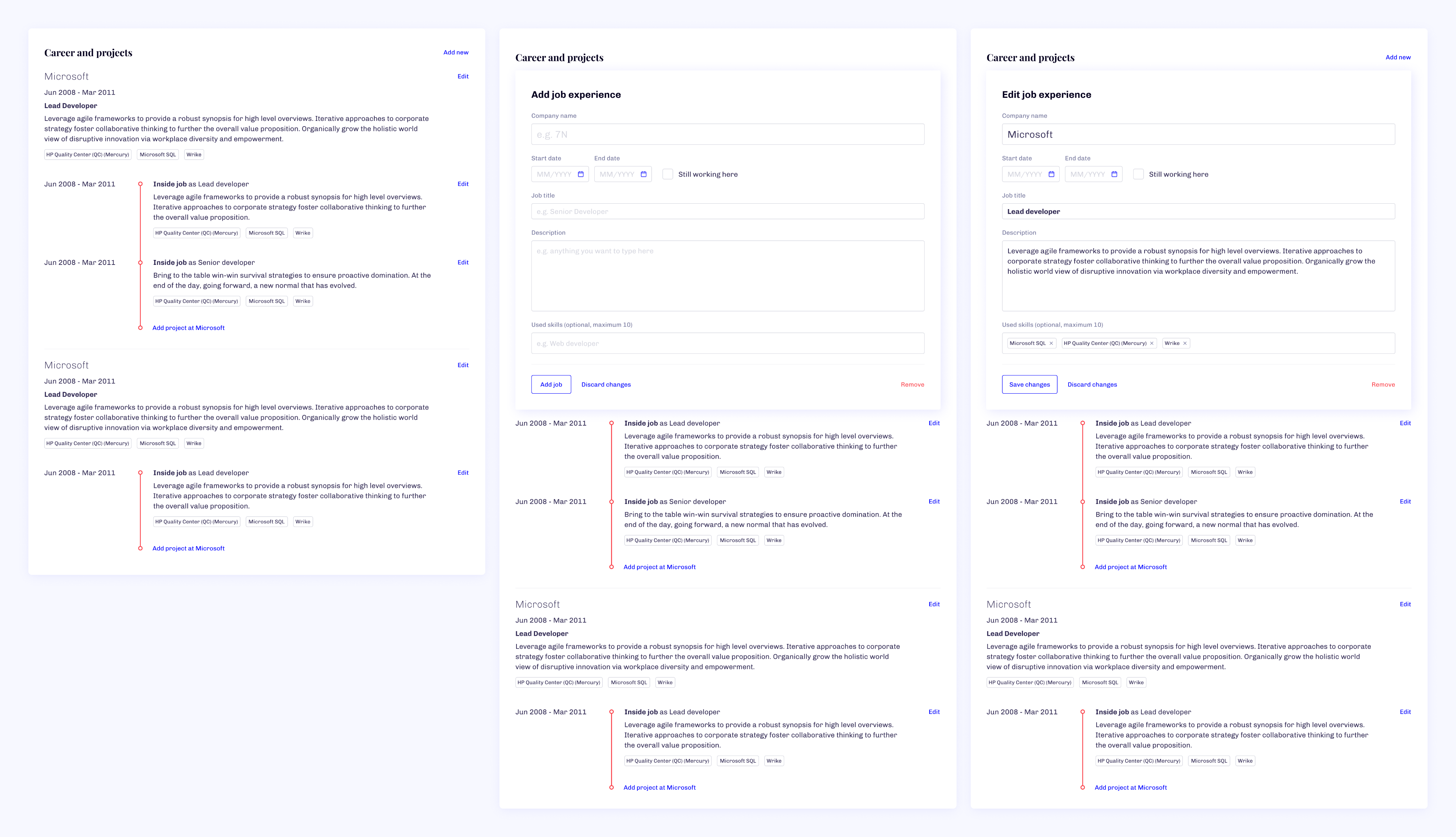
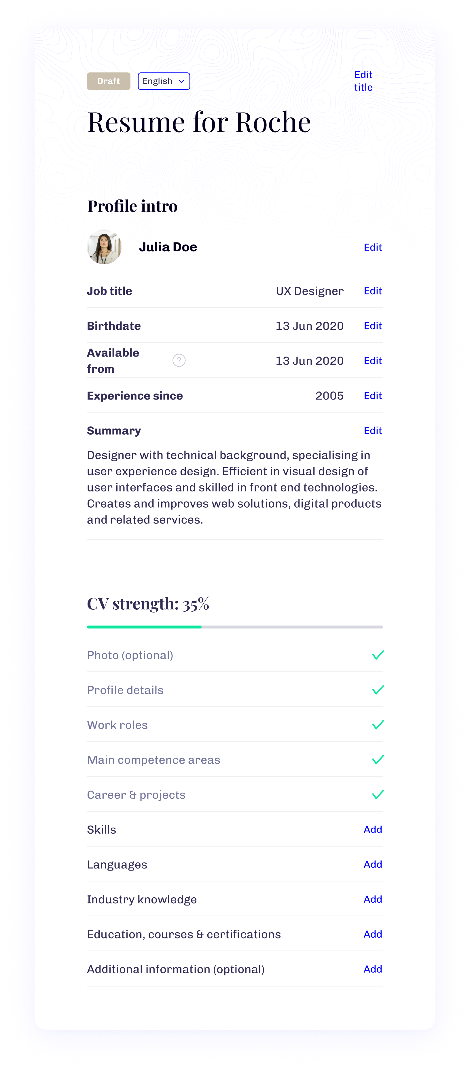
We focused on building a strong MVP that included the CV system and User Management (Power Tools). Beyond the MVP, our roadmap contained additional product owner features - but those were postponed to meet delivery deadlines.
All Black on White 🎲
Given that the UI was largely text-based, I purposefully avoided clutter like unnecessary icons. Instead, I leaned into clear contrast and strong visual cues to guide users through actions.
Our users came from 8+ countries across 3 continents, so accessibility and inclusivity were top priorities. A crisp, contrast-oriented design aligned with the 7N brand. Fonts, colors, and layout were carefully balanced and distributed through web component guidelines.
Before Going Public
We chose to launch a private beta exclusively with long-time 7N employees to refine features in a safe space. This round of testing let me gather in-depth feedback on design reliability and accessibility.
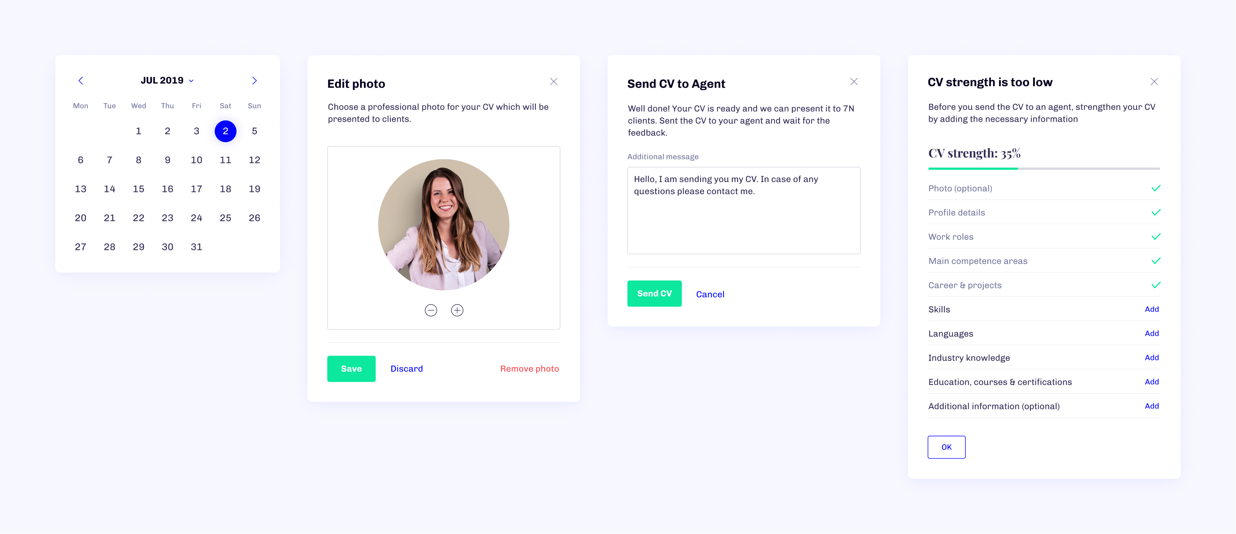
Both the User Creation Wizard and CV Creator were enthusiastically received. Recruiters noted they halved their processing time, and managers welcomed the modern alternative to the outdated Azure CRM.
Closed Beta & First Feedback
Presenting the platform to a closed group was a major milestone. After user interviews, we created a list of adjustments and prepped a development roadmap. I ran UI workshops to apply insights directly into our flows.
The overall design received positive feedback, though spacing and contrast needed minor refinements. One of the standout compliments: “The UI clearly communicates where I am in the process - even when it's complex, like building a CV.”
The Open Beta 🥁
The open beta window gave us several additional months before public release and it turned out to be a blessing. Our main goal? Build a modern UI system that could work untouched for years.
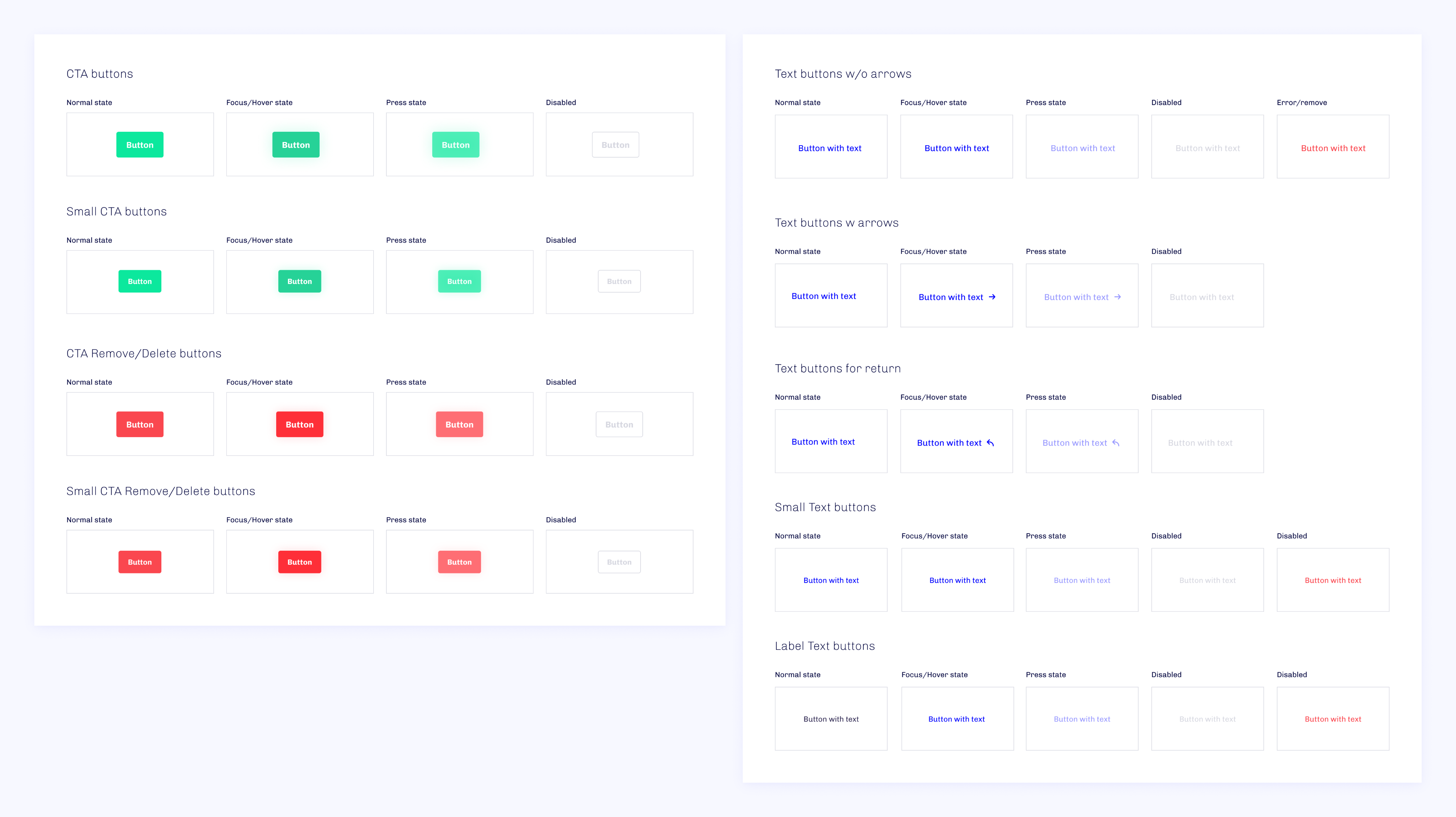
I started by using Figma component libraries to design flexible, scalable UI parts. Over 30 components with 100+ states were developed and documented. Upon request, the design system was made accessible to the R&D team via ZeroHeight.
Powering Up the Power Tools
Next came fine-tuning the tools for managers. Font sizes, spacing, and contrast were optimized for prolonged use, reducing eye strain and improving readability. Blue was used for functional actions; yellow became the highlight color for primary buttons, and orange signaled points of value and emphasis.
Blue represents action (a common choice in UX), but we swapped it out for yellow in primary buttons to soften the feel. Orange highlights valuable elements and draws attention to details.
Learning by Comparing
Throughout development, we ran four successful A/B tests to fine-tune different aspects of the user interface. Each one gave me clearer insight into what worked, and what didn’t - particularly around navigation flow and interaction clarity. The results helped us slim down and simplify the UI without sacrificing functionality.
We also updated color schemes and typography to meet accessibility standards and improve readability across devices. Beyond visual tweaks, these tests revealed valuable patterns in user preferences and decision-making. What started as routine validation quickly became a powerful learning tool, shaping how I approach user-centric design to this day.
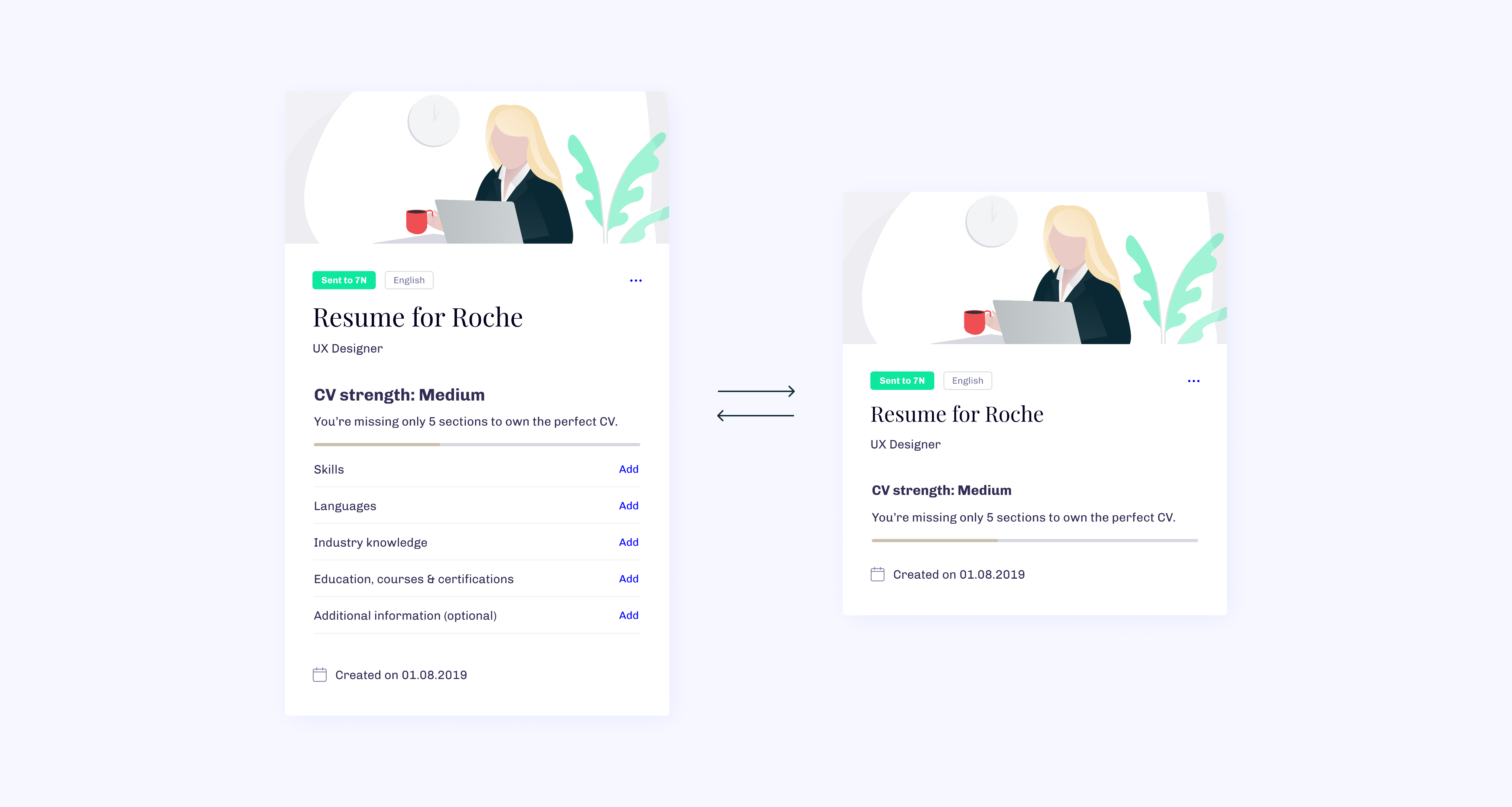
Brighten My Day ✨
One of the team’s favorite additions: illustrations and subtle animations. Each one was custom-crafted to bring a warm, unmistakable 7N identity to the platform.
The Global Release 🎫
At the end of our scheduled beta, we had the honor of unveiling my7N during the 7N Quarterly Event. It was the perfect stage to showcase nearly three years of hard work, creative problem-solving, and a clear vision for the platform's future.
When my7N officially went live, we didn’t hit pause. We kept the momentum going by putting feedback collection and user support front and center. Launch day was just the beginning.
Ask the Questions That Matter
Need help? Just ask. Users can reach out anytime via live chat, starting with our friendly chatbot for quick, natural responses. If needed, questions are escalated to our amazing 7N support team or passed along to our feedback inbox for follow-up.
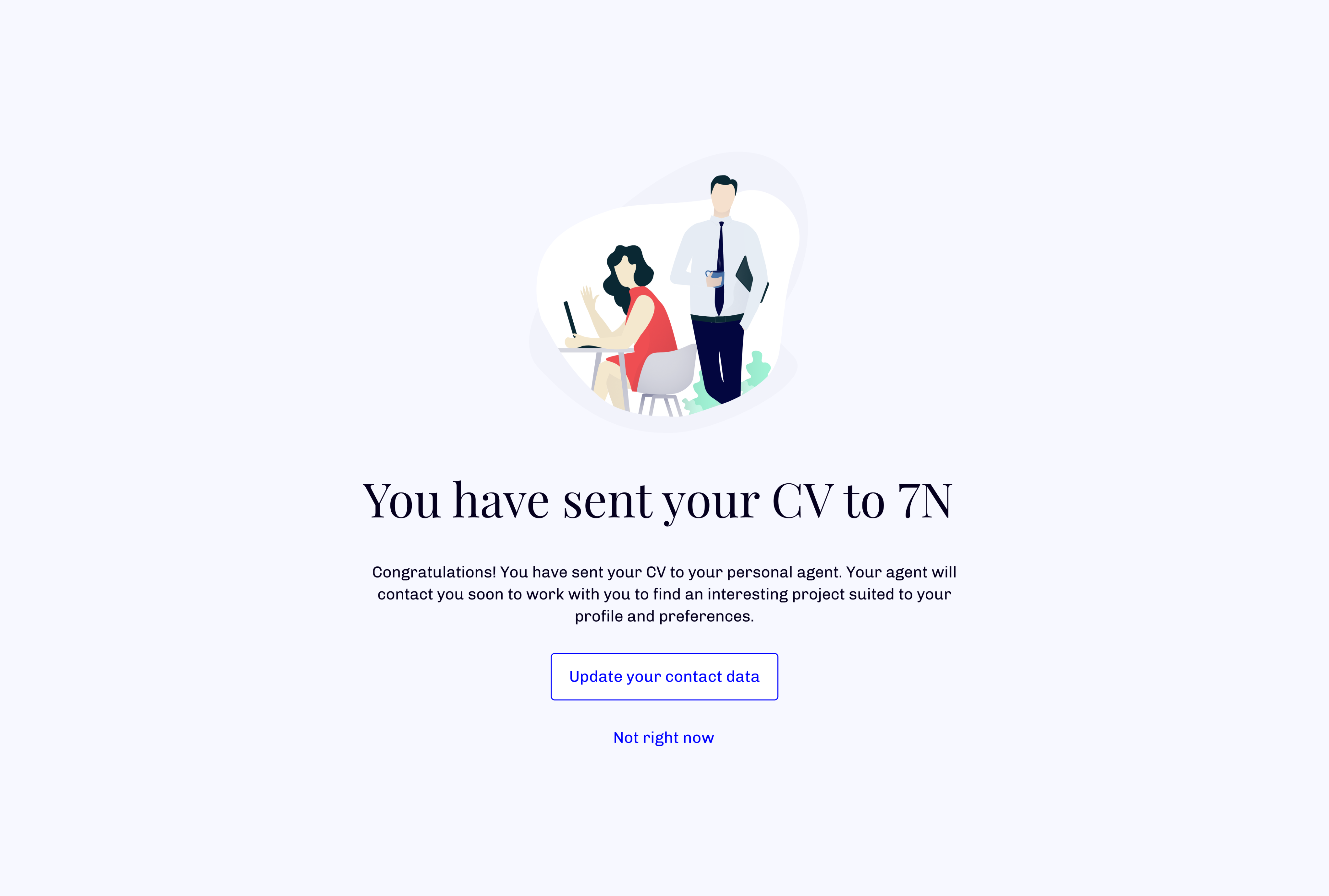
Send Feedback, Share the Vibe
Right after sending a CV, users are invited to leave feedback, either to offer suggestions or just share how the experience felt. It’s our way of staying connected and constantly improving, while taking the pulse of how my7N is performing.
Don’t Make Me Think
From day one, user convenience drove every decision. We tested and refined profile creation, editing, and updating flows to make them as smooth and fast as possible.
Subtle animations, clean shapes, and thoughtful color choices work together to reduce visual fatigue and put users at ease. The design doesn’t just look good, it feels good to use.
The Outcome 🤔
This was my swan song as part of the 7N Research & Development team and I left a piece of my heart in it.
I came in with curiosity, left with clarity. It’s here I learned how to empathize deeply, follow my creative instincts, and sharpen my focus as a designer. Saying goodbye to this project felt like saying goodbye to a chapter of personal growth.
On Multi-Product Ownership
At the start, we were scrappy, a tiny team of one developer and two designers, myself included. The roadmap was long and kept growing. Some days, prioritizing was a challenge, and leadership hires came later than ideal.
Yet, we kept building. Over three years, we laid the foundations for something that not only worked, it evolved to meet the real needs of both daily users and newcomers.
The "Mindset of a Servant"
One of 7N’s core values might raise an eyebrow at first: “Mindset of a servant.” But honestly, it changed the way I think about teamwork.
It taught me that leadership isn’t about taking charge, it’s about clearing the path. Even something as simple as making coffee for the team can create a stronger sense of support, presence, and focus.
The Rule of Three
Whenever I approached a design problem, I stuck to the “rule of three”, a principle from Sheth Jagdish that encourages thinking in triads. Three directions. Three versions. Three points of impact.
It forced me to push deeper into every idea and offer my team more thoughtful, well-rounded solutions. Looking back, it shaped the way I work and I’m grateful for that.

my7N
Social Platform with Recruitment in Mind

/
Behance
/
Dribbble
Mateusz Staniszewski © 2025
Designed With Time & Love by Me ⭐
7N was experiencing increased corporate growth and they needed a tailored IT platform to support it.
As 7N experienced rapid growth, the company needed a custom-built IT platform to manage internal processes and support recruitment more efficiently. Leadership decided to build this system from the ground up, assembling a team of talented designers and developers. I took on the role of UI Designer and UX Consultant, helping shape an entirely new product experience to support our expanding organization.
Disclaimer: All views expressed are my own and do not necessarily reflect those of the company. Certain design elements have been modified from the original.
My Role
I was responsible for defining UI guidelines, creating high-fidelity prototypes, and building smooth interactions. I also supported user flow development whenever needed.
The product went through two major iterations over three years. This allowed ample time for research, testing, and crafting pixel-perfect solutions. Our team - three designers (one UX, two UX/UI) and a strong lineup of software engineers - served the needs of four different Product Owners.
Originally scoped as a management tool MVP, the platform eventually evolved into a multifunctional hub for managing current and future consultants across 7N. It's worth noting that early on, the project lacked a designated leader or IT manager. Those roles emerged organically as the platform matured.
RESPONSIBILITIES 🧔🏽
Visual Guidelines, interactions & hi-fi prototyping
TIMELINE & OUTPUT ⏱
3 years to design a web based platform for over 1000 active users
TEAM 💃🏼🕺🏻
UX & UI Designers, Front & Back-end Developers and Product Owners
High-Level Goals 🥅
01 / Make It Accessible
Large platforms can be overwhelming. Our tool needed to support managers and employees through onboarding, performance reviews, and career growth without confusion.
02 / Unite Everything in One Tool
Managing user data can be frustrating, especially if both ends of the experience (employee and management) aren’t considered equally. We aimed to create a calm, intuitive experience.
04 / Reflect the 7N Culture
We wanted to translate 7N’s open-minded, feedback-driven culture into features like chat and simple communication tools.
03 / Make Users Feel Valued
How could we show users their expertise matters? We explored ways to reinforce that they’re progressing and excelling in their specialties.
Context & Discovery
It was vital to understand the organizational environment and the different perspectives feeding into the platform. With multiple product owners each bringing their own priorities, we conducted internal and external interviews to capture the needs of real users.
Who Are the Users?
Using the consultant database, we identified and interviewed users from within and beyond 7N. With input from over 30 co-workers, we built proto-personas to empathize with typical user needs and frustrations. Most of the data contributors were internal employees, whose feedback remained at the core of our decision-making.
The Rock Star Developer
Denmark, 42 y.o.
Henrik is a seasoned Senior Software Engineering Consultant with 7N, currently assigned to one of Scandinavia’s largest banks. He was specially flown in to showcase his expertise as a standout “Rock Star” developer.

Motivation
Henrik aims to update his profile with input from Agents and Managers to increase his visibility and improve his chances of landing high-profile contracts on major projects in the near future.
Goal
To truly feel valued in his role, Henrik wants his consultant profile to stand out - uniquely crafted and prominently featured on the platform.
The Recruiter
Sweden, 38 y.o.
Markus is a seasoned Senior Recruiter at 7N with years of experience, constantly scanning the European market to identify the top 3% of IT talent.
Motivation
The Scandinavian IT job market presents unique challenges in sourcing skilled specialists. Markus wants to shift focus from endless browsing to meaningful conversations and real engagement with candidates.
Goal
Markus is looking for powerful search and comparison tools to dramatically speed up his research, ideally cutting the time spent by half.
The Newcomer
Poland, 28 y.o.
Lukas is a talented Senior Backend Developer currently being recruited by 7N to join an upcoming long-term client project as a consultant.
Motivation
By sharing his professional details with an Agent, Lukas makes it easier for 7N to present him to clients and open doors to future contract opportunities.
Goal
Lukas is looking for a smooth and straightforward onboarding experience so he can officially join 7N as a consultant and receive a job offer as soon as possible.
The Agent
Poland, 24 y.o.
Anna plays a key role in supporting team growth and cohesion within the company. She’s also responsible for onboarding new 7N consultants, ensuring a seamless start to their journey.
Motivation
Understanding each team member's individual needs and responding to their requests takes time and effort. Anna wants a better-organized management process so she can devote more energy to supporting her teammates.
Goal
She’s looking for a robust tool to streamline assessments, monitor team dynamics, and simplify onboarding, making management more efficient and people-focused.
We built the platform with scalability in mind, ensuring it could adapt even after the original features shipped.
Linking the connections
As the visual design lead, I played a hybrid role - observing, asking, tweaking, and supporting the team’s choices when needed. You could say I stood between Design Thinking and Engineering.
Thankfully, we had strong architectural oversight from the development team, which drastically reduced unnecessary back-and-forth and helped us stay lean and focused.
The design team built smart flows, detailed prototypes, and effective cognitive maps. Our first iteration lacked key stakeholder insights, so the second go-round was more informed and better prepared.
We focused on building a strong MVP that included the CV system and User Management (Power Tools). Beyond the MVP, our roadmap contained additional product owner features - but those were postponed to meet delivery deadlines.
All Black on White 🎲
Given that the UI was largely text-based, I purposefully avoided clutter like unnecessary icons. Instead, I leaned into clear contrast and strong visual cues to guide users through actions.
Our users came from 8+ countries across 3 continents, so accessibility and inclusivity were top priorities. A crisp, contrast-oriented design aligned with the 7N brand. Fonts, colors, and layout were carefully balanced and distributed through web component guidelines.
Before Going Public
We chose to launch a private beta exclusively with long-time 7N employees to refine features in a safe space. This round of testing let me gather in-depth feedback on design reliability and accessibility.
Both the User Creation Wizard and CV Creator were enthusiastically received. Recruiters noted they halved their processing time, and managers welcomed the modern alternative to the outdated Azure CRM.
Closed Beta & First Feedback
Presenting the platform to a closed group was a major milestone. After user interviews, we created a list of adjustments and prepped a development roadmap. I ran UI workshops to apply insights directly into our flows.
The overall design received positive feedback, though spacing and contrast needed minor refinements. One of the standout compliments: “The UI clearly communicates where I am in the process - even when it's complex, like building a CV.”
The Open Beta 🥁
The open beta window gave us several additional months before public release and it turned out to be a blessing. Our main goal? Build a modern UI system that could work untouched for years.
I started by using Figma component libraries to design flexible, scalable UI parts. Over 30 components with 100+ states were developed and documented. Upon request, the design system was made accessible to the R&D team via ZeroHeight.
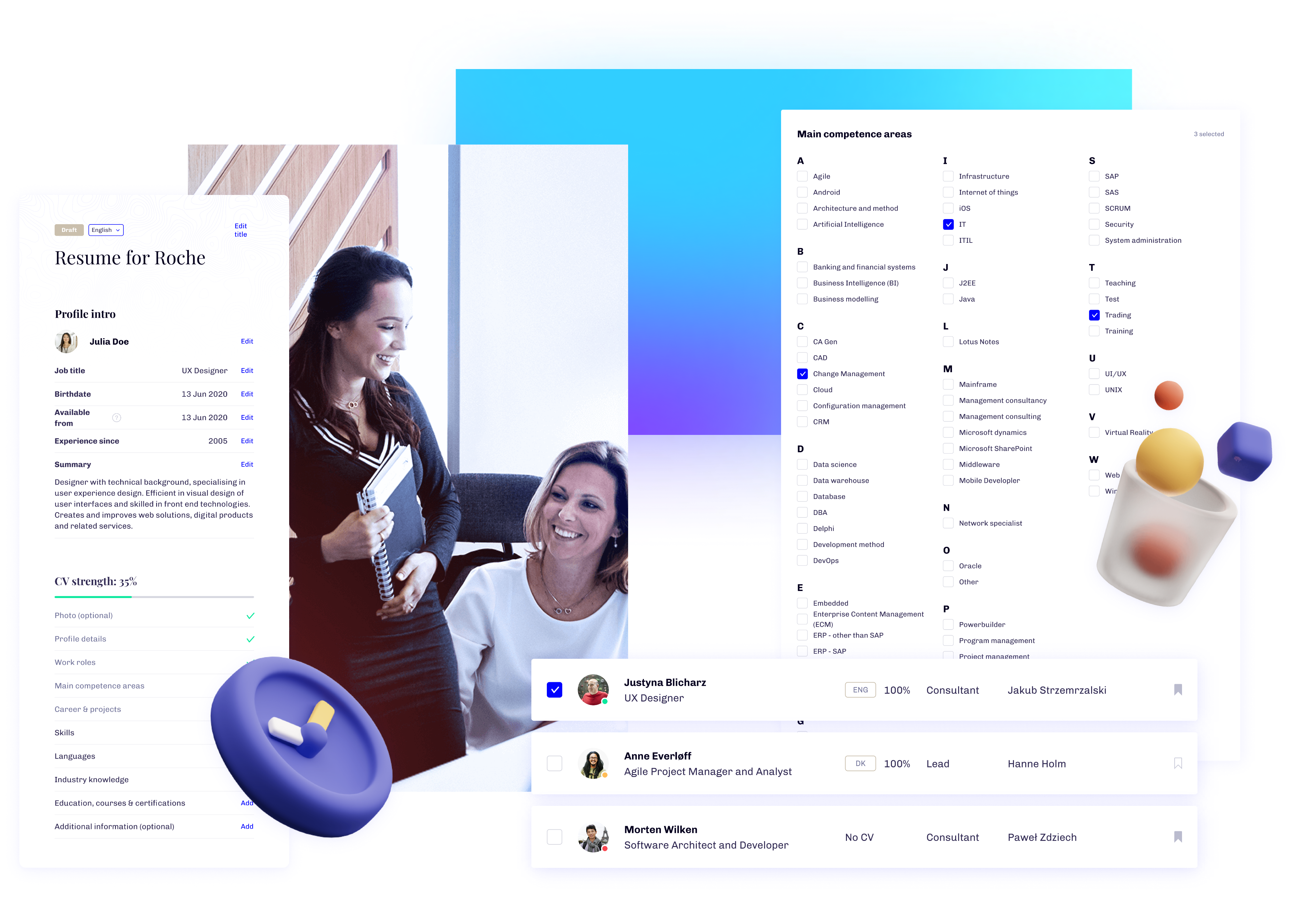
Powering Up the Power Tools
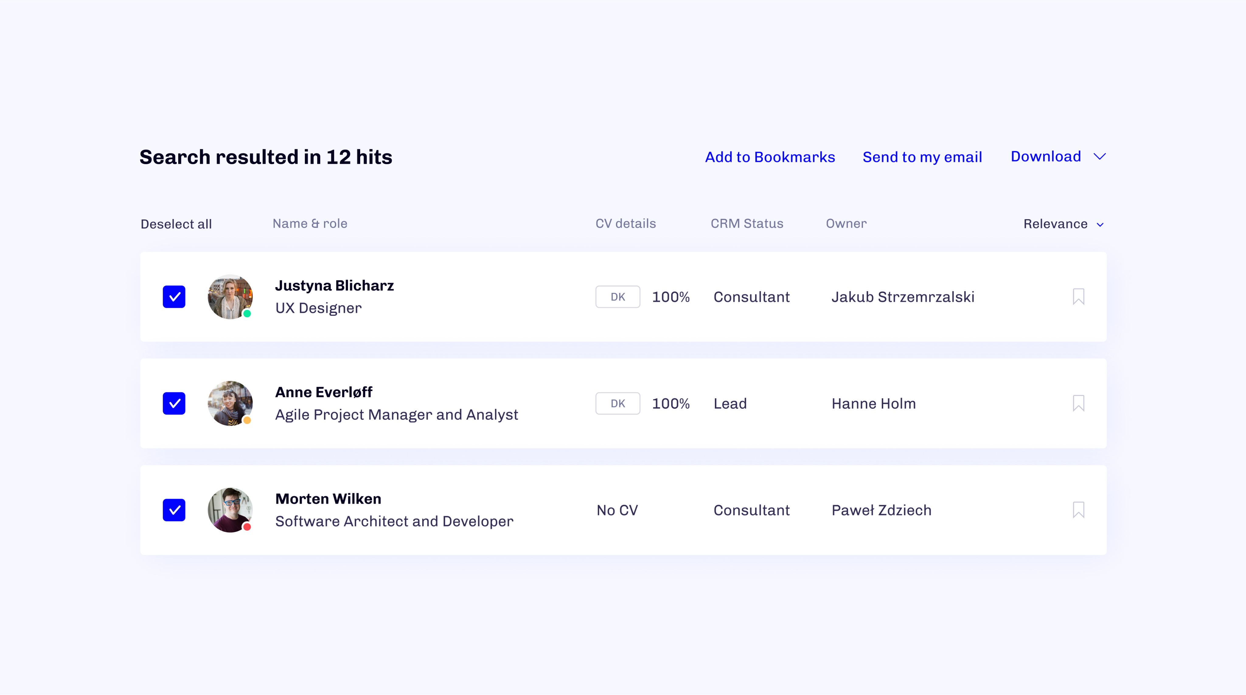
Next came fine-tuning the tools for managers. Font sizes, spacing, and contrast were optimized for prolonged use, reducing eye strain and improving readability. Blue was used for functional actions; yellow became the highlight color for primary buttons, and orange signaled points of value and emphasis.
Blue represents action (a common choice in UX), but we swapped it out for yellow in primary buttons to soften the feel. Orange highlights valuable elements and draws attention to details.
Learning by Comparing
Throughout development, we ran four successful A/B tests to fine-tune different aspects of the user interface. Each one gave me clearer insight into what worked, and what didn’t - particularly around navigation flow and interaction clarity. The results helped us slim down and simplify the UI without sacrificing functionality.
We also updated color schemes and typography to meet accessibility standards and improve readability across devices. Beyond visual tweaks, these tests revealed valuable patterns in user preferences and decision-making. What started as routine validation quickly became a powerful learning tool, shaping how I approach user-centric design to this day.
Brighten My Day ✨
One of the team’s favorite additions: illustrations and subtle animations. Each one was custom-crafted to bring a warm, unmistakable 7N identity to the platform.
The Global Release 🎫
At the end of our scheduled beta, we had the honor of unveiling my7N during the 7N Quarterly Event. It was the perfect stage to showcase nearly three years of hard work, creative problem-solving, and a clear vision for the platform's future.
When my7N officially went live, we didn’t hit pause. We kept the momentum going by putting feedback collection and user support front and center. Launch day was just the beginning.
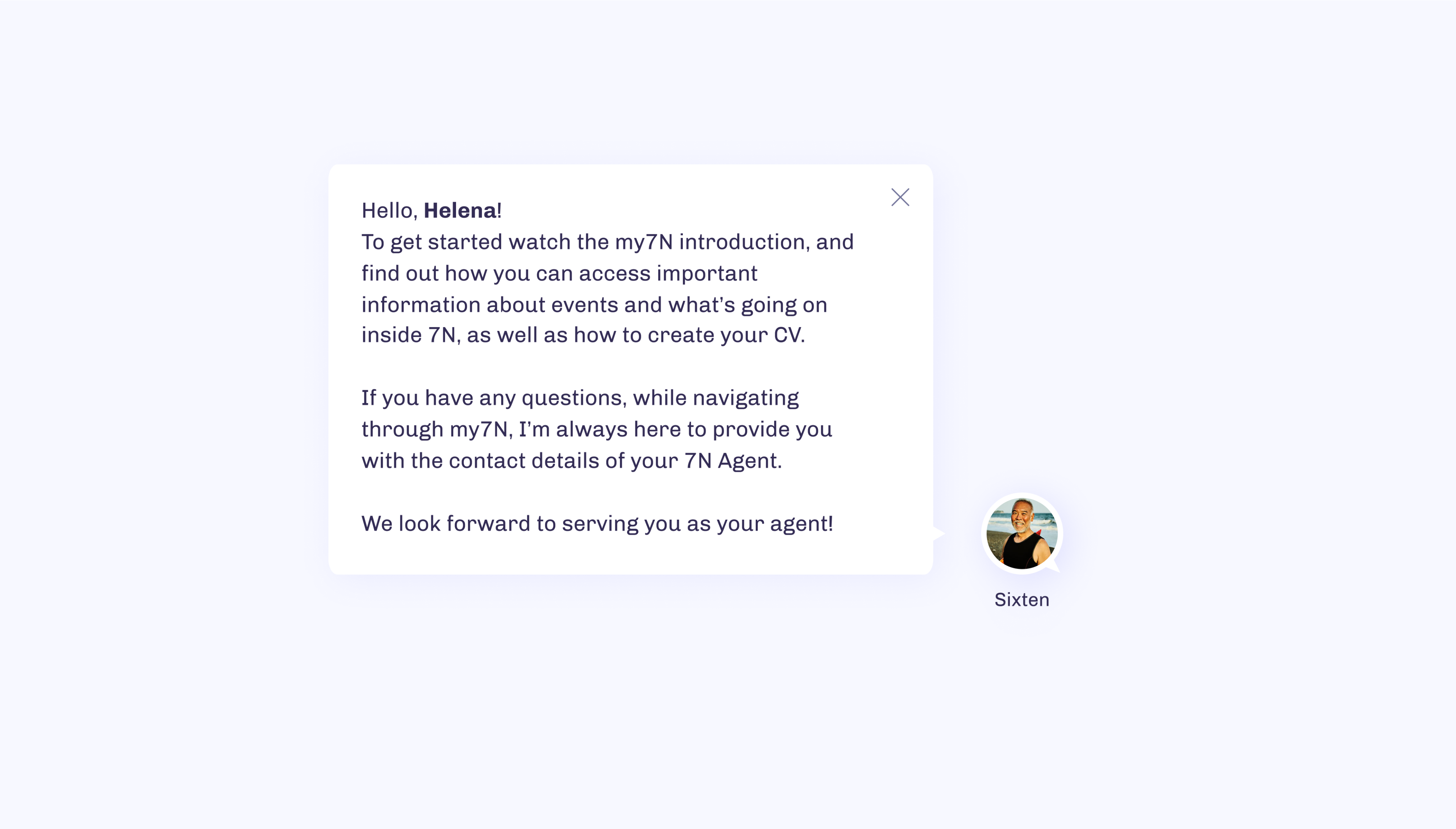
Ask the Questions That Matter
Need help? Just ask. Users can reach out anytime via live chat, starting with our friendly chatbot for quick, natural responses. If needed, questions are escalated to our amazing 7N support team or passed along to our feedback inbox for follow-up.
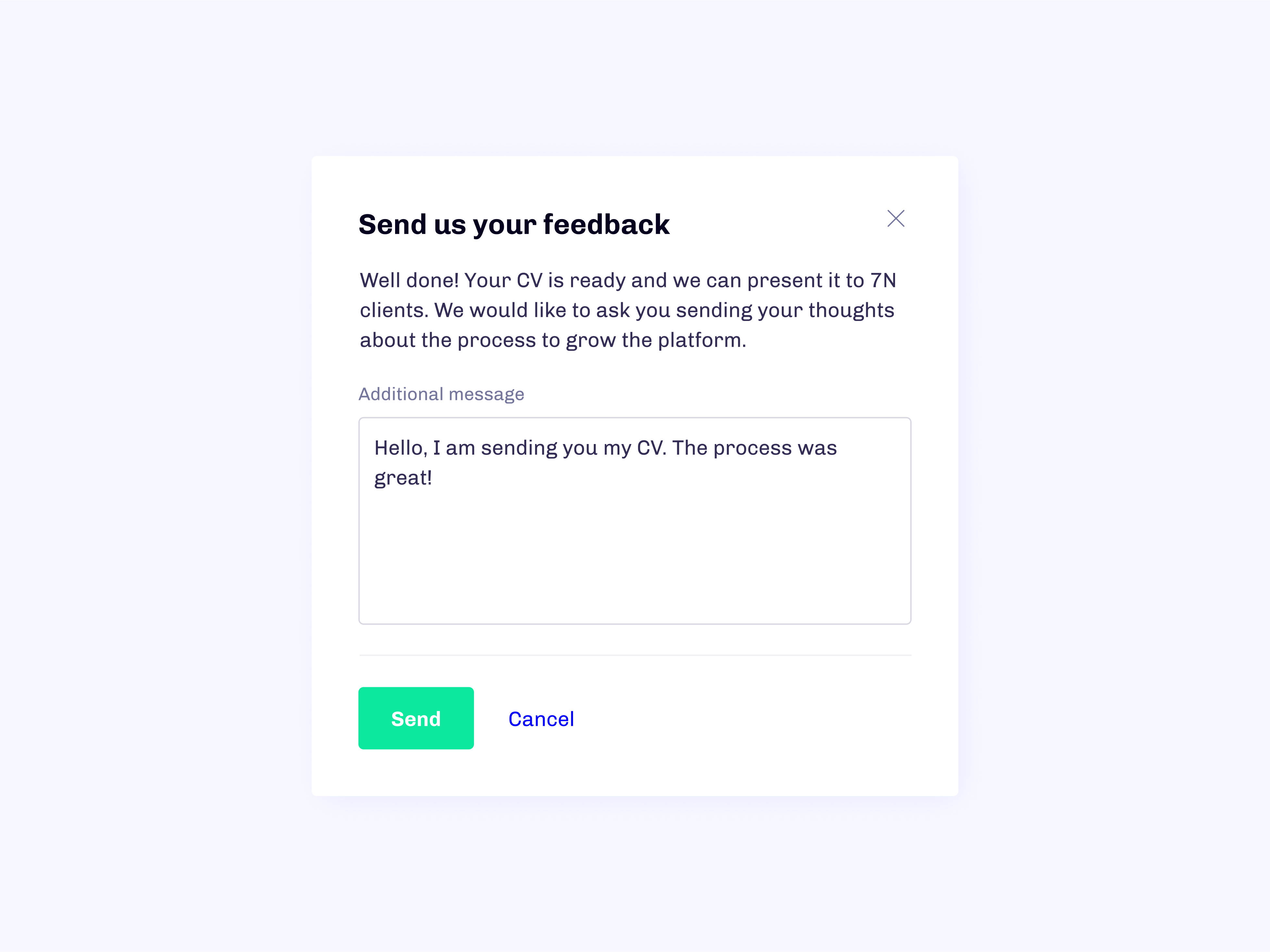
Send Feedback, Share the Vibe
Right after sending a CV, users are invited to leave feedback, either to offer suggestions or just share how the experience felt. It’s our way of staying connected and constantly improving, while taking the pulse of how my7N is performing.
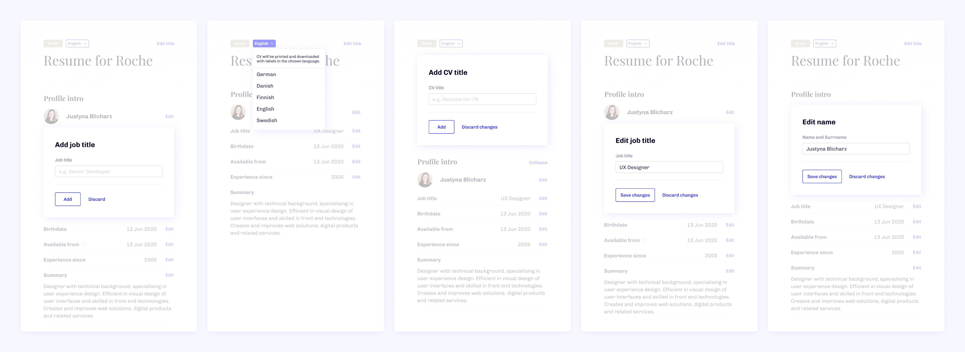
Don’t Make Me Think
From day one, user convenience drove every decision. We tested and refined profile creation, editing, and updating flows to make them as smooth and fast as possible.
Subtle animations, clean shapes, and thoughtful color choices work together to reduce visual fatigue and put users at ease. The design doesn’t just look good, it feels good to use.
The Outcome 🤔
This was my swan song as part of the 7N Research & Development team and I left a piece of my heart in it.
I came in with curiosity, left with clarity. It’s here I learned how to empathize deeply, follow my creative instincts, and sharpen my focus as a designer. Saying goodbye to this project felt like saying goodbye to a chapter of personal growth.
On Multi-Product Ownership
At the start, we were scrappy, a tiny team of one developer and two designers, myself included. The roadmap was long and kept growing. Some days, prioritizing was a challenge, and leadership hires came later than ideal.
Yet, we kept building. Over three years, we laid the foundations for something that not only worked, it evolved to meet the real needs of both daily users and newcomers.
The "Mindset of a Servant"
One of 7N’s core values might raise an eyebrow at first: “Mindset of a servant.” But honestly, it changed the way I think about teamwork.
It taught me that leadership isn’t about taking charge, it’s about clearing the path. Even something as simple as making coffee for the team can create a stronger sense of support, presence, and focus.
The Rule of Three
Whenever I approached a design problem, I stuck to the “rule of three”, a principle from Sheth Jagdish that encourages thinking in triads. Three directions. Three versions. Three points of impact.
It forced me to push deeper into every idea and offer my team more thoughtful, well-rounded solutions. Looking back, it shaped the way I work and I’m grateful for that.

my7N
Social Platform with Recruitment in Mind

/
Behance
/
Dribbble
Mateusz Staniszewski © 2025
Designed With Time & Love by Me ⭐
7N was experiencing increased corporate growth and they needed a tailored IT platform to support it.
As 7N experienced rapid growth, the company needed a custom-built IT platform to manage internal processes and support recruitment more efficiently. Leadership decided to build this system from the ground up, assembling a team of talented designers and developers. I took on the role of UI Designer and UX Consultant, helping shape an entirely new product experience to support our expanding organization.
Disclaimer: All views expressed are my own and do not necessarily reflect those of the company. Certain design elements have been modified from the original.
My Role
I was responsible for defining UI guidelines, creating high-fidelity prototypes, and building smooth interactions. I also supported user flow development whenever needed.
The product went through two major iterations over three years. This allowed ample time for research, testing, and crafting pixel-perfect solutions. Our team - three designers (one UX, two UX/UI) and a strong lineup of software engineers - served the needs of four different Product Owners.
Originally scoped as a management tool MVP, the platform eventually evolved into a multifunctional hub for managing current and future consultants across 7N. It's worth noting that early on, the project lacked a designated leader or IT manager. Those roles emerged organically as the platform matured.
RESPONSIBILITIES 🧔🏽
Visual Guidelines, interactions & hi-fi prototyping
TIMELINE & OUTPUT ⏱
3 years to design a web based platform for over 1000 active users
TEAM 💃🏼🕺🏻
UX & UI Designers, Front & Back-end Developers and Product Owners
High-Level Goals 🥅
01 / Make It Accessible
Large platforms can be overwhelming. Our tool needed to support managers and employees through onboarding, performance reviews, and career growth without confusion.
02 / Unite Everything in One Tool
Managing user data can be frustrating, especially if both ends of the experience (employee and management) aren’t considered equally. We aimed to create a calm, intuitive experience.
04 / Reflect the 7N Culture
We wanted to translate 7N’s open-minded, feedback-driven culture into features like chat and simple communication tools.
03 / Make Users Feel Valued
How could we show users their expertise matters? We explored ways to reinforce that they’re progressing and excelling in their specialties.
Context & Discovery
It was vital to understand the organizational environment and the different perspectives feeding into the platform. With multiple product owners each bringing their own priorities, we conducted internal and external interviews to capture the needs of real users.
Who Are the Users?
Using the consultant database, we identified and interviewed users from within and beyond 7N. With input from over 30 co-workers, we built proto-personas to empathize with typical user needs and frustrations. Most of the data contributors were internal employees, whose feedback remained at the core of our decision-making.
The Rock Star Developer
Denmark, 42 y.o.
Henrik is a seasoned Senior Software Engineering Consultant with 7N, currently assigned to one of Scandinavia’s largest banks. He was specially flown in to showcase his expertise as a standout “Rock Star” developer.

Motivation
Henrik aims to update his profile with input from Agents and Managers to increase his visibility and improve his chances of landing high-profile contracts on major projects in the near future.
Goal
To truly feel valued in his role, Henrik wants his consultant profile to stand out - uniquely crafted and prominently featured on the platform.
The Recruiter
Sweden, 38 y.o.
Markus is a seasoned Senior Recruiter at 7N with years of experience, constantly scanning the European market to identify the top 3% of IT talent.
Motivation
The Scandinavian IT job market presents unique challenges in sourcing skilled specialists. Markus wants to shift focus from endless browsing to meaningful conversations and real engagement with candidates.
Goal
Markus is looking for powerful search and comparison tools to dramatically speed up his research, ideally cutting the time spent by half.
The Newcomer
Poland, 28 y.o.
Lukas is a talented Senior Backend Developer currently being recruited by 7N to join an upcoming long-term client project as a consultant.
Motivation
By sharing his professional details with an Agent, Lukas makes it easier for 7N to present him to clients and open doors to future contract opportunities.
Goal
Lukas is looking for a smooth and straightforward onboarding experience so he can officially join 7N as a consultant and receive a job offer as soon as possible.
The Agent
Poland, 24 y.o.
Anna plays a key role in supporting team growth and cohesion within the company. She’s also responsible for onboarding new 7N consultants, ensuring a seamless start to their journey.
Motivation
Understanding each team member's individual needs and responding to their requests takes time and effort. Anna wants a better-organized management process so she can devote more energy to supporting her teammates.
Goal
She’s looking for a robust tool to streamline assessments, monitor team dynamics, and simplify onboarding, making management more efficient and people-focused.
We built the platform with scalability in mind, ensuring it could adapt even after the original features shipped.
Linking the connections
As the visual design lead, I played a hybrid role - observing, asking, tweaking, and supporting the team’s choices when needed. You could say I stood between Design Thinking and Engineering.
Thankfully, we had strong architectural oversight from the development team, which drastically reduced unnecessary back-and-forth and helped us stay lean and focused.
The design team built smart flows, detailed prototypes, and effective cognitive maps. Our first iteration lacked key stakeholder insights, so the second go-round was more informed and better prepared.
We focused on building a strong MVP that included the CV system and User Management (Power Tools). Beyond the MVP, our roadmap contained additional product owner features - but those were postponed to meet delivery deadlines.
All Black on White 🎲
Given that the UI was largely text-based, I purposefully avoided clutter like unnecessary icons. Instead, I leaned into clear contrast and strong visual cues to guide users through actions.
Our users came from 8+ countries across 3 continents, so accessibility and inclusivity were top priorities. A crisp, contrast-oriented design aligned with the 7N brand. Fonts, colors, and layout were carefully balanced and distributed through web component guidelines.
Before Going Public
We chose to launch a private beta exclusively with long-time 7N employees to refine features in a safe space. This round of testing let me gather in-depth feedback on design reliability and accessibility.
Both the User Creation Wizard and CV Creator were enthusiastically received. Recruiters noted they halved their processing time, and managers welcomed the modern alternative to the outdated Azure CRM.
Closed Beta & First Feedback
Presenting the platform to a closed group was a major milestone. After user interviews, we created a list of adjustments and prepped a development roadmap. I ran UI workshops to apply insights directly into our flows.
The overall design received positive feedback, though spacing and contrast needed minor refinements. One of the standout compliments: “The UI clearly communicates where I am in the process - even when it's complex, like building a CV.”
The Open Beta 🥁
The open beta window gave us several additional months before public release and it turned out to be a blessing. Our main goal? Build a modern UI system that could work untouched for years.
I started by using Figma component libraries to design flexible, scalable UI parts. Over 30 components with 100+ states were developed and documented. Upon request, the design system was made accessible to the R&D team via ZeroHeight.
Powering Up the Power Tools
Next came fine-tuning the tools for managers. Font sizes, spacing, and contrast were optimized for prolonged use, reducing eye strain and improving readability. Blue was used for functional actions; yellow became the highlight color for primary buttons, and orange signaled points of value and emphasis.
Blue represents action (a common choice in UX), but we swapped it out for yellow in primary buttons to soften the feel. Orange highlights valuable elements and draws attention to details.
Learning by Comparing
Throughout development, we ran four successful A/B tests to fine-tune different aspects of the user interface. Each one gave me clearer insight into what worked, and what didn’t - particularly around navigation flow and interaction clarity. The results helped us slim down and simplify the UI without sacrificing functionality.
We also updated color schemes and typography to meet accessibility standards and improve readability across devices. Beyond visual tweaks, these tests revealed valuable patterns in user preferences and decision-making. What started as routine validation quickly became a powerful learning tool, shaping how I approach user-centric design to this day.
Brighten My Day
One of the team’s favorite additions: illustrations and subtle animations. Each one was custom-crafted to bring a warm, unmistakable 7N identity to the platform.
The Global Release 🎫
At the end of our scheduled beta, we had the honor of unveiling my7N during the 7N Quarterly Event. It was the perfect stage to showcase nearly three years of hard work, creative problem-solving, and a clear vision for the platform's future.
When my7N officially went live, we didn’t hit pause. We kept the momentum going by putting feedback collection and user support front and center. Launch day was just the beginning.
Ask the Questions That Matter
Need help? Just ask. Users can reach out anytime via live chat, starting with our friendly chatbot for quick, natural responses. If needed, questions are escalated to our amazing 7N support team or passed along to our feedback inbox for follow-up.
Send Feedback, Share the Vibe
Right after sending a CV, users are invited to leave feedback, either to offer suggestions or just share how the experience felt. It’s our way of staying connected and constantly improving, while taking the pulse of how my7N is performing.
Don’t Make Me Think
From day one, user convenience drove every decision. We tested and refined profile creation, editing, and updating flows to make them as smooth and fast as possible.
Subtle animations, clean shapes, and thoughtful color choices work together to reduce visual fatigue and put users at ease. The design doesn’t just look good, it feels good to use.
The Outcome 🤔
This was my swan song as part of the 7N Research & Development team and I left a piece of my heart in it.
I came in with curiosity, left with clarity. It’s here I learned how to empathize deeply, follow my creative instincts, and sharpen my focus as a designer. Saying goodbye to this project felt like saying goodbye to a chapter of personal growth.
On Multi-Product Ownership
At the start, we were scrappy, a tiny team of one developer and two designers, myself included. The roadmap was long and kept growing. Some days, prioritizing was a challenge, and leadership hires came later than ideal.
Yet, we kept building. Over three years, we laid the foundations for something that not only worked, it evolved to meet the real needs of both daily users and newcomers.
The "Mindset of a Servant"
One of 7N’s core values might raise an eyebrow at first: “Mindset of a servant.” But honestly, it changed the way I think about teamwork.
It taught me that leadership isn’t about taking charge, it’s about clearing the path. Even something as simple as making coffee for the team can create a stronger sense of support, presence, and focus.
The Rule of Three
Whenever I approached a design problem, I stuck to the “rule of three”, a principle from Sheth Jagdish that encourages thinking in triads. Three directions. Three versions. Three points of impact.
It forced me to push deeper into every idea and offer my team more thoughtful, well-rounded solutions. Looking back, it shaped the way I work and I’m grateful for that.

my7N
Social Platform with Recruitment in Mind

/
Behance
/
Dribbble
Mateusz Staniszewski © 2025
Designed With Time & Love by Me ⭐