The tech startup world is growing fast, and with it, the demand for smart, flexible recruitment tools.
Kandidate was one of those fast-paced startups looking to level up their product and better serve their customers. I joined their design team as a Product Designer, tasked with rethinking the platform’s experience from the ground up.
Disclaimer: All views shared here are my own and may not reflect the official stance of the company. Some design details have been modified.
My Role
As a Product Designer, I co-led UX direction and created UI guidelines for the web platform. My day-to-day involved collaborating with Product Owners, shaping the user journey, and turning research insights into pixel-perfect Figma designs. I also reviewed new features and handed off designs directly to developers.
We worked in an agile setting, which meant features evolved quickly based on feedback from users and clients and sometimes that meant going back to the drawing board just as fast.
RESPONSIBILITIES 🧔🏽
Senior Principle Designer & Design System Ownership
TIMELINE & OUTPUT ⏱
9 months of continuous work on the product
TEAM 💃🏼🕺🏻
Product Owners (2), UX researcher, Tech Lead, Front & Back-end Developers
The Environment 🛋
Before diving into design specifics, it’s worth highlighting the unique work culture. I was part-time but quickly felt like family. Daily check-ins, open communication, and friendly vibes made collaborating with the Kandidate team a genuinely enjoyable experience.
A Vision Shaped by Users
What surprised me most? Nearly every feature in the backlog came from user feedback, not traditional market research. It took some getting used to, but it made the vision incredibly user-driven.
The Co-Founder had a clear directive: the product needed to be clean, accessible, and usable by people across industries and skill levels. From that point on, accessibility became a core focus.
Startup Culture in Action
Kandidate had that signature startup energy. Quick decisions, constant iteration, and a collaborative spirit. Even when workflows got messy, the team’s openness made it easy to navigate. We moved fast, made room for experimentation, and learned as we went.
Design Challenges
Working within agile had its ups and downs. Strict deadlines? Check. Ever-shifting priorities due to new feedback? Also check. It could be frustrating - especially when defining UI guidelines so we embraced a "keep-it-simple" mindset that helped us move forward with clarity.
Understanding the Users
While a teammate led UX research, we frequently discussed findings together. Our users were primarily recruiters and specialists, mostly based in the UK and working in IT startups. That gave us a clear target for design decisions and persona creation.
From what I gathered, users just wanted recruitment tools that worked - nothing flashy, just simple, useful, and efficient. That made mapping user journeys surprisingly intuitive.
The Specialist
Ireland, 24 y.o.
Stan is an accomplished Project Manager with experience at top tech companies like Google. He’s now exploring fresh opportunities across the UK market.

Motivation
By building a profile in collaboration with Agents and Managers, Stan increases his chances of securing high-value contracts on major projects in the near future.
Goal
Stan wants to join the Kandidate platform to receive personalized, high-quality job offers tailored to his expertise and career aspirations.

The Recruiter
England, 27 y.o.
Anita is a seasoned Senior Recruiter at Kandidate, with years of experience navigating the fast-paced UK market in search of top-tier talent.
Motivation
The UK hiring landscape is one of the largest and most complex globally. Even for highly experienced recruiters, sifting through vast volumes of user data can be daunting. Anita wants to spend less time manually filtering and more time connecting with great candidates.
Goal
She’s looking for powerful search and comparison tools to streamline her workflow, cutting research time in half and boosting efficiency.
Defining the MVP
The Product Owners were always open to conversation. We talked about new features and the broader vision behind Kandidate. While I wasn't in charge of the product journey maps, I contributed to feature design and often brought ideas to the table.
The MVP reflected the company’s values: fast onboarding and strong insight into candidates' strengths and weaknesses. That unique structure was vital to preserve - and designing within that framework was a rewarding challenge.
Design Philosophy:Accessible at Every Step 💡
From the start, I had a clear vision and the freedom to explore it. Our user base was large, professional, and diverse, so I built the experience around three guiding principles:
Don’t Make Me Think
Inspired by Steve Krug’s usability book, the interface had to feel intuitive and obvious.
Stick to the Rules
Consistent components and flows made sure users always knew where they were and how to complete tasks.
Step-by-Step
Tasks were broken into clear, manageable steps - especially important for onboarding and form submissions.
These rules gave structure to my creativity and helped me design with purpose.
Search, Filter & Chat
The biggest design challenge? The search experience. With over 20 filter categories, things had gotten messy. This was a high-priority fix, and I was more than ready to take it on.
I introduced moving containers to keep filters always accessible on the left side, and redesigned the filter UI to be more compact, intuitive, and responsive to common screen sizes. We kept the overall layout familiar so developers could focus on functionality without overhauling everything.
One of the most visible wins came from the redesigned profile cards, a month-long task that paid off in clarity and usability.
We also revamped the chat experience based on user research. Fields were reordered, the flow was streamlined, and the result was a relaxed, minimal interface that supported conversation without clutter.
Keeping Users Focused
Every product needs a reason for users to stick around and return. That was something I tried to tackle head-on.
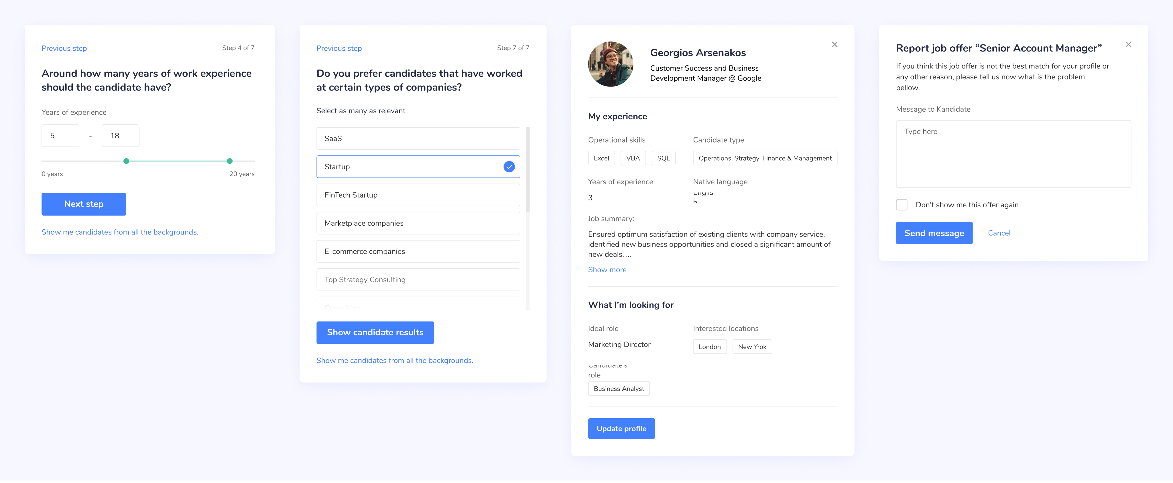
The Wizard flow was key. Instead of dumping users into a long list of form fields, the Wizard walked them through the process one step at a time. It kept people engaged, focused, and motivated to complete the journey.
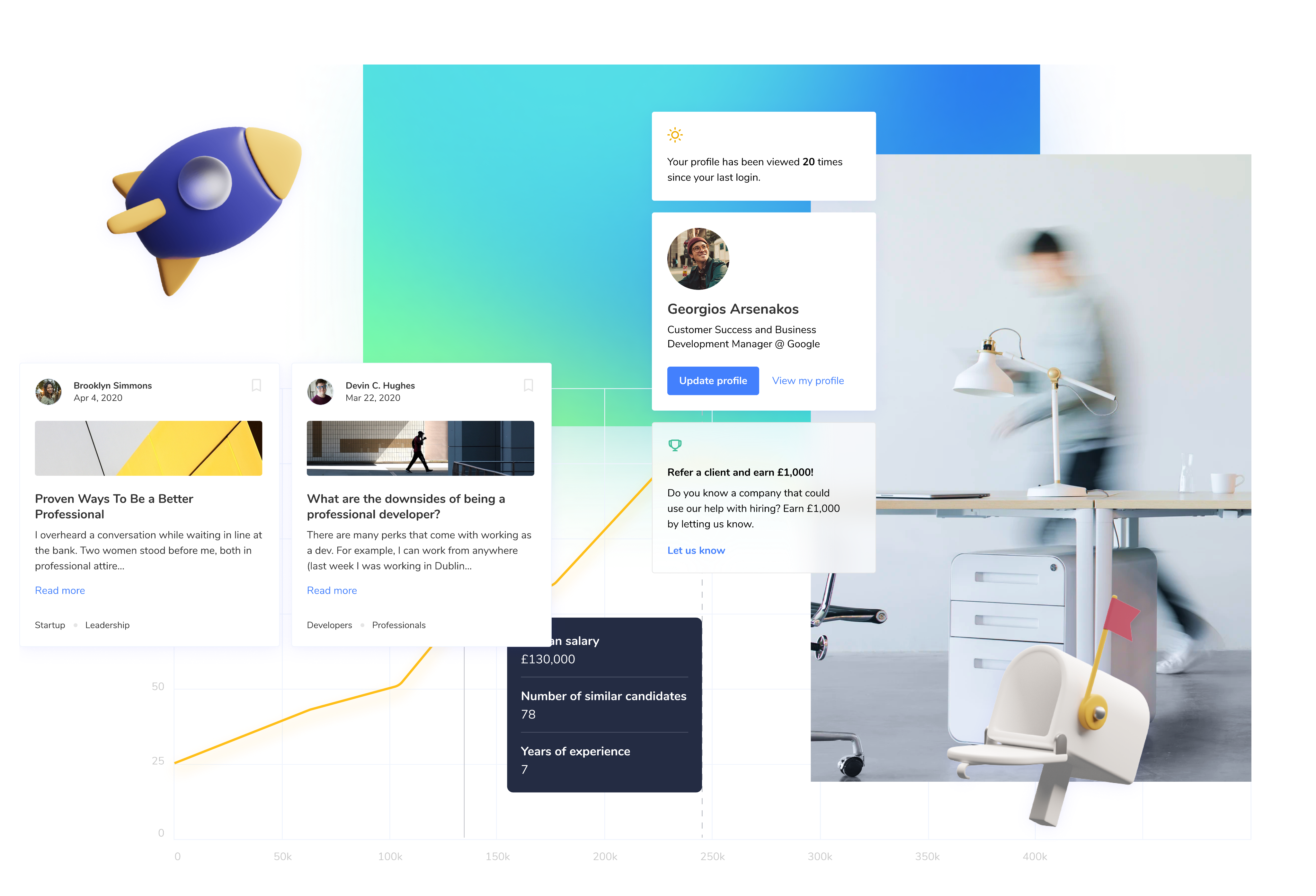
The RoyalTreatment 👑
One of my favorite redesigns was the profile section. Product Owners shared feedback showing users weren’t engaging with it, and we brainstormed ways to make it more meaningful.
The redesign retained our core design principles. Each component was clear, interactive, and visually distinct. A polished 3D style made important elements pop, guiding users to what mattered most.
After completing the Wizard, new users landed on a familiar, functional profile dashboard, an anchor point in their platform journey.
Staying Informed
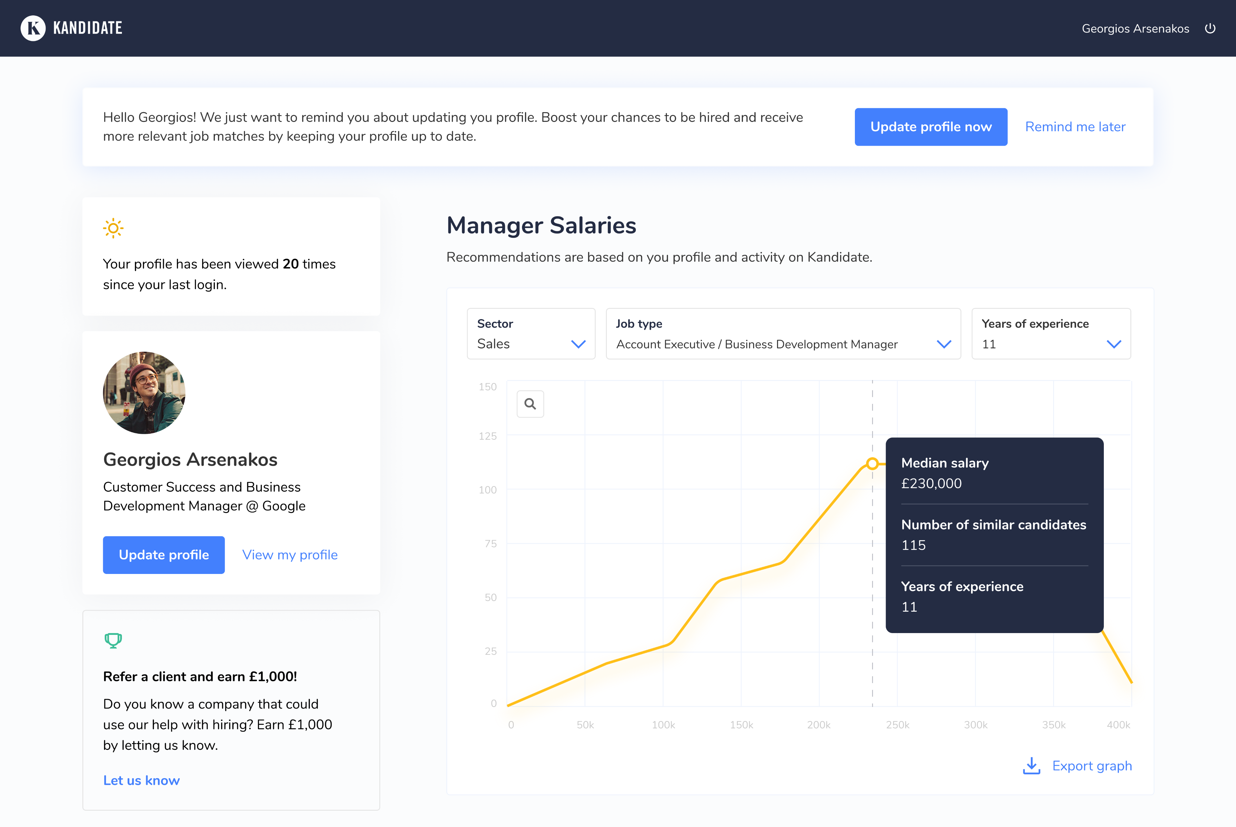
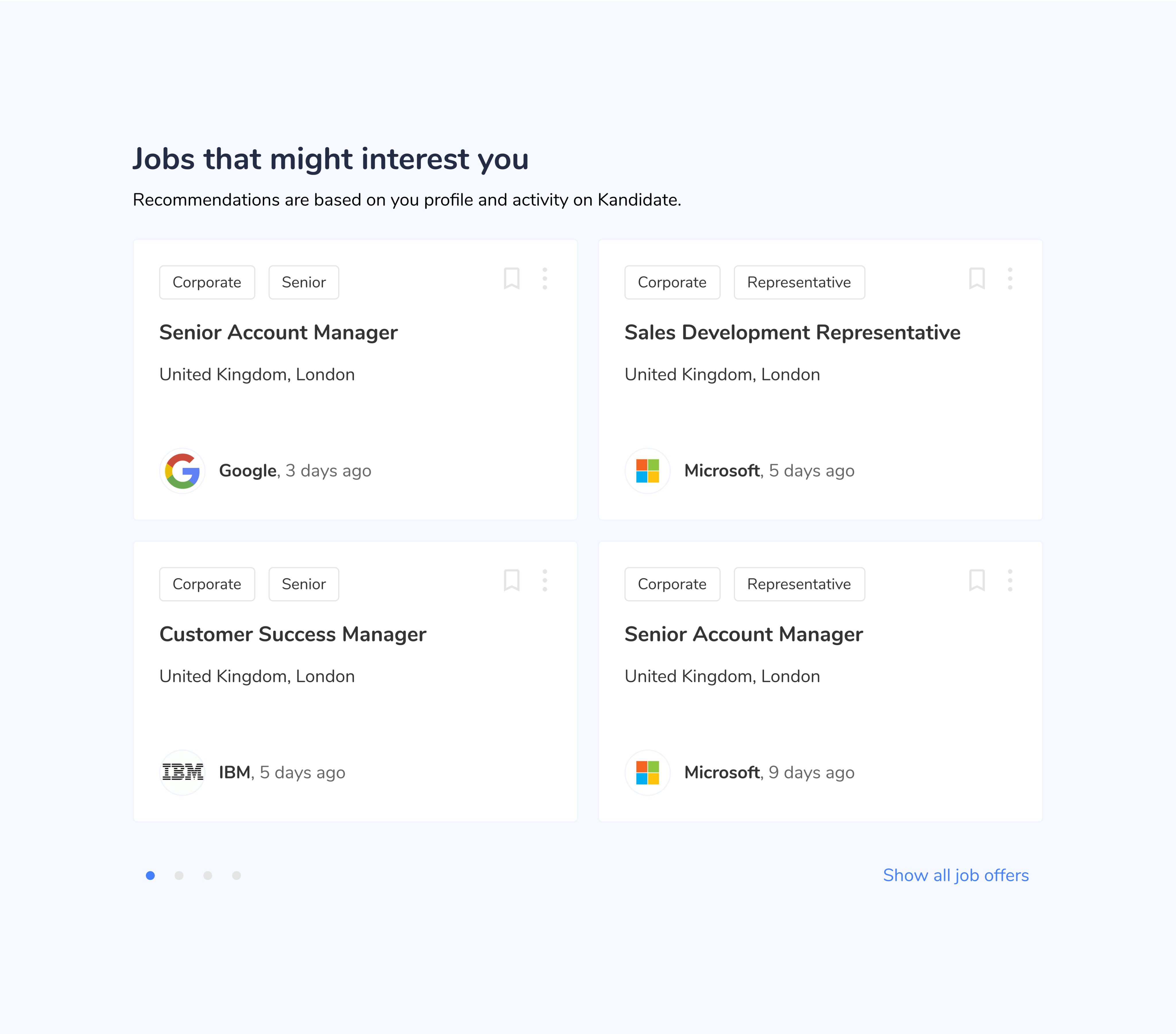
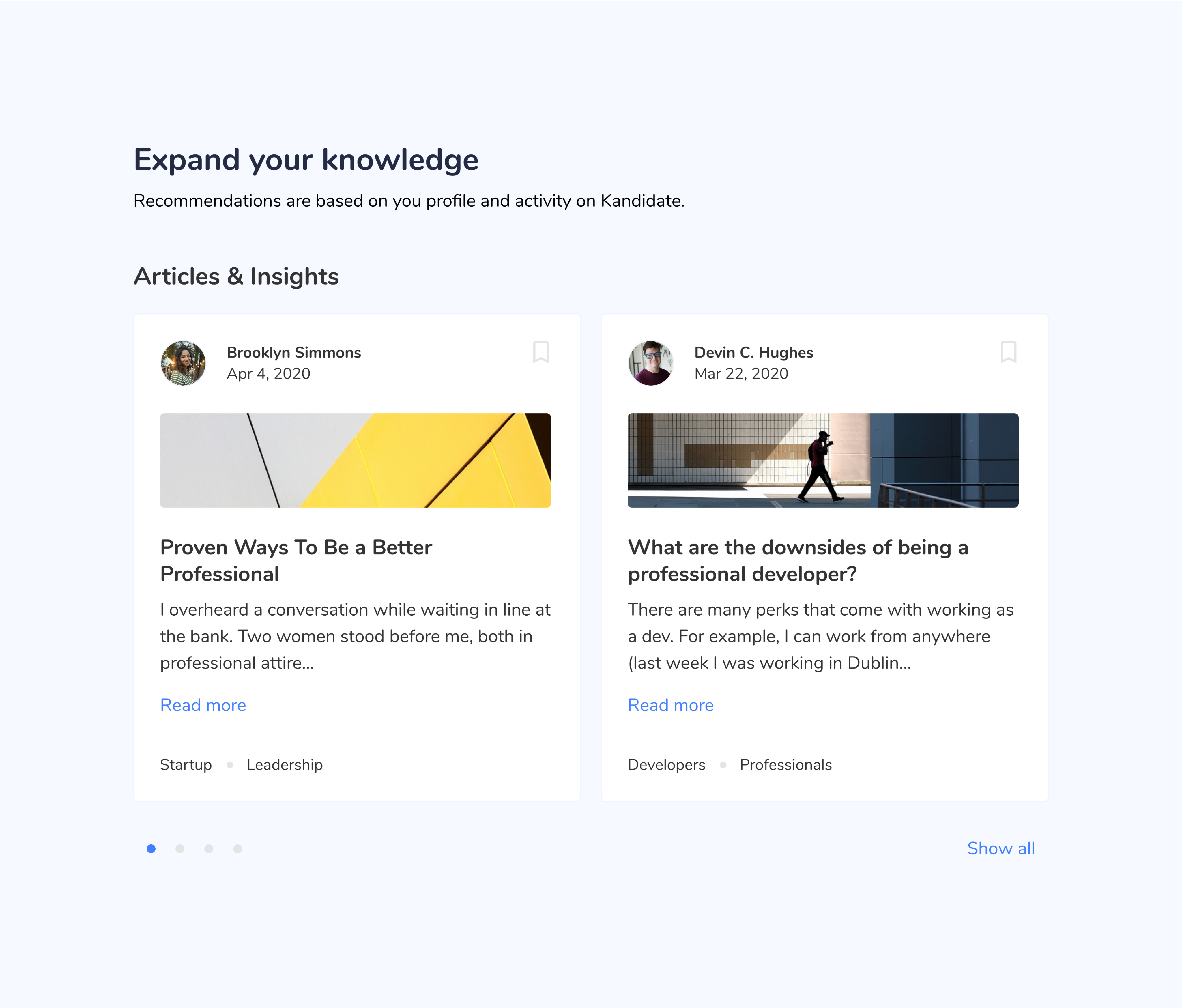
What gave the new profile that “royal” edge? We added genuinely useful features that gave users a reason to check in daily. The "Manager Salaries" and "Jobs You Might Like" sections were especially well received. Finally, the profile was a place people actually wanted to visit.
Even as UX decisions evolved and some recruiter-facing features were scaled back, the updated UI was flexible enough to adapt without redesign.
Knowledge Is Power
One of the ideas I worked on that didn’t get implemented during my time was a learning hub. It would have offered courses and articles to help specialists level up their skills, complete with badges to reward engagement.
The concept was discussed with the co-founder, but due to COVID-19 and budget shifts, it was moved to the backlog.
Follow-ups 💌
During my 9 months as a Product Designer at Kandidate, I had the chance to revisit and refine various ideas. Some light-touch, like landing pages to attract new users, and others that required deeper cognitive planning. No matter the scope, the results were always met with positive feedback or thoughtful input from the team.
Bringing in New Users
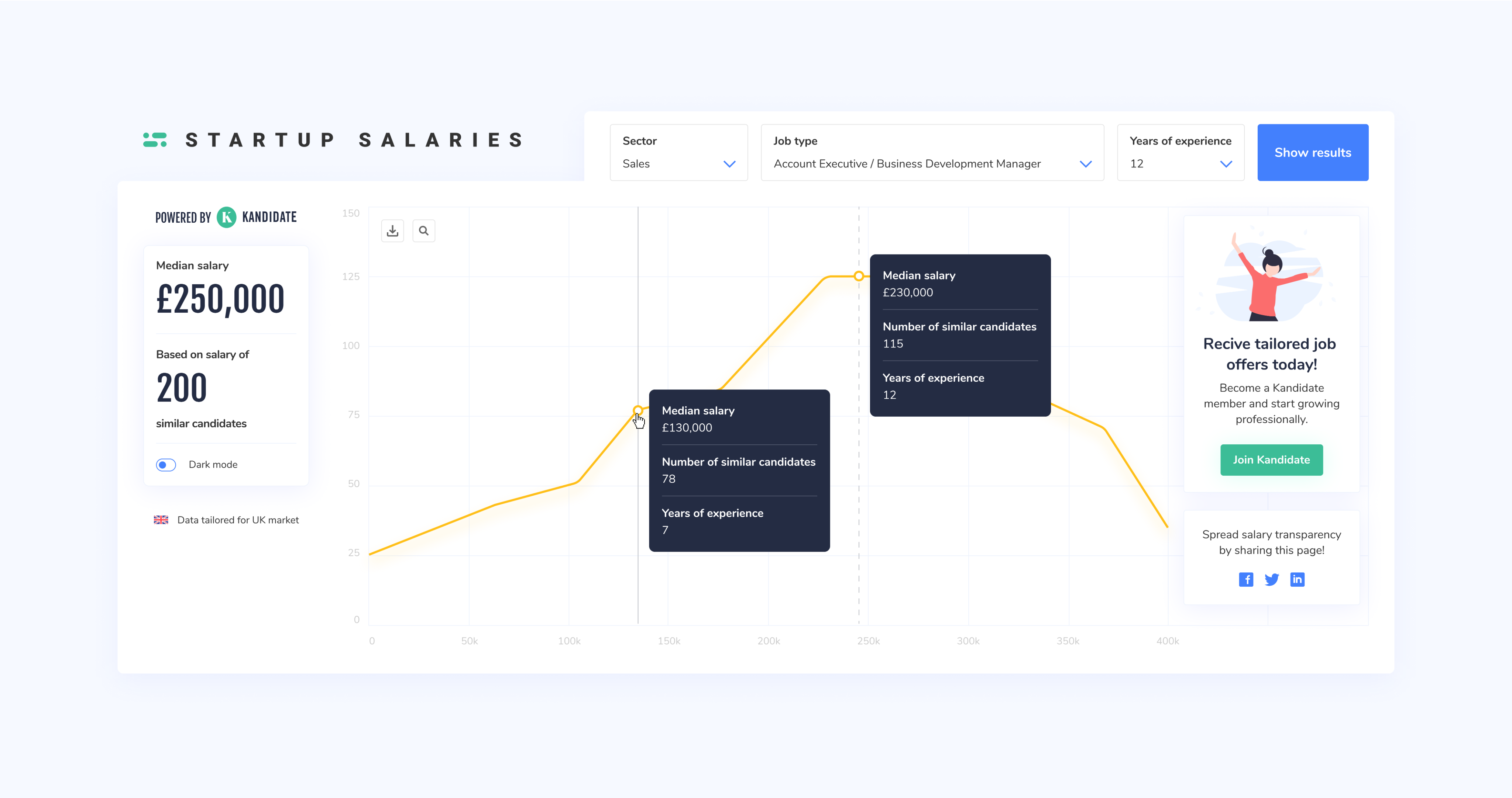
One standout initiative was the “Startup Salaries” website, which compared median salaries across different roles and sectors. Not only did it draw in new visitors, but some of its features were later integrated into user profiles within the platform, bridging marketing and product design in a meaningful way.
Updating the Flow
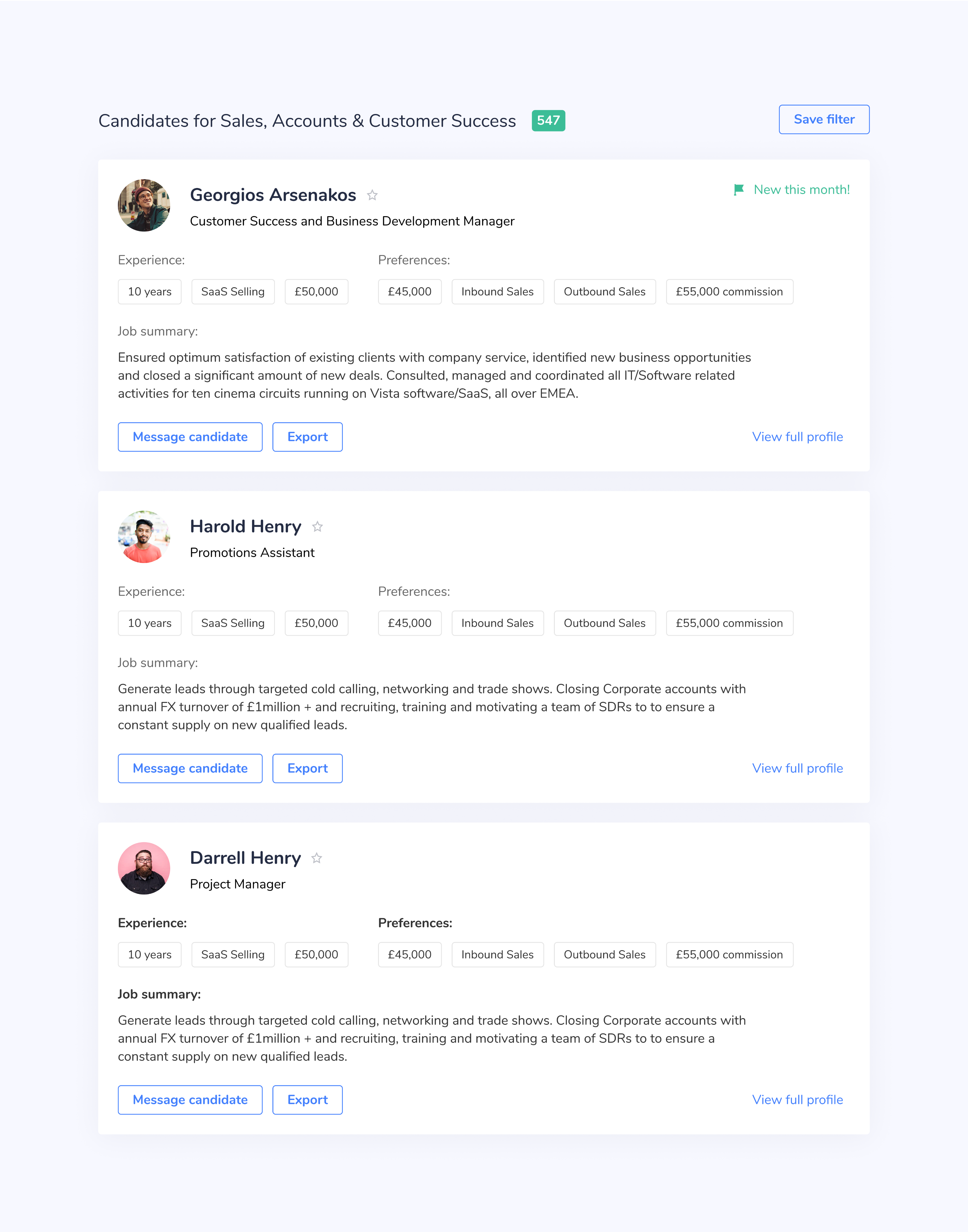
As our feature set and customer base grew, so did the need to evolve key flows. Search results being a great example. We expanded and refined them to keep pace with demand while maintaining usability at the core.
Thanks to solid UI guidelines, adding new elements like the “New this month!” banner felt natural and consistent. Through it all, the philosophy stayed the same: Don’t make me think.
The Outcome 🤔
Working at Kandidate was a genuinely rewarding chapter. I eventually had to step away to take on a full-time leadership position - it became too much to juggle both roles while still maintaining the high standard I set for myself. Still, my time there taught me a ton.
I got first-hand insight into how product design functions in a UK startup, and how that differs from corporate environments - especially in terms of decision-making and managerial structure.
Agile Project Management
Coming from a background in Scrum, transitioning back to Agile was both thrilling and refreshing. At Kandidate, some design requests came directly from user research conducted the night before - and our lean, well-synced team would have working solutions live within a week. It was fast-paced, responsive, and eye-opening. With the right mindset, Agile truly shines.
Startup Culture
The startup environment suited this kind of rapid-fire development perfectly. It felt like working with friends - high-energy, collaborative, and genuinely fun. Sure, I missed some of the structure and polish of corporate processes, but the people made up for it. The vibe was authentic, relaxed, and full of ownership.
The PandeMIC
So why did I leave? Like many, the COVID-19 outbreak hit startups in the UK hard. Cuts to the development team eventually slowed down design initiatives too. It made sense for me to step away at that point.
That said, from what I’ve heard, the product is thriving and the team is back on its feet and growing again after a few turbulent months.

Kandidate
Find and Hire the Right People for Your Team

/
Behance
/
Dribbble
Mateusz Staniszewski © 2025
Designed With Time & Love by Me ⭐

The tech startup world is growing fast, and with it, the demand for smart, flexible recruitment tools.
Kandidate was one of those fast-paced startups looking to level up their product and better serve their customers. I joined their design team as a Product Designer, tasked with rethinking the platform’s experience from the ground up.
Disclaimer: All views shared here are my own and may not reflect the official stance of the company. Some design details have been modified.
My Role
As a Product Designer, I co-led UX direction and created UI guidelines for the web platform. My day-to-day involved collaborating with Product Owners, shaping the user journey, and turning research insights into pixel-perfect Figma designs. I also reviewed new features and handed off designs directly to developers.
We worked in an agile setting, which meant features evolved quickly based on feedback from users and clients and sometimes that meant going back to the drawing board just as fast.
RESPONSIBILITIES 🧔🏽
Product concept & journey, ideation, end-to-end prototype, visual concept
TIMELINE & OUTPUT ⏱
9 months of continuous work on the product
TEAM 💃🏼🕺🏻
Product Owners (2), UX researcher, Tech Lead, Front & Back-end Developers
The Environment 🛋
Before diving into design specifics, it’s worth highlighting the unique work culture. I was part-time but quickly felt like family. Daily check-ins, open communication, and friendly vibes made collaborating with the Kandidate team a genuinely enjoyable experience.
A Vision Shaped by Users
What surprised me most? Nearly every feature in the backlog came from user feedback, not traditional market research. It took some getting used to, but it made the vision incredibly user-driven.
The Co-Founder had a clear directive: the product needed to be clean, accessible, and usable by people across industries and skill levels. From that point on, accessibility became a core focus.
Startup Culture in Action
Kandidate had that signature startup energy. Quick decisions, constant iteration, and a collaborative spirit. Even when workflows got messy, the team’s openness made it easy to navigate. We moved fast, made room for experimentation, and learned as we went.
Design Challenges
Working within agile had its ups and downs. Strict deadlines? Check. Ever-shifting priorities due to new feedback? Also check. It could be frustrating - especially when defining UI guidelines so we embraced a "keep-it-simple" mindset that helped us move forward with clarity.
Understanding the Users
While a teammate led UX research, we frequently discussed findings together. Our users were primarily recruiters and specialists, mostly based in the UK and working in IT startups. That gave us a clear target for design decisions and persona creation.
From what I gathered, users just wanted recruitment tools that worked - nothing flashy, just simple, useful, and efficient. That made mapping user journeys surprisingly intuitive.
The Specialist
Ireland, 24 y.o.
Stan is an accomplished Project Manager with experience at top tech companies like Google. He’s now exploring fresh opportunities across the UK market.

Motivation
By building a profile in collaboration with Agents and Managers, Stan increases his chances of securing high-value contracts on major projects in the near future.
Goal
Stan wants to join the Kandidate platform to receive personalized, high-quality job offers tailored to his expertise and career aspirations.
The Recruiter
England, 27 y.o.
Anita is a seasoned Senior Recruiter at Kandidate, with years of experience navigating the fast-paced UK market in search of top-tier talent.
Motivation
The UK hiring landscape is one of the largest and most complex globally. Even for highly experienced recruiters, sifting through vast volumes of user data can be daunting. Anita wants to spend less time manually filtering and more time connecting with great candidates.
Goal
She’s looking for powerful search and comparison tools to streamline her workflow, cutting research time in half and boosting efficiency.
Defining the MVP
The Product Owners were always open to conversation. We talked about new features and the broader vision behind Kandidate. While I wasn't in charge of the product journey maps, I contributed to feature design and often brought ideas to the table.
The MVP reflected the company’s values: fast onboarding and strong insight into candidates' strengths and weaknesses. That unique structure was vital to preserve - and designing within that framework was a rewarding challenge.
Design Philosophy:Accessible at Every Step 💡
From the start, I had a clear vision and the freedom to explore it. Our user base was large, professional, and diverse, so I built the experience around three guiding principles:
Don’t Make Me Think
Inspired by Steve Krug’s usability book, the interface had to feel intuitive and obvious.
Stick to the Rules
Consistent components and flows made sure users always knew where they were and how to complete tasks.
Step-by-Step
Tasks were broken into clear, manageable steps - especially important for onboarding and form submissions.
These rules gave structure to my creativity and helped me design with purpose.
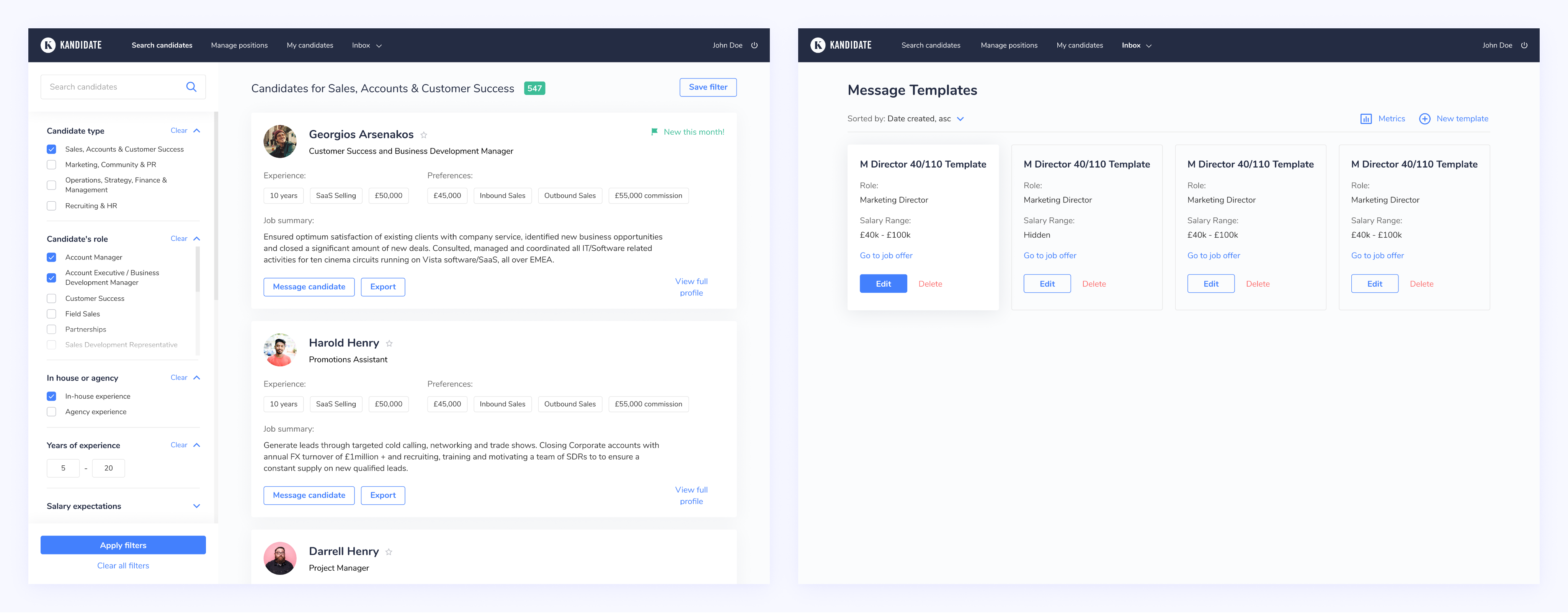
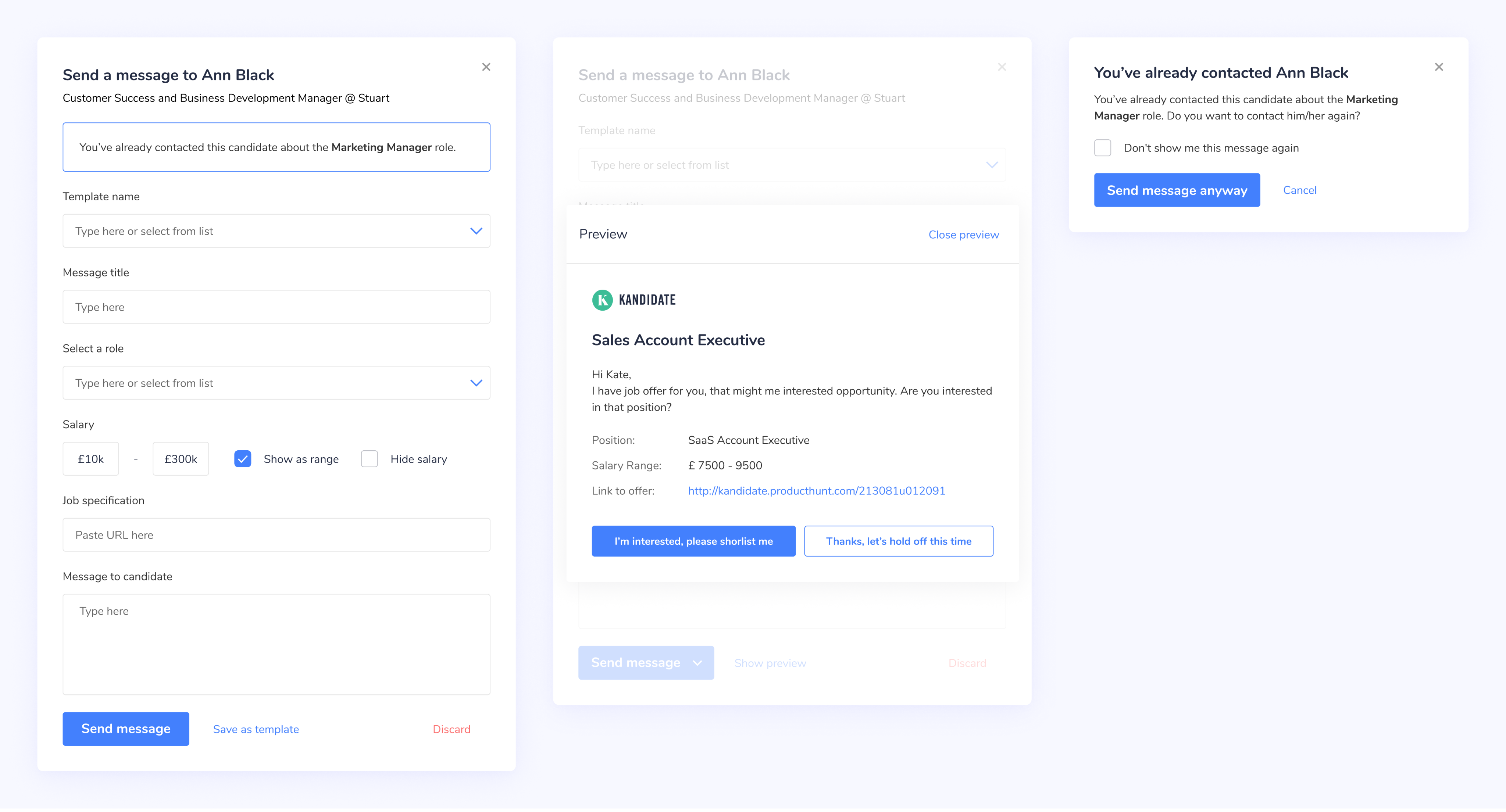
Search, Filter & Chat
The biggest design challenge? The search experience. With over 20 filter categories, things had gotten messy. This was a high-priority fix, and I was more than ready to take it on.
I introduced moving containers to keep filters always accessible on the left side, and redesigned the filter UI to be more compact, intuitive, and responsive to common screen sizes. We kept the overall layout familiar so developers could focus on functionality without overhauling everything.
One of the most visible wins came from the redesigned profile cards, a month-long task that paid off in clarity and usability.
We also revamped the chat experience based on user research. Fields were reordered, the flow was streamlined, and the result was a relaxed, minimal interface that supported conversation without clutter.
Keeping Users Focused
Every product needs a reason for users to stick around and return. That was something I tried to tackle head-on.
The Wizard flow was key. Instead of dumping users into a long list of form fields, the Wizard walked them through the process one step at a time. It kept people engaged, focused, and motivated to complete the journey.
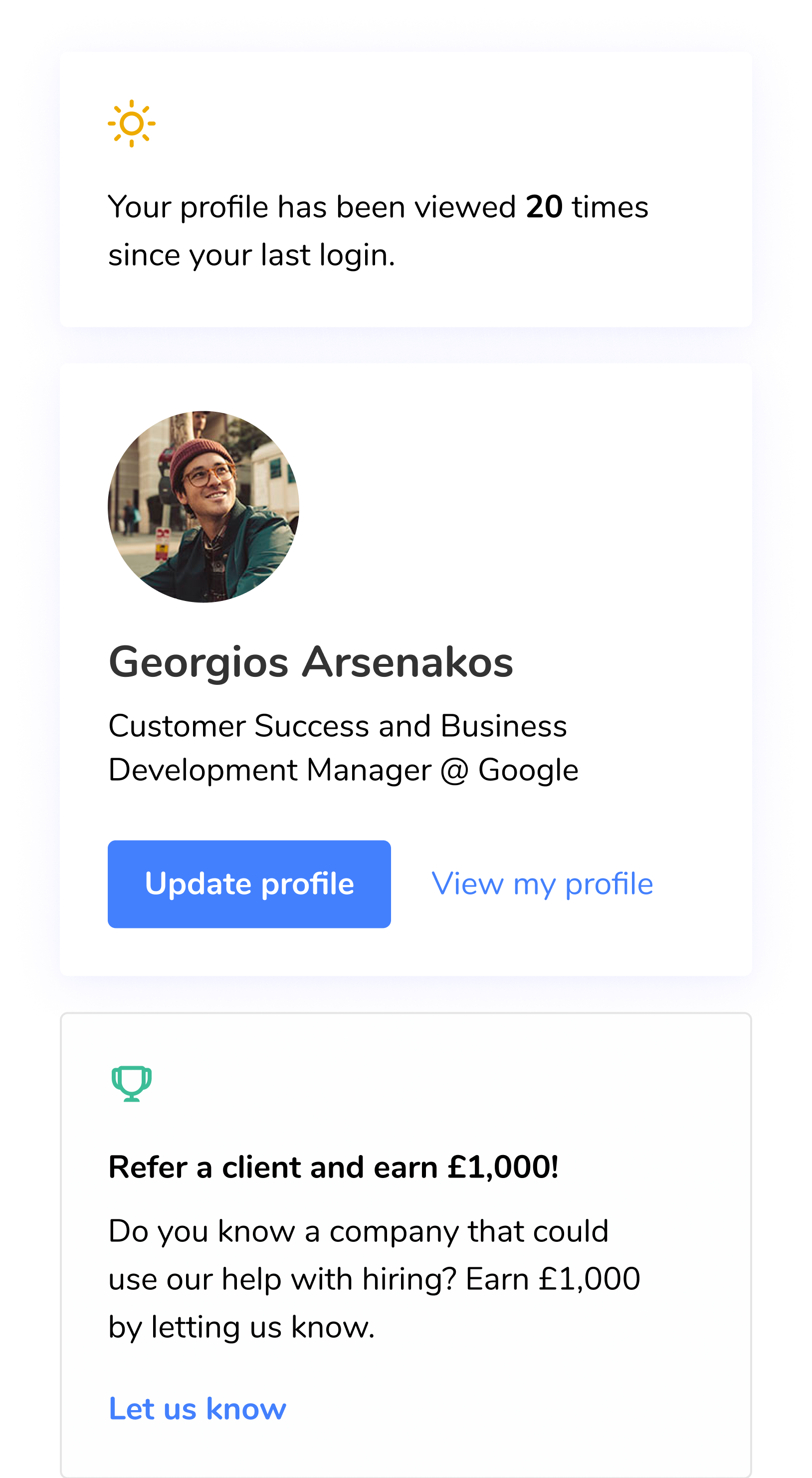
The Royal Treatment 👑
One of my favorite redesigns was the profile section. Product Owners shared feedback showing users weren’t engaging with it, and we brainstormed ways to make it more meaningful.
The redesign retained our core design principles. Each component was clear, interactive, and visually distinct. A polished 3D style made important elements pop, guiding users to what mattered most.
After completing the Wizard, new users landed on a familiar, functional profile dashboard, an anchor point in their platform journey.
Staying Informed
What gave the new profile that “royal” edge? We added genuinely useful features that gave users a reason to check in daily. The "Manager Salaries" and "Jobs You Might Like" sections were especially well received. Finally, the profile was a place people actually wanted to visit.
Even as UX decisions evolved and some recruiter-facing features were scaled back, the updated UI was flexible enough to adapt without redesign.
Knowledge Is Power
One of the ideas I worked on that didn’t get implemented during my time was a learning hub. It would have offered courses and articles to help specialists level up their skills, complete with badges to reward engagement.
The concept was discussed with the co-founder, but due to COVID-19 and budget shifts, it was moved to the backlog.
Follow-ups 💌
During my 9 months as a Product Designer at Kandidate, I had the chance to revisit and refine various ideas. Some light-touch, like landing pages to attract new users, and others that required deeper cognitive planning. No matter the scope, the results were always met with positive feedback or thoughtful input from the team.
Bringing in New Users
One standout initiative was the “Startup Salaries” website, which compared median salaries across different roles and sectors. Not only did it draw in new visitors, but some of its features were later integrated into user profiles within the platform, bridging marketing and product design in a meaningful way.
Updating the Flow
As our feature set and customer base grew, so did the need to evolve key flows. Search results being a great example. We expanded and refined them to keep pace with demand while maintaining usability at the core.
Thanks to solid UI guidelines, adding new elements like the “New this month!” banner felt natural and consistent. Through it all, the philosophy stayed the same: Don’t make me think.
The Outcome 🤔
Working at Kandidate was a genuinely rewarding chapter. I eventually had to step away to take on a full-time leadership position - it became too much to juggle both roles while still maintaining the high standard I set for myself. Still, my time there taught me a ton.
I got first-hand insight into how product design functions in a UK startup, and how that differs from corporate environments - especially in terms of decision-making and managerial structure.
Agile Project Management
Coming from a background in Scrum, transitioning back to Agile was both thrilling and refreshing. At Kandidate, some design requests came directly from user research conducted the night before - and our lean, well-synced team would have working solutions live within a week. It was fast-paced, responsive, and eye-opening. With the right mindset, Agile truly shines.
Startup Culture
The startup environment suited this kind of rapid-fire development perfectly. It felt like working with friends - high-energy, collaborative, and genuinely fun. Sure, I missed some of the structure and polish of corporate processes, but the people made up for it. The vibe was authentic, relaxed, and full of ownership.
The PandeMIC
So why did I leave? Like many, the COVID-19 outbreak hit startups in the UK hard. Cuts to the development team eventually slowed down design initiatives too. It made sense for me to step away at that point.
That said, from what I’ve heard, the product is thriving and the team is back on its feet and growing again after a few turbulent months.

Kandidate
Find and Hire the Right People for Your Team

/
Behance
/
Dribbble
Mateusz Staniszewski © 2025
Designed With Time & Love by Me ⭐
The tech startup world is growing fast, and with it, the demand for smart, flexible recruitment tools.
Kandidate was one of those fast-paced startups looking to level up their product and better serve their customers. I joined their design team as a Product Designer, tasked with rethinking the platform’s experience from the ground up.
Disclaimer: All views shared here are my own and may not reflect the official stance of the company. Some design details have been modified.
My Role
As a Product Designer, I co-led UX direction and created UI guidelines for the web platform. My day-to-day involved collaborating with Product Owners, shaping the user journey, and turning research insights into pixel-perfect Figma designs. I also reviewed new features and handed off designs directly to developers.
We worked in an agile setting, which meant features evolved quickly based on feedback from users and clients and sometimes that meant going back to the drawing board just as fast.
RESPONSIBILITIES 🧔🏽
Product concept & journey, ideation, end-to-end prototype, visual concept
TIMELINE & OUTPUT ⏱
9 months of continuous work on the product
TEAM 💃🏼🕺🏻
Product Owners (2), UX researcher, Tech Lead, Front & Back-end Developers
The Environment 🛋
Before diving into design specifics, it’s worth highlighting the unique work culture. I was part-time but quickly felt like family. Daily check-ins, open communication, and friendly vibes made collaborating with the Kandidate team a genuinely enjoyable experience.
A Vision Shaped by Users
What surprised me most? Nearly every feature in the backlog came from user feedback, not traditional market research. It took some getting used to, but it made the vision incredibly user-driven.
The Co-Founder had a clear directive: the product needed to be clean, accessible, and usable by people across industries and skill levels. From that point on, accessibility became a core focus.
Startup Culture in Action
Kandidate had that signature startup energy. Quick decisions, constant iteration, and a collaborative spirit. Even when workflows got messy, the team’s openness made it easy to navigate. We moved fast, made room for experimentation, and learned as we went.
Design Challenges
Working within agile had its ups and downs. Strict deadlines? Check. Ever-shifting priorities due to new feedback? Also check. It could be frustrating - especially when defining UI guidelines so we embraced a "keep-it-simple" mindset that helped us move forward with clarity.
Understanding the Users
While a teammate led UX research, we frequently discussed findings together. Our users were primarily recruiters and specialists, mostly based in the UK and working in IT startups. That gave us a clear target for design decisions and persona creation.
From what I gathered, users just wanted recruitment tools that worked - nothing flashy, just simple, useful, and efficient. That made mapping user journeys surprisingly intuitive.
The Specialist
Ireland, 24 y.o.
Stan is an accomplished Project Manager with experience at top tech companies like Google. He’s now exploring fresh opportunities across the UK market.

Motivation
By building a profile in collaboration with Agents and Managers, Stan increases his chances of securing high-value contracts on major projects in the near future.
Goal
Stan wants to join the Kandidate platform to receive personalized, high-quality job offers tailored to his expertise and career aspirations.
The Recruiter
England, 27 y.o.
Anita is a seasoned Senior Recruiter at Kandidate, with years of experience navigating the fast-paced UK market in search of top-tier talent.
Motivation
The UK hiring landscape is one of the largest and most complex globally. Even for highly experienced recruiters, sifting through vast volumes of user data can be daunting. Anita wants to spend less time manually filtering and more time connecting with great candidates.
Goal
She’s looking for powerful search and comparison tools to streamline her workflow, cutting research time in half and boosting efficiency.
Defining the MVP
The Product Owners were always open to conversation. We talked about new features and the broader vision behind Kandidate. While I wasn't in charge of the product journey maps, I contributed to feature design and often brought ideas to the table.
The MVP reflected the company’s values: fast onboarding and strong insight into candidates' strengths and weaknesses. That unique structure was vital to preserve - and designing within that framework was a rewarding challenge.
Design Philosophy:Accessible at Every Step 💡
From the start, I had a clear vision and the freedom to explore it. Our user base was large, professional, and diverse, so I built the experience around three guiding principles:
Don’t Make Me Think
Inspired by Steve Krug’s usability book, the interface had to feel intuitive and obvious.
Stick to the Rules
Consistent components and flows made sure users always knew where they were and how to complete tasks.
Step-by-Step
Tasks were broken into clear, manageable steps - especially important for onboarding and form submissions.
These rules gave structure to my creativity and helped me design with purpose.
Search, Filter & Chat
The biggest design challenge? The search experience. With over 20 filter categories, things had gotten messy. This was a high-priority fix, and I was more than ready to take it on.
I introduced moving containers to keep filters always accessible on the left side, and redesigned the filter UI to be more compact, intuitive, and responsive to common screen sizes. We kept the overall layout familiar so developers could focus on functionality without overhauling everything.
One of the most visible wins came from the redesigned profile cards, a month-long task that paid off in clarity and usability.
We also revamped the chat experience based on user research. Fields were reordered, the flow was streamlined, and the result was a relaxed, minimal interface that supported conversation without clutter.
Keeping Users Focused
Every product needs a reason for users to stick around and return. That was something I tried to tackle head-on.
The Wizard flow was key. Instead of dumping users into a long list of form fields, the Wizard walked them through the process one step at a time. It kept people engaged, focused, and motivated to complete the journey.
The Royal Treatment 👑
One of my favorite redesigns was the profile section. Product Owners shared feedback showing users weren’t engaging with it, and we brainstormed ways to make it more meaningful.
The redesign retained our core design principles. Each component was clear, interactive, and visually distinct. A polished 3D style made important elements pop, guiding users to what mattered most.
After completing the Wizard, new users landed on a familiar, functional profile dashboard, an anchor point in their platform journey.
Staying Informed
What gave the new profile that “royal” edge? We added genuinely useful features that gave users a reason to check in daily. The "Manager Salaries" and "Jobs You Might Like" sections were especially well received. Finally, the profile was a place people actually wanted to visit.
Even as UX decisions evolved and some recruiter-facing features were scaled back, the updated UI was flexible enough to adapt without redesign.
Knowledge Is Power
One of the ideas I worked on that didn’t get implemented during my time was a learning hub. It would have offered courses and articles to help specialists level up their skills, complete with badges to reward engagement.
The concept was discussed with the co-founder, but due to COVID-19 and budget shifts, it was moved to the backlog.
Follow-ups 💌
During my 9 months as a Product Designer at Kandidate, I had the chance to revisit and refine various ideas. Some light-touch, like landing pages to attract new users, and others that required deeper cognitive planning. No matter the scope, the results were always met with positive feedback or thoughtful input from the team.
Bringing in New Users
One standout initiative was the “Startup Salaries” website, which compared median salaries across different roles and sectors. Not only did it draw in new visitors, but some of its features were later integrated into user profiles within the platform, bridging marketing and product design in a meaningful way.
Updating the Flow
As our feature set and customer base grew, so did the need to evolve key flows. Search results being a great example. We expanded and refined them to keep pace with demand while maintaining usability at the core.
Thanks to solid UI guidelines, adding new elements like the “New this month!” banner felt natural and consistent. Through it all, the philosophy stayed the same: Don’t make me think.
The Outcome 🤔
Working at Kandidate was a genuinely rewarding chapter. I eventually had to step away to take on a full-time leadership position - it became too much to juggle both roles while still maintaining the high standard I set for myself. Still, my time there taught me a ton.
I got first-hand insight into how product design functions in a UK startup, and how that differs from corporate environments - especially in terms of decision-making and managerial structure.
Agile Project Management
Coming from a background in Scrum, transitioning back to Agile was both thrilling and refreshing. At Kandidate, some design requests came directly from user research conducted the night before - and our lean, well-synced team would have working solutions live within a week. It was fast-paced, responsive, and eye-opening. With the right mindset, Agile truly shines.
Startup Culture
The startup environment suited this kind of rapid-fire development perfectly. It felt like working with friends - high-energy, collaborative, and genuinely fun. Sure, I missed some of the structure and polish of corporate processes, but the people made up for it. The vibe was authentic, relaxed, and full of ownership.
The PandeMIC
So why did I leave? Like many, the COVID-19 outbreak hit startups in the UK hard. Cuts to the development team eventually slowed down design initiatives too. It made sense for me to step away at that point.
That said, from what I’ve heard, the product is thriving and the team is back on its feet and growing again after a few turbulent months.

Kandidate
Find and Hire the Right People for Your Team

/
Behance
/
Dribbble
Mateusz Staniszewski © 2025
Designed With Time & Love by Me ⭐