
Egnyte needed to update its user interface to remain competitive in the rapidly evolving cloud storage and collaboration market.
Platforms like Dropbox, OneDrive, and Box were already offering sleek, user-friendly experiences with intuitive navigation and responsive design. Egnyte's legacy UI, while functional, risked falling behind in both usability and visual appeal. To maintain user trust and market relevance, a modern, accessible, and brand-consistent redesign became not just a design initiative, but a strategic imperative.
Disclaimer: All views shared here are my own and may not reflect the official stance of the company. Some design details have been modified.
My Role
As a Senior Principal Designer at Egnyte, a company specializing in cloud-based content security, compliance, and collaboration tools, I led the complete redesign of the core application. This role placed me at the intersection of design innovation, cross-team leadership, and strategic decision-making.
My primary objective was to modernize the platform’s user interface and experience while creating a design system that would drive consistency and scalability across Egnyte’s product ecosystem.
RESPONSIBILITIES 🧔🏽
Senior Principle Designer & Design System Ownership
TIMELINE & OUTPUT ⏱
4 months to design a web based platform for more than 16,000 customers worldwide
TEAM 💃🏼🕺🏻
UX & UI Designers, Front & Back-end Developers and Product Owners
High-Level Goals 🥅
When I joined the initiative, Egnyte’s application was functionally rich but visually outdated. Our high-level goals were:
01 / Rethink the UX
To rethink and rebuild the UX to be intuitive, responsive, and modern.
02 / Unite Everything
To introduce a cohesive visual language reflective of Egnyte’s evolving brand.
03 / Make it Accessible
To define and implement accessibility standards across all components.
04 / Create Design SYstem
To create a comprehensive design system that developers and designers could easily adopt across teams and future products.
I took a leadership role both as a designer and product thinker, balancing hands-on UI execution with broader team coordination.
Discovery Process
We analyzed leading file-sharing and cloud collaboration tools: Dropbox, OneDrive, and Box to understand current UX standards, strengths, and feature patterns. This helped contextualize where Egnyte’s experience lagged and where we had an opportunity to differentiate.
We hosted collaborative workshops with engineers, designers, product managers, and support teams to uncover internal pain points. Through gap analysis exercises, we aligned on where the experience fell short, both from a technical and user perspective.
Who Are the Users?
To shape the redesign, we first established three core user personas based on internal insights and usage data. The power user needed speed, flexibility, and customizable tools to manage vast amounts of content daily. The organization administrator managed security and user roles, requiring clarity, control, and error-proof workflows. The external guest user interacted via shared links and expected a frictionless, secure experience without needing to learn the platform.
We then mapped detailed user journeys for each persona. These revealed areas of friction, such as inconsistent permissions, unclear navigation, and accessibility gaps - insights that directly shaped the UX direction of the redesign.

The Power User
USA, 31 y.o.
Alex is a highly active user who lives inside the Egnyte platform daily. They manage large volumes of documents and collaborate across departments, often juggling complex folder structures and multiple devices.

Motivation
By updating his profile with Agents and Managers he’s more likely to receive more contracts on large projects in near future.
Goal
He wants to manage files fast, work in a way that fits their style, and have full access from any device.

An Administrator
Poland, 34 y.o.
Monika oversees the platform from a security and governance standpoint. She is responsible for defining access rules, managing user permissions, and ensuring data protection policies are enforced across the company.
Motivation
Monika wants to keep data safe, ensure compliance, and quickly spot and fix potential risks.
Goal
She wants to manage user access with ease, track activity when needed, and keep sensitive data well-organized and clearly protected.

The External Guest
Germany, 25 y.o.
Tomas is an external partner who doesn’t use Egnyte regularly but receives occasional links to download shared files. His interaction is brief, but his experience shapes his perception of the company’s professionalism and security.
Motivation
Tomas wants quick, hassle-free access to shared files, with a smooth and secure download - especially on mobile.
Goal
Tomas wants to open shared links easily, know the file is safe and trusted, and have a smooth, branded experience that leaves him confident.
We built the platform with scalability in mind, ensuring it could adapt even after the original features shipped.
Design Concept & Stakeholder Buy-In
Once the research phase concluded, we synthesized our insights and crafted a bold, forward-looking vision for Egnyte’s next-gen application. With support from my design team, we produced polished UI concepts that balanced modern aesthetics, modular layout structures, and accessibility standards.
We presented this vision to key stakeholders through structured walkthroughs and documentation. Our proposed roadmap outlined a 12-month rollout plan with staged development, adequate testing, and resources. Unfortunately, leadership imposed a four-month turnaround, which introduced significant challenges from day one.
Execution & Product Design ✨
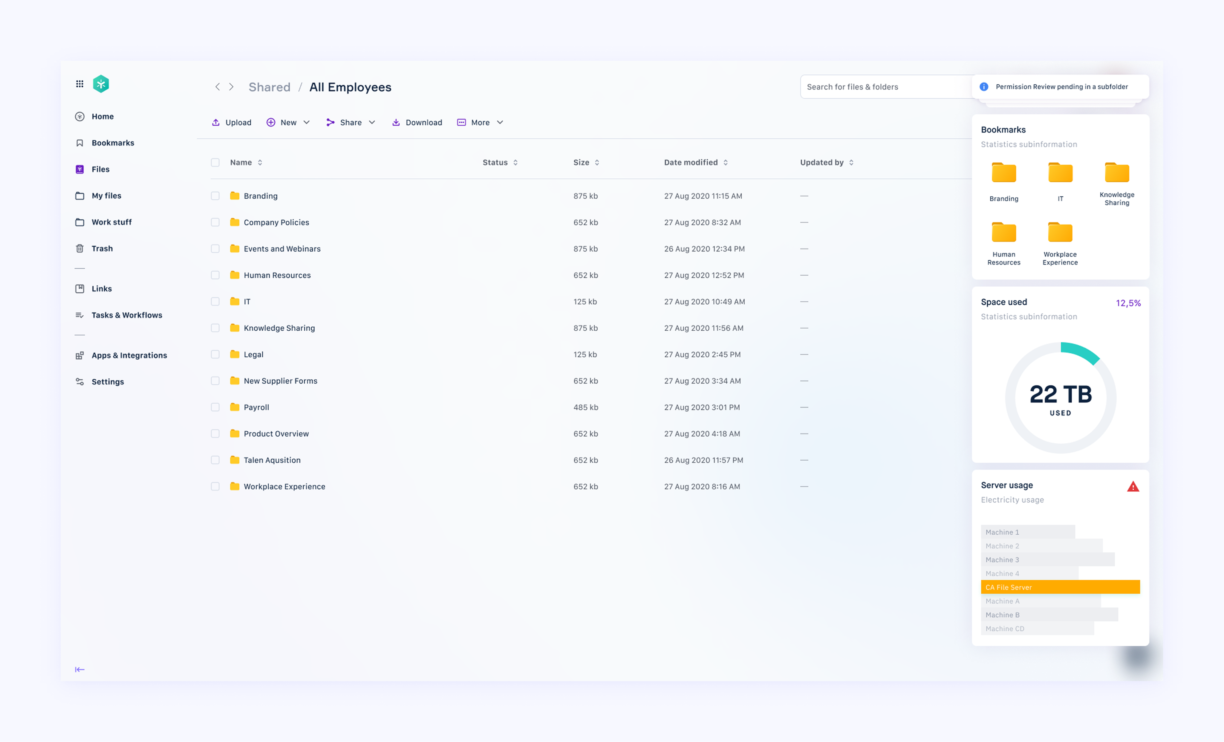
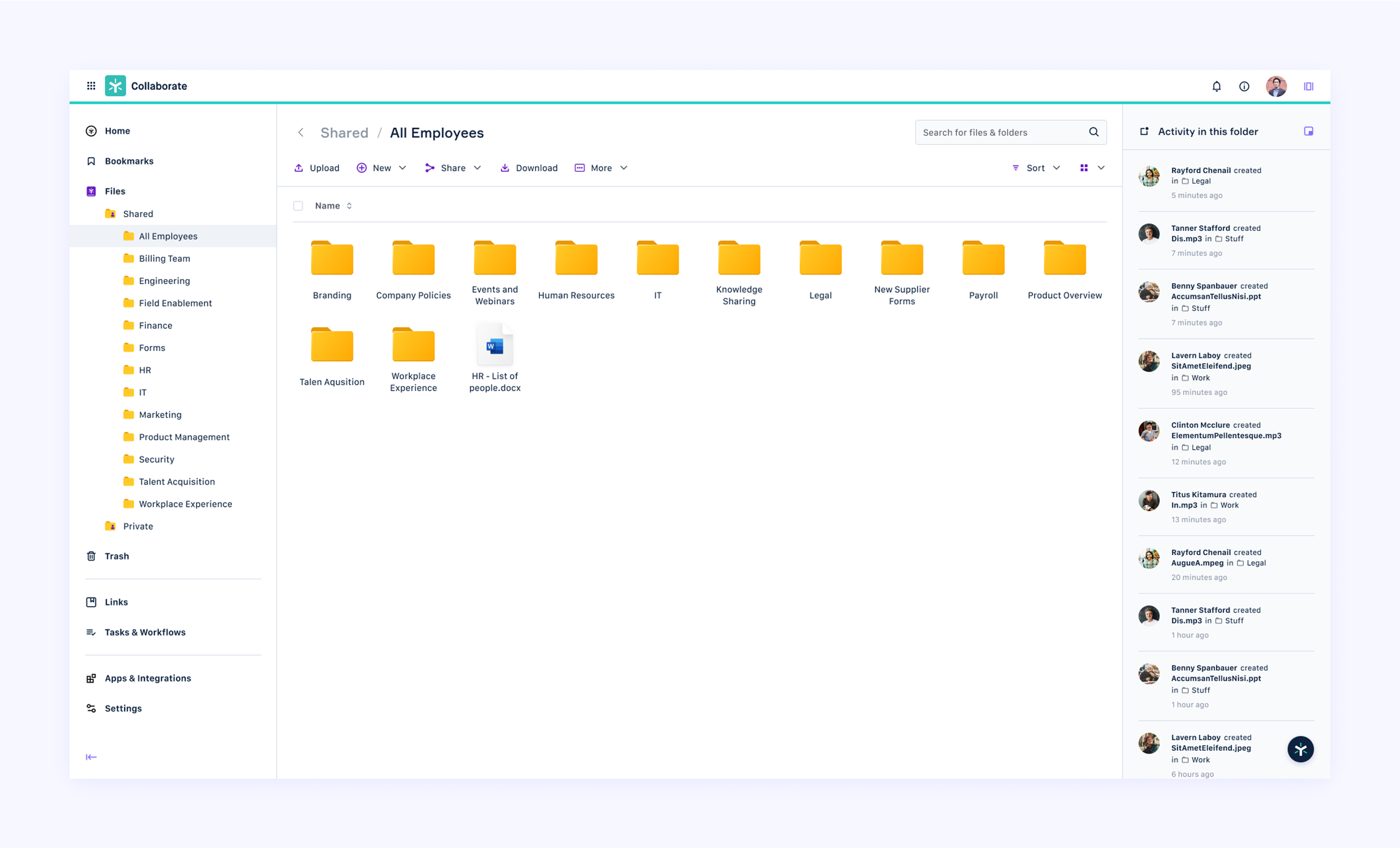
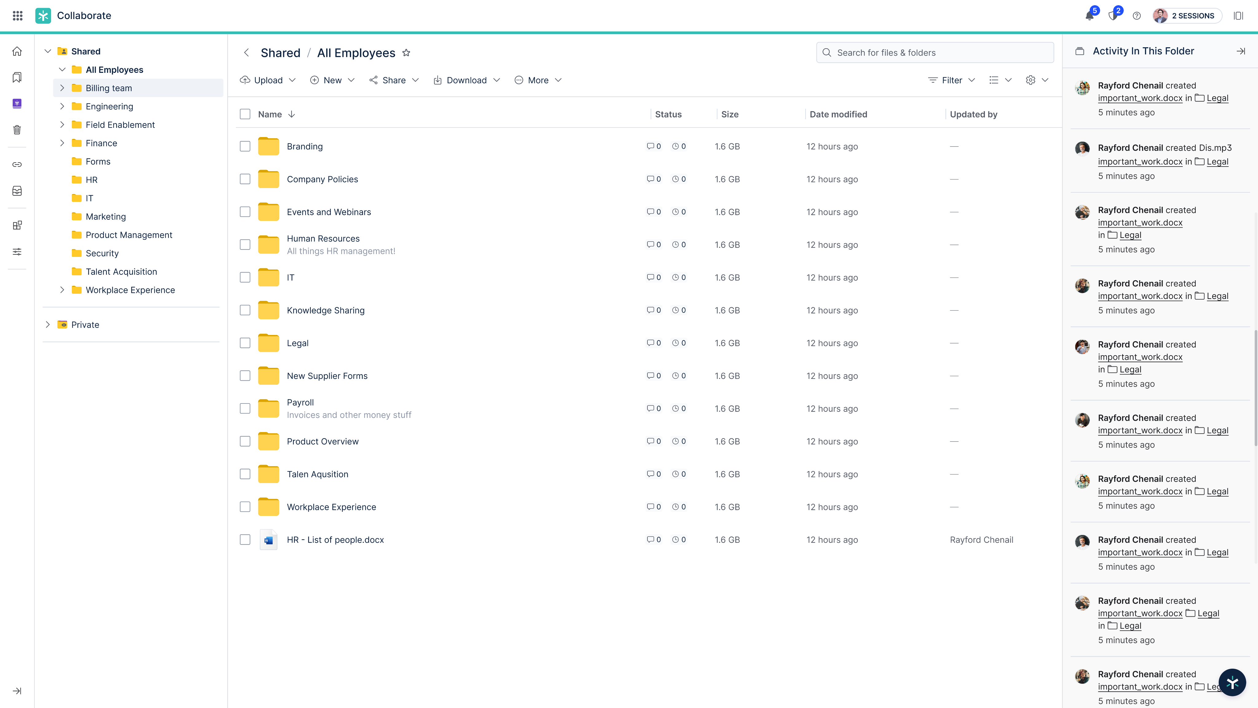
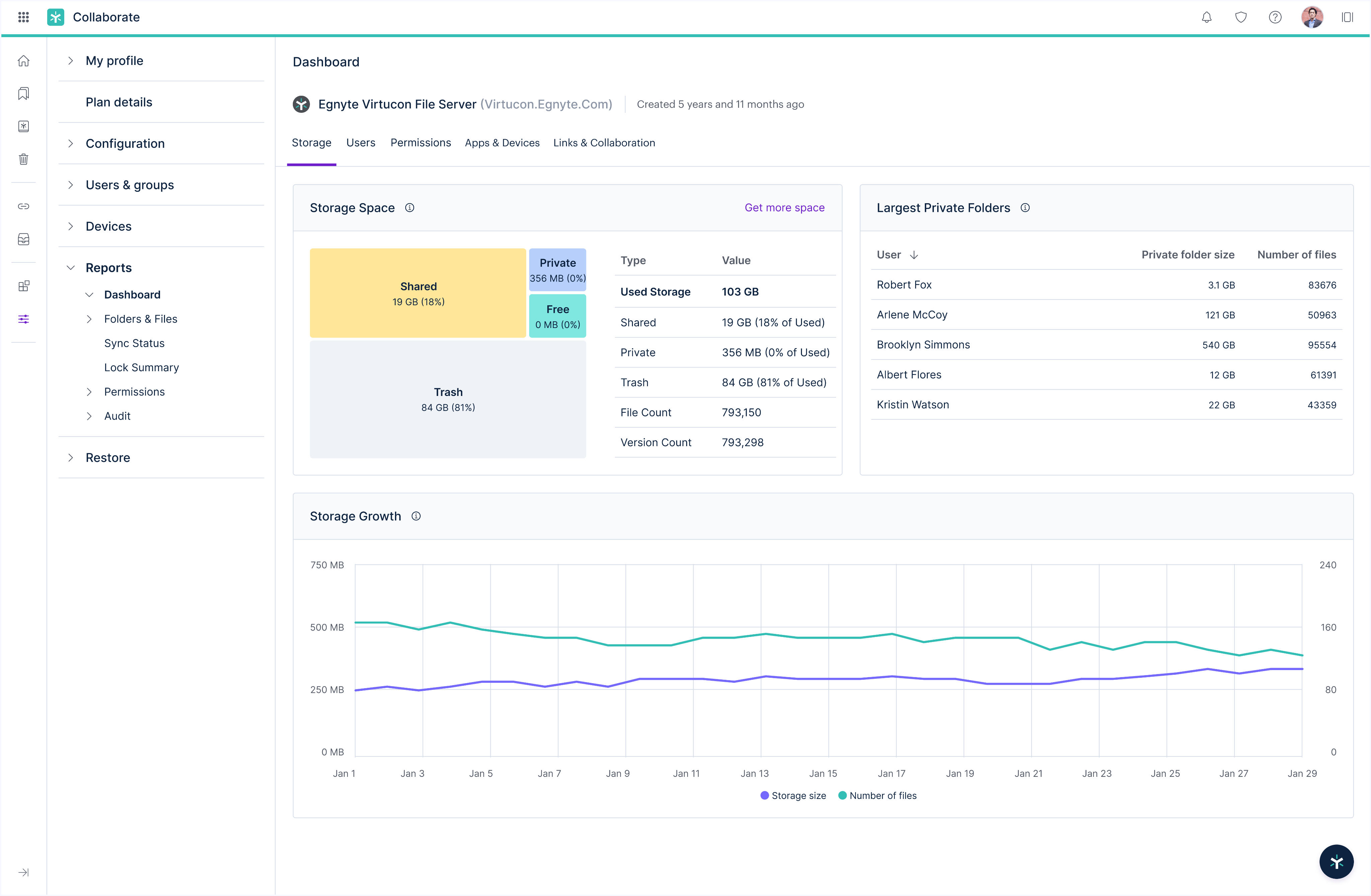
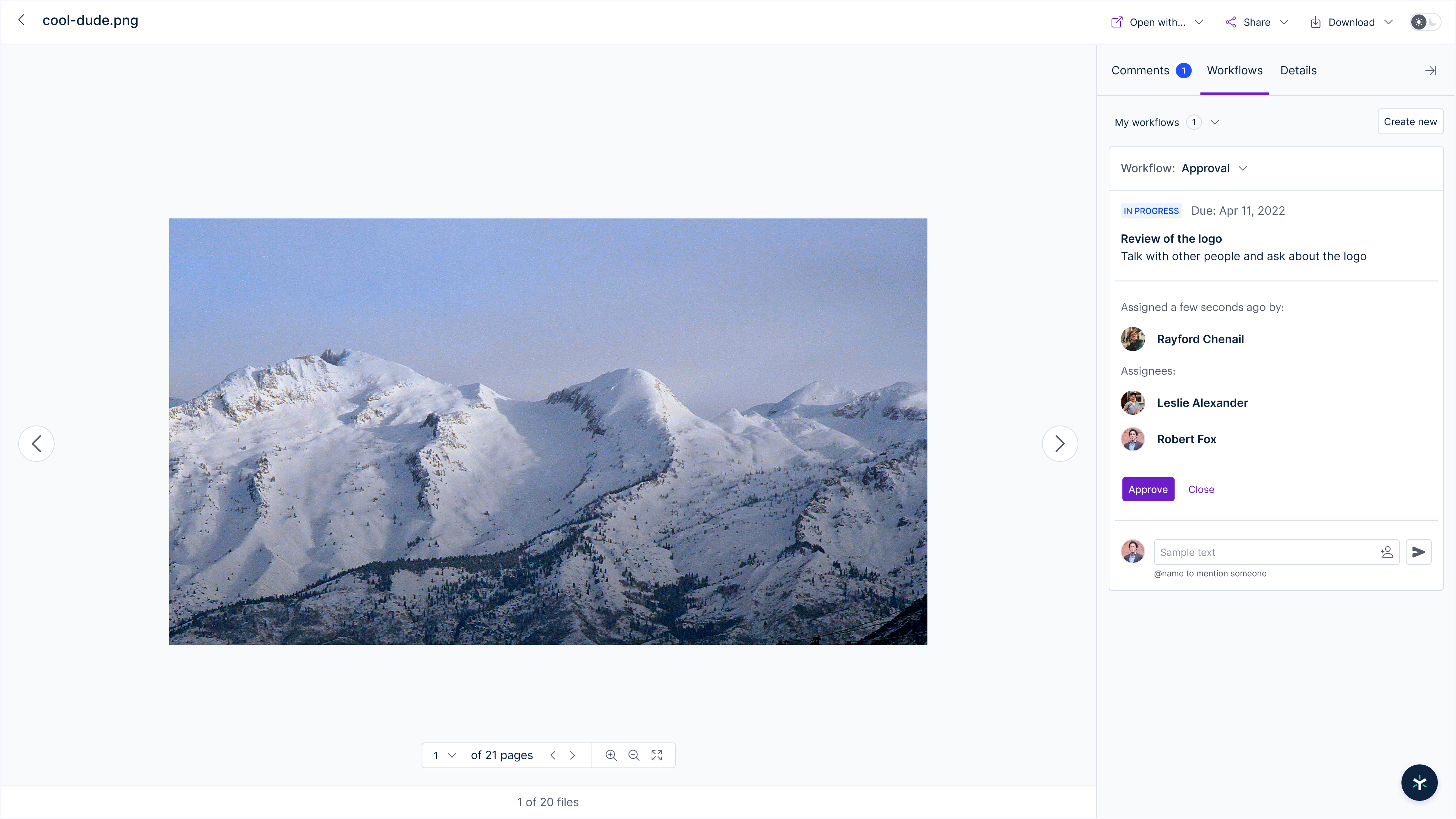
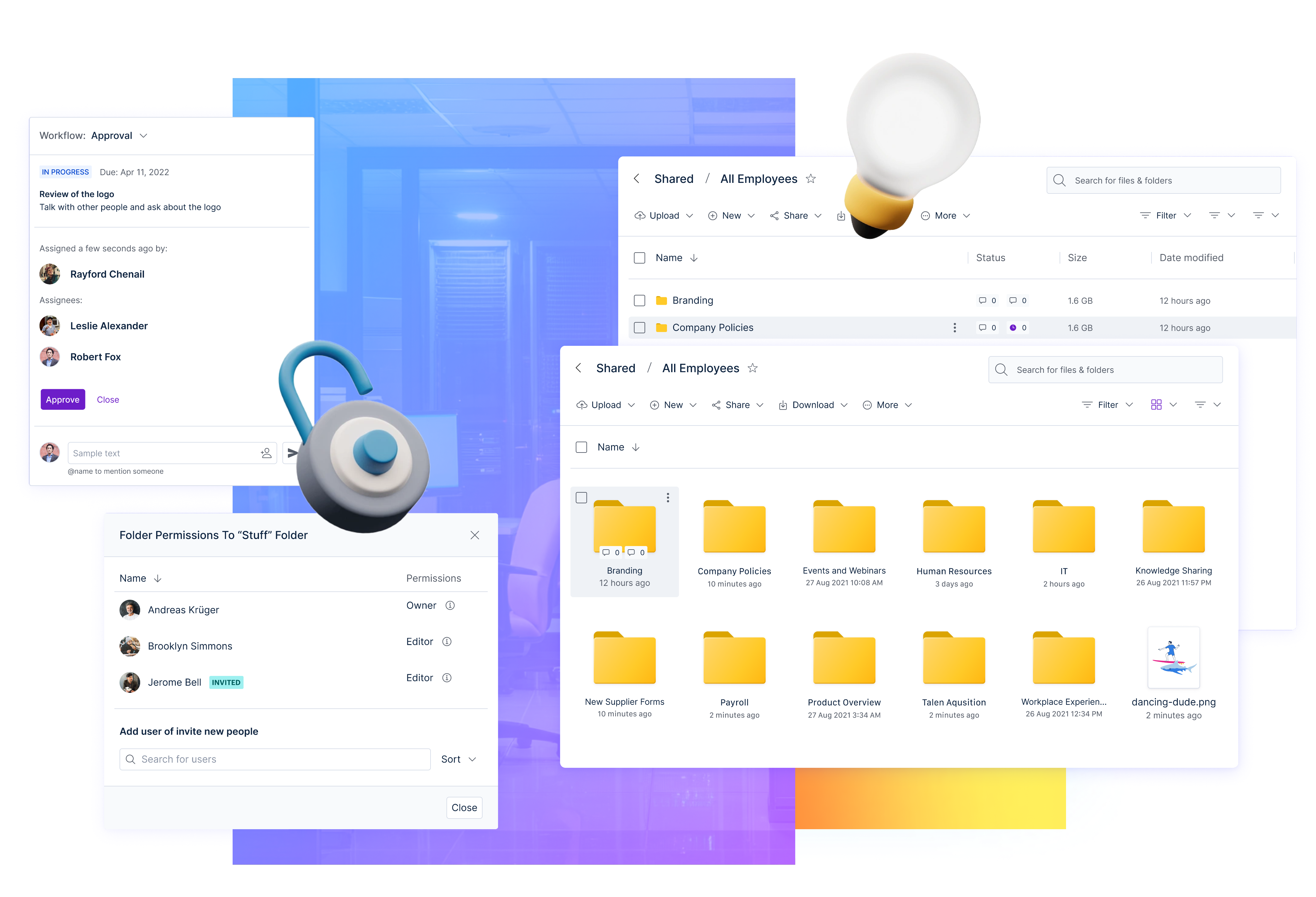
With limited time and big ambitions, our team focused on building a system that was both adaptable and future-proof. We designed a flexible and responsive interface where users could rearrange or hide sections according to their workflow. This gave them control without losing structure.
The Review of the Flows
While the project focused primarily on UI, we also reviewed the UX to inform critical interface decisions. This involved identifying friction points across user journeys and updating select UX features in collaboration with the design team. We didn’t aim to rebuild the user experience from the ground up, but we did take targeted steps to improve flow, logic, and task efficiency where it counted. These adjustments ensured the visual redesign wasn’t just aesthetic, it was grounded in functional improvements that made everyday interactions smoother and more intuitive.
Our design stayed true to Egnyte’s identity while intentionally stepping forward into a more experience-led product philosophy.
Creative Principles
Typography and iconography reflected a clean, modern sensibility, while customization options allowed users to tailor the experience to their brand preferences. One standout element was the navigation redesign, we gave users options like a collapsible navigation tree that mimicked familiar systems such as Dropbox or file explorer interfaces. This eased onboarding and helped users adapt quickly, even amid big visual changes.
Our design stayed true to Egnyte’s identity while intentionally stepping forward into a more experience-led product philosophy.
A/B Testing & Accessibility Enhancements
We engaged internal users for A/B testing and iterated quickly based on feedback. Changes were small but impactful: enhancing font sizes for readability, adjusting color contrast for clarity, and refining component interactions for ease of use. Accessibility wasn't tacked on at the end - it was a central pillar throughout the redesign.
These tests validated that even incremental improvements could significantly elevate the user experience when approached with rigor and empathy.
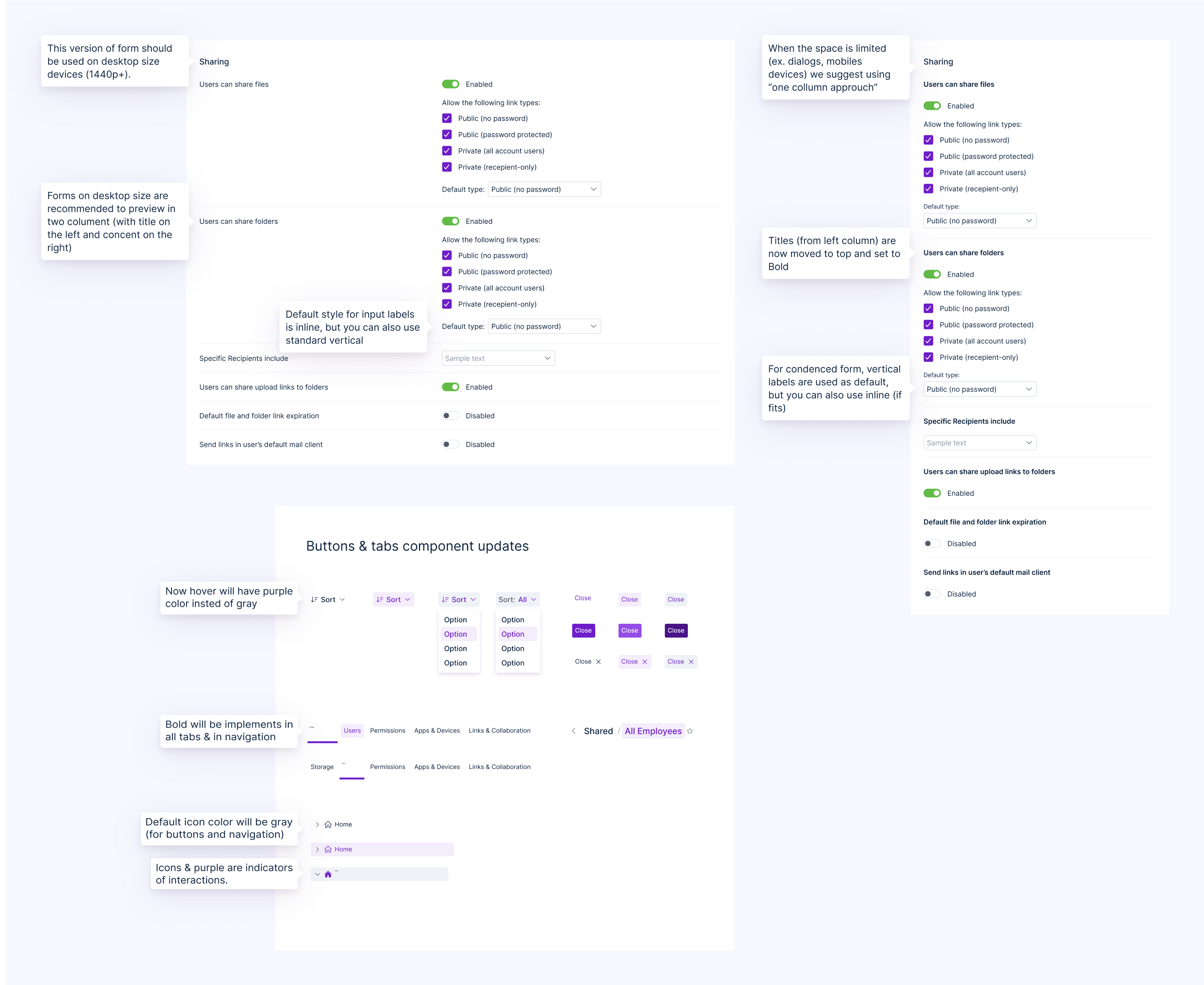
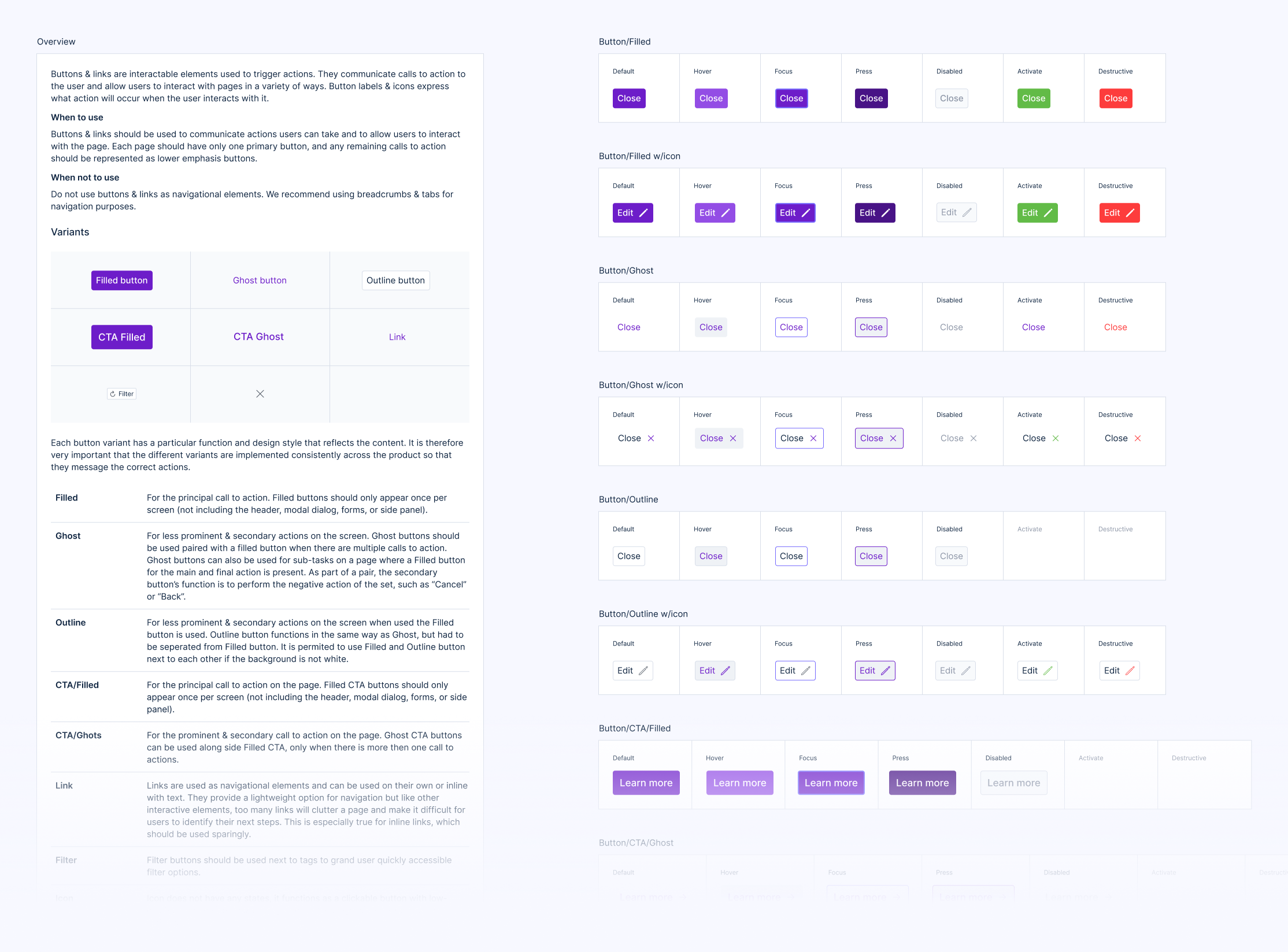
The Design System
Building the design system was one of the most rewarding parts of the project. We worked closely with developers to ensure that every component, from buttons to layout grids, could be reused and maintained across different products and platforms. It wasn't just a visual library; it was a shared language between design and engineering.
I structured documentation so future teams could easily onboard and extend it. Nearly three years later, this system is still the backbone of Egnyte’s digital design - a lasting legacy of thoughtful collaboration and engineering-informed design thinking.
Release & Organizational Challenges 🚓
Despite strong execution, rollout decisions beyond our control impacted the project. Leadership opted for a phased launch, releasing the redesign in waves. Unfortunately, this caused confusion among users, as parts of the application felt mismatched in terms of interface and functionality. Inconsistencies accumulated quickly, and team morale was tested by daily patching and reactive change cycles.
Security Based Issues
Because of Egnyte’s strict security protocols, we were unable to conduct open beta releases or broader user testing outside the organization. This meant many design decisions had to be validated internally and iterated with limited external feedback. To support alignment and adoption across teams, we shared the design system documentation company-wide. This helped standardize implementation across different departments and created a reference point for consistent usage, even in the absence of traditional testing cycles.
The People are What Matters
Although the project ran twice as long as initially planned, I focused on bringing stability to my team. I introduced clearer processes and leaned into communication to help others manage the moving pieces. It wasn’t easy - but it taught me how to lead under pressure and prioritize people over perfection.
The Outcome 🤔
By the end of this project, our goals around design system creation, UI modernization, and user experience enhancement were achieved - despite the extended timeline and implementation hurdles.
Freedom to Create
In the early stages of the project, I was given space to think boldly and explore ideas without being confined by rigid processes or overly prescriptive direction. This freedom extended beyond UI aesthetics - it included the strategic vision for the experience, how the design system would be structured, and the role it would play across future products. Having this trust from leadership allowed me to bring more of myself into the work, take calculated risks, and architect the foundations in a way that felt meaningful and scalable. That creative latitude made all the difference in shaping a system that wasn’t just functional, but purpose-driven.
Great Teamwork
Working alongside the design and engineering teams was one of the most rewarding parts of the experience. The designers I collaborated with were not only deeply talented but brought a level of thoughtfulness and passion that made brainstorming sessions genuinely exciting. Meanwhile, the developers were curious, constructive, and open to challenging conversations - everyone took pride in doing things well, not just fast. That spirit of shared ownership and mutual respect helped us problem-solve creatively and kept the energy high, even in more chaotic phases.
Know your place
This project reminded me that leadership doesn’t always mean having control - it often means understanding where your influence starts and stops. I learned to embrace the ambiguity that comes with shifting timelines, evolving expectations, and decisions made at levels I couldn’t always access. Instead of resisting the chaos, I focused on creating clarity within my own sphere and being a source of calm for the team. That meant communicating openly, asking better questions, and modeling empathy in tough conversations. It taught me to lead with presence, not position.

Egntye
Cloud-based security and collaboration tools

/
Behance
/
Dribbble
Mateusz Staniszewski © 2025
Designed With Time & Love by Me ⭐
Egnyte needed to update its user interface to remain competitive in the rapidly evolving cloud storage and collaboration market.
Platforms like Dropbox, OneDrive, and Box were already offering sleek, user-friendly experiences with intuitive navigation and responsive design. Egnyte's legacy UI, while functional, risked falling behind in both usability and visual appeal. To maintain user trust and market relevance, a modern, accessible, and brand-consistent redesign became not just a design initiative, but a strategic imperative.
Disclaimer: All views shared here are my own and may not reflect the official stance of the company. Some design details have been modified.
My Role
As a Senior Principal Designer at Egnyte, a company specializing in cloud-based content security, compliance, and collaboration tools, I led the complete redesign of the core application. This role placed me at the intersection of design innovation, cross-team leadership, and strategic decision-making.
My primary objective was to modernize the platform’s user interface and experience while creating a design system that would drive consistency and scalability across Egnyte’s product ecosystem.
RESPONSIBILITIES 🧔🏽
Senior Principle Designer & Design System Ownership
TIMELINE & OUTPUT ⏱
4 months to design a web based platform for more than 16,000 customers worldwide
TEAM 💃🏼🕺🏻
UX & UI Designers, Front & Back-end Developers and Product Owners
High-Level Goals 🥅
When I joined the initiative, Egnyte’s application was functionally rich but visually outdated. Our high-level goals were:
01 / Rethink the UX
To rethink and rebuild the UX to be intuitive, responsive, and modern.
02 / Unite Everything
To introduce a cohesive visual language reflective of Egnyte’s evolving brand.
03 / Make it Accessible
To define and implement accessibility standards across all components.
04 / Create Design SYstem
To create a comprehensive design system that developers and designers could easily adopt across teams and future products.
I took a leadership role both as a designer and product thinker, balancing hands-on UI execution with broader team coordination.
Discovery Process
We analyzed leading file-sharing and cloud collaboration tools: Dropbox, OneDrive, and Box to understand current UX standards, strengths, and feature patterns. This helped contextualize where Egnyte’s experience lagged and where we had an opportunity to differentiate.
We hosted collaborative workshops with engineers, designers, product managers, and support teams to uncover internal pain points. Through gap analysis exercises, we aligned on where the experience fell short, both from a technical and user perspective.
Who Are the Users?
To shape the redesign, we first established three core user personas based on internal insights and usage data. The power user needed speed, flexibility, and customizable tools to manage vast amounts of content daily. The organization administrator managed security and user roles, requiring clarity, control, and error-proof workflows. The external guest user interacted via shared links and expected a frictionless, secure experience without needing to learn the platform.
We then mapped detailed user journeys for each persona. These revealed areas of friction, such as inconsistent permissions, unclear navigation, and accessibility gaps - insights that directly shaped the UX direction of the redesign.
The Power User
USA, 31 y.o.
Alex is a highly active user who lives inside the Egnyte platform daily. They manage large volumes of documents and collaborate across departments, often juggling complex folder structures and multiple devices.

Motivation
By updating his profile with Agents and Managers he’s more likely to receive more contracts on large projects in near future.
Goal
He wants to manage files fast, work in a way that fits their style, and have full access from any device.
An Administrator
Poland, 34 y.o.
Monika oversees the platform from a security and governance standpoint. She is responsible for defining access rules, managing user permissions, and ensuring data protection policies are enforced across the company.
Motivation
Monika wants to keep data safe, ensure compliance, and quickly spot and fix potential risks.
Goal
She wants to manage user access with ease, track activity when needed, and keep sensitive data well-organized and clearly protected.
The External Guest
Germany, 25 y.o.
Tomas is an external partner who doesn’t use Egnyte regularly but receives occasional links to download shared files. His interaction is brief, but his experience shapes his perception of the company’s professionalism and security.
Motivation
Tomas wants quick, hassle-free access to shared files, with a smooth and secure download - especially on mobile.
Goal
Tomas wants to open shared links easily, know the file is safe and trusted, and have a smooth, branded experience that leaves him confident.
We built the platform with scalability in mind, ensuring it could adapt even after the original features shipped.
Design Concept & Stakeholder Buy-In
Once the research phase concluded, we synthesized our insights and crafted a bold, forward-looking vision for Egnyte’s next-gen application. With support from my design team, we produced polished UI concepts that balanced modern aesthetics, modular layout structures, and accessibility standards.
We presented this vision to key stakeholders through structured walkthroughs and documentation. Our proposed roadmap outlined a 12-month rollout plan with staged development, adequate testing, and resources. Unfortunately, leadership imposed a four-month turnaround, which introduced significant challenges from day one.
Execution & Product Design ✨
With limited time and big ambitions, our team focused on building a system that was both adaptable and future-proof. We designed a flexible and responsive interface where users could rearrange or hide sections according to their workflow. This gave them control without losing structure.
The Review of the Flows
While the project focused primarily on UI, we also reviewed the UX to inform critical interface decisions. This involved identifying friction points across user journeys and updating select UX features in collaboration with the design team. We didn’t aim to rebuild the user experience from the ground up, but we did take targeted steps to improve flow, logic, and task efficiency where it counted. These adjustments ensured the visual redesign wasn’t just aesthetic, it was grounded in functional improvements that made everyday interactions smoother and more intuitive.
Our design stayed true to Egnyte’s identity while intentionally stepping forward into a more experience-led product philosophy.
Creative Principles
Typography and iconography reflected a clean, modern sensibility, while customization options allowed users to tailor the experience to their brand preferences. One standout element was the navigation redesign, we gave users options like a collapsible navigation tree that mimicked familiar systems such as Dropbox or file explorer interfaces. This eased onboarding and helped users adapt quickly, even amid big visual changes.
Our design stayed true to Egnyte’s identity while intentionally stepping forward into a more experience-led product philosophy.
A/B Testing & Accessibility Enhancements
We engaged internal users for A/B testing and iterated quickly based on feedback. Changes were small but impactful: enhancing font sizes for readability, adjusting color contrast for clarity, and refining component interactions for ease of use. Accessibility wasn't tacked on at the end - it was a central pillar throughout the redesign.
These tests validated that even incremental improvements could significantly elevate the user experience when approached with rigor and empathy.
The Design System
Building the design system was one of the most rewarding parts of the project. We worked closely with developers to ensure that every component, from buttons to layout grids, could be reused and maintained across different products and platforms. It wasn't just a visual library; it was a shared language between design and engineering.
I structured documentation so future teams could easily onboard and extend it. Nearly three years later, this system is still the backbone of Egnyte’s digital design - a lasting legacy of thoughtful collaboration and engineering-informed design thinking.
Release & Organizational Challenges 🚓
Despite strong execution, rollout decisions beyond our control impacted the project. Leadership opted for a phased launch, releasing the redesign in waves. Unfortunately, this caused confusion among users, as parts of the application felt mismatched in terms of interface and functionality. Inconsistencies accumulated quickly, and team morale was tested by daily patching and reactive change cycles.
Security Based Issues
Because of Egnyte’s strict security protocols, we were unable to conduct open beta releases or broader user testing outside the organization. This meant many design decisions had to be validated internally and iterated with limited external feedback. To support alignment and adoption across teams, we shared the design system documentation company-wide. This helped standardize implementation across different departments and created a reference point for consistent usage, even in the absence of traditional testing cycles.
The People are What Matters
Although the project ran twice as long as initially planned, I focused on bringing stability to my team. I introduced clearer processes and leaned into communication to help others manage the moving pieces. It wasn’t easy - but it taught me how to lead under pressure and prioritize people over perfection.
The Outcome 🤔
By the end of this project, our goals around design system creation, UI modernization, and user experience enhancement were achieved - despite the extended timeline and implementation hurdles.
Freedom to Create
In the early stages of the project, I was given space to think boldly and explore ideas without being confined by rigid processes or overly prescriptive direction. This freedom extended beyond UI aesthetics - it included the strategic vision for the experience, how the design system would be structured, and the role it would play across future products. Having this trust from leadership allowed me to bring more of myself into the work, take calculated risks, and architect the foundations in a way that felt meaningful and scalable. That creative latitude made all the difference in shaping a system that wasn’t just functional, but purpose-driven.
Great Teamwork
Working alongside the design and engineering teams was one of the most rewarding parts of the experience. The designers I collaborated with were not only deeply talented but brought a level of thoughtfulness and passion that made brainstorming sessions genuinely exciting. Meanwhile, the developers were curious, constructive, and open to challenging conversations - everyone took pride in doing things well, not just fast. That spirit of shared ownership and mutual respect helped us problem-solve creatively and kept the energy high, even in more chaotic phases.
Know your place
This project reminded me that leadership doesn’t always mean having control - it often means understanding where your influence starts and stops. I learned to embrace the ambiguity that comes with shifting timelines, evolving expectations, and decisions made at levels I couldn’t always access. Instead of resisting the chaos, I focused on creating clarity within my own sphere and being a source of calm for the team. That meant communicating openly, asking better questions, and modeling empathy in tough conversations. It taught me to lead with presence, not position.

Egntye
Cloud-based security and collaboration tools

/
Behance
/
Dribbble
Mateusz Staniszewski © 2025
Designed With Time & Love by Me ⭐